
HTML and CSS Lists: importance,Uses and Responsive Design
Contents
HTML and CSS Lists
Learn how to effectively structure and style HTML lists using CSS. Explore the importance and uses of CSS lists, navigation menus, content organization, user interface components, and responsive design techniques. Enhance your web development skills with practical examples and code snippets.
CSS lists are an essential part of web design and play a crucial role in structuring and organizing content on a webpage. They provide a way to present information in a logical and visually appealing manner.
Here are the importance and uses of CSS lists:
Structuring Content:
Lists help structure and organize information, making it easier for users to scan and comprehend. By using ordered lists (numbered lists) or unordered lists (bullet lists), you can create a hierarchy and visually separate different sections of content.
Here’s an example of HTML code that demonstrates how to use CSS to structure content with ordered and unordered lists:
<!DOCTYPE html>
<html>
<head>
<title>Structuring Content with CSS Lists</title>
<style>
/* Customizing ordered list */
ol {
margin: 0;
padding: 0;
list-style-type: decimal; /* Change to your desired numbering style */
}
/* Customizing unordered list */
ul {
margin: 0;
padding: 0;
list-style-type: disc; /* Change to your desired bullet style */
}
/* Styling list items */
li {
margin-bottom: 5px; /* Add spacing between list items */
}
/* Styling nested lists */
li ul {
margin-top: 5px; /* Add spacing above nested unordered lists */
margin-left: 20px; /* Indent nested unordered lists */
}
/* Customizing nested ordered list */
li ol {
margin-top: 5px; /* Add spacing above nested ordered lists */
margin-left: 20px; /* Indent nested ordered lists */
list-style-type: lower-alpha; /* Change to your desired numbering style */
}
</style>
</head>
<body>
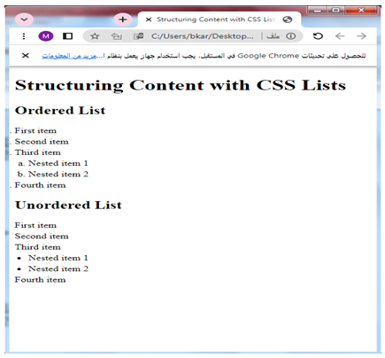
<h1>Structuring Content with CSS Lists</h1>
<h2>Ordered List</h2>
<ol>
<li>First item</li>
<li>Second item</li>
<li>Third item
<ol>
<li>Nested item 1</li>
<li>Nested item 2</li>
</ol>
</li>
<li>Fourth item</li>
</ol>
<h2>Unordered List</h2>
<ul>
<li>First item</li>
<li>Second item</li>
<li>Third item
<ul>
<li>Nested item 1</li>
<li>Nested item 2</li>
</ul>
</li>
<li>Fourth item</li>
</ul>
</body>
</html>
Explanation:
1-In the above code, we have applied CSS styles to customize the appearance of ordered (<ol>) and unordered (<ul>) lists.
2-The margin and padding properties are used to remove any default spacing around the lists.
3-The list-style-type property allows you to change the numbering or bullet style.
4-Additionally, we have added spacing between list items using the margin-bottom property.
5-For nested lists, we have used margin-top to add spacing above them and margin-left to indent them.
Try to modify the CSS properties to suit your specific design preferences and requirements.
How to create CSS Navigation Menus?
Lists are commonly used to create navigation menus.
By styling the list items and applying CSS properties, you can create horizontal or vertical menus that guide users through different sections or pages of a website.
Here’s an example of HTML code that demonstrates how to create a basic navigation menu using an unordered list (<ul>) and style it with CSS:
<!DOCTYPE html>
<html>
<head>
<title>Navigation Menu</title>
<style>
/* Styling the navigation menu */
ul.nav-menu {
list-style-type: none;
margin: 0;
padding: 0;
background-color: #f1f1f1;
}
/* Styling the menu items */
ul.nav-menu li {
display: inline-block;
margin-right: 10px;
}
/* Styling the links within the menu items */
ul.nav-menu li a {
display: block;
padding: 10px;
text-decoration: none;
color: #333;
font-weight: bold;
}
/* Styling the links on hover */
ul.nav-menu li a:hover {
background-color: #333;
color: #fff;
}
</style>
</head>
<body>
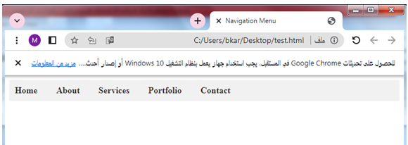
<ul class="nav-menu">
<li><a href="#">Home</a></li>
<li><a href="#">About</a></li>
<li><a href="#">Services</a></li>
<li><a href="#">Portfolio</a></li>
<li><a href="#">Contact</a></li>
</ul>
</body>
</html>
Explanation:
1-In the above code, we have created an unordered list (<ul>) with the class “nav-menu” to represent the navigation menu.
2-The CSS styles are applied to the class “nav-menu” to customize its appearance.
3-The menu items are represented by list items (<li>) within the unordered list.
4-We have used display: inline-block to position the menu items horizontally, and margin-right to add spacing between them.
5-The links (<a>) within the menu items are styled using CSS properties.
6-We have set display: block to make them take up the full width of the menu item, added padding for spacing, and customized the colors and font properties.
7-On hover, the background color and text color of the links are changed to provide visual feedback.
You can modify the CSS styles to match your desired design and add appropriate URLs to the anchor (<a>) tags to link to different pages or sections of your website.
How to style and customize a list using CSS?
Styling and Customization: CSS allows you to customize the appearance of lists to match your website’s design.
You can change the bullet styles, modify the spacing, apply different colors, or use custom images as bullets.
This flexibility helps create a visually appealing and cohesive design.
Here’s an example of HTML code that demonstrates how to style and customize a list using CSS:
<!DOCTYPE html>
<html>
<head>
<title>List Styling and Customization</title>
<style>
/* Customizing the unordered list */
ul.custom-list {
list-style-type: none;
padding: 0;
}
/* Styling the list items */
ul.custom-list li {
margin-bottom: 10px;
background-color: #f1f1f1;
padding: 10px;
border-radius: 5px;
}
/* Changing the bullet style */
ul.custom-list li::before {
content: "•"; /* Custom bullet character */
color: #333;
font-weight: bold;
margin-right: 10px;
}
/* Changing the bullet color on hover */
ul.custom-list li:hover::before {
color: #ff0000;
}
/* Styling a specific list item */
ul.custom-list li.special-item {
background-color: #ffd700;
color: #333;
font-weight: bold;
}
</style>
</head>
<body>
<h1>List Styling and Customization</h1>
<ul class="custom-list">
<li>First item</li>
<li>Second item</li>
<li class="special-item">Special item</li>
<li>Fourth item</li>
</ul>
</body>
</html>
Explanation:
1-In the above code, we have created an unordered list (<ul>) with the class “custom-list” to apply the custom styles.
2-The CSS styles are applied to the class “custom-list” to customize the appearance of the list.
3-We have removed the default bullet style using list-style-type: none and removed any default padding with padding: 0.
4-The list items are styled using the class “custom-list li”.
5-We have added margin, background color, padding, and border radius to give the list items a distinct appearance.
6-To change the bullet style, we have used the ::before pseudo-element on the list items and added the desired content using the content property.
7-In this example, we have used a custom bullet character (“•”), but you can use different characters or images as desired.
8-Additionally, we have added a hover effect by changing the color of the bullet on hover using the ul.custom-list li:hover::before selector.
9-Furthermore, we have customized a specific list item by adding the class “special-item” to one of the list items.
10-This allows us to target that specific item and apply unique styles, such as changing the background color, font color, and font weight.

Try to modify the CSS styles to match your desired design and customize the appearance of the list and its items according to your needs.
How to indent and nest lists using CSS ?
Indenting and Nesting: Lists can be nested within other lists, creating a hierarchical structure.
This is particularly useful for submenus or multi-level navigation systems.
CSS provides the ability to indent and control the spacing of nested lists, allowing you to create clear visual cues for sub-level items.
Here’s an example of HTML code that demonstrates how to indent and nest lists using CSS:
<!DOCTYPE html>
<html>
<head>
<title>Indenting and Nesting Lists</title>
<style>
/* Customizing the unordered list */
ul.indent-list {
list-style-type: none;
padding: 0;
}
/* Styling the list items */
ul.indent-list li {
margin-bottom: 10px;
}
/* Indenting nested unordered lists */
ul.indent-list ul {
margin-left: 20px;
}
/* Customizing the ordered list */
ol.nested-list {
list-style-type: lower-alpha;
padding: 0;
}
/* Indenting nested ordered lists */
ol.nested-list ol {
margin-left: 20px;
}
</style>
</head>
<body>
<h1>Indenting and Nesting Lists</h1>
<h2>Unordered List</h2>
<ul class="indent-list">
<li>First item</li>
<li>Second item</li>
<li>
Third item
<ul>
<li>Nested item 1</li>
<li>Nested item 2</li>
</ul>
</li>
<li>Fourth item</li>
</ul>
<h2>Ordered List</h2>
<ol class="nested-list">
<li>First item</li>
<li>Second item</li>
<li>
Third item
<ol>
<li>Nested item 1</li>
<li>Nested item 2</li>
</ol>
</li>
<li>Fourth item</li>
</ol>
</body>
</html>
Explanation:
1-In the above code, we have used an unordered list (<ul>) with the class “indent-list” and an ordered list (<ol>) with the class “nested-list” to demonstrate indenting and nesting.
2-We have removed the default list styles using list-style-type: none and removed any default padding with padding: 0 on both the unordered and ordered lists.
3-To indent nested unordered lists, we have targeted the <ul> element within the main list item using the selector ul.indent-list ul.
4-We have applied margin-left: 20px to create an indent effect.
5-Similarly, for nested ordered lists, we have targeted the <ol> element within the main list item using the selector ol.nested-list ol and applied margin-left: 20px to create an indent effect.
You can modify the CSS styles and adjust the margin-left value to control the level of indentation as desired.

How to create user interface components using lists and CSS ?
User Interface Components:
CSS lists are often used to create user interface components such as dropdown menus, tabbed navigation, or accordion-style content. These components enhance user experience and provide interactive ways to display information.
Here’s an example of HTML code that demonstrates how to create user interface components using lists and CSS:
<!DOCTYPE html>
<html>
<head>
<title>User Interface Components</title>
<style>
/* Styling the dropdown menu */
.dropdown-menu {
list-style-type: none;
padding: 0;
width: 200px;
}
/* Styling the dropdown menu items */
.dropdown-menu li {
background-color: #f1f1f1;
padding: 10px;
border-radius: 5px;
margin-bottom: 5px;
}
/* Styling the dropdown menu links */
.dropdown-menu li a {
text-decoration: none;
color: #333;
}
/* Styling the accordion menu */
.accordion-menu {
list-style-type: none;
padding: 0;
width: 200px;
}
/* Styling the accordion menu items */
.accordion-menu li {
background-color: #f1f1f1;
padding: 10px;
border-radius: 5px;
margin-bottom: 5px;
}
/* Styling the accordion menu links */
.accordion-menu li a {
text-decoration: none;
color: #333;
display: block;
}
/* Styling the accordion menu content */
.accordion-menu li .content {
display: none;
padding: 10px;
background-color: #fff;
border-radius: 5px;
margin-top: 5px;
}
/* Showing the accordion menu content on hover */
.accordion-menu li:hover .content {
display: block;
}
</style>
</head>
<body>
<h1>User Interface Components</h1>
<h2>Dropdown Menu</h2>
<ul class="dropdown-menu">
<li><a href="#">Item 1</a></li>
<li><a href="#">Item 2</a></li>
<li><a href="#">Item 3</a></li>
<li><a href="#">Item 4</a></li>
</ul>
<h2>Accordion Menu</h2>
<ul class="accordion-menu">
<li>
<a href="#">Section 1</a>
<div class="content">
Content for Section 1
</div>
</li>
<li>
<a href="#">Section 2</a>
<div class="content">
Content for Section 2
</div>
</li>
<li>
<a href="#">Section 3</a>
<div class="content">
Content for Section 3
</div>
</li>
</ul>
</body>
</html>
Explanation:
1-In the above code, we have created two user interface components: a dropdown menu and an accordion menu.
2-Both components are created using lists (<ul>) and styled with CSS.
3-For the dropdown menu, we have used a <ul> element with the class “dropdown-menu”.
4-Each menu item is represented by a list item (<li>) with a link (<a>) inside it.
5-The menu items are styled with background color, padding, border-radius, and margin-bottom.
You can modify the styles to match your desired design.
6-For the accordion menu, we have used a similar structure with a <ul> element and list items representing each section.
7-Each list item has an anchor tag for the section title and a div with the class “content” for the section’s content.
8-The content is initially hidden using display: none, and it is displayed when the user hovers over the section title using the :hover pseudo-class.
You can customize the accordion menu styles and content as per your requirements.

Content Organization:
Lists can be used to organize various types of content, including feature lists, product specifications, testimonials, or steps in a tutorial.
By utilizing different list styles and CSS properties, you can present the information in a structured and easy-to-read format.
Here’s an example of HTML code that demonstrates content organization using lists and CSS:
<!DOCTYPE html>
<html>
<head>
<title>Content Organization</title>
<style>
/* Styling the feature list */
.feature-list {
list-style-type: disc;
padding-left: 20px;
}
/* Styling the product specifications list */
.specifications-list {
list-style-type: none;
padding-left: 0;
}
/* Styling the testimonials list */
.testimonials-list {
list-style-type: none;
padding-left: 0;
}
/* Styling the tutorial steps list */
.tutorial-steps {
list-style-type: decimal;
padding-left: 20px;
}
</style>
</head>
<body>
<h1>Content Organization</h1>
<h2>Feature List</h2>
<ul class="feature-list">
<li>Feature 1</li>
<li>Feature 2</li>
<li>Feature 3</li>
<li>Feature 4</li>
</ul>
<h2>Product Specifications</h2>
<ul class="specifications-list">
<li>Specification 1</li>
<li>Specification 2</li>
<li>Specification 3</li>
<li>Specification 4</li>
</ul>
<h2>Testimonials</h2>
<ul class="testimonials-list">
<li>Testimonial 1</li>
<li>Testimonial 2</li>
<li>Testimonial 3</li>
<li>Testimonial 4</li>
</ul>
<h2>Tutorial Steps</h2>
<ol class="tutorial-steps">
<li>Step 1</li>
<li>Step 2</li>
<li>Step 3</li>
<li>Step 4</li>
</ol>
</body>
</html>
Explanation:
1-In the above code, we have demonstrated content organization using different types of lists styled with CSS.
2-The feature list is represented by an unordered list (<ul>) with the class “feature-list”.
3-It has a disc-style bullet point and a left padding of 20 pixels to create a visual hierarchy.
4-The product specifications are organized using an unordered list with the class “specifications-list”.
5-It has no bullet points (list-style-type: none) and no left padding to create a clean and compact list of specifications.
6-The testimonials are also organized using an unordered list with the class “testimonials-list”.
7-Similarly, it has no bullet points and no left padding.
7-The tutorial steps are represented by an ordered list (<ol>) with the class “tutorial-steps”.
8-It has a decimal numbering style and a left padding of 20 pixels to create a step-by-step structure.

Try to modify the content and styles to match your specific content organization requirements.
How to create Responsive Desing CSS List ?
Responsive Design:
Lists can adapt to different screen sizes and devices, thanks to CSS’s responsive design capabilities.
By using media queries and responsive CSS techniques, you can adjust the layout and styling of lists to ensure optimal readability and usability on mobile devices or smaller screens.
Here’s an example of HTML code that demonstrates a responsive design for a list using media queries and CSS:
<!DOCTYPE html>
<html>
<head>
<title>Responsive Design - List</title>
<style>
/* Base styles for the list */
.responsive-list {
list-style-type: none;
padding: 0;
margin: 0;
}
/* Common styles for list items */
.responsive-list li {
padding: 10px;
border: 1px solid #ccc;
margin-bottom: 10px;
}
/* Responsive styles for mobile devices */
@media (max-width: 600px) {
.responsive-list li {
font-size: 16px;
}
}
/* Responsive styles for tablets and larger screens */
@media (min-width: 601px) {
.responsive-list li {
font-size: 20px;
}
}
</style>
</head>
<body>
<h1>Responsive Design - List</h1>
<ul class="responsive-list">
<li>List Item 1</li>
<li>List Item 2</li>
<li>List Item 3</li>
<li>List Item 4</li>
</ul>
</body>
</html>
Explanation:
1-In the above code, we have created a simple list (<ul>) with the class “responsive-list” and applied basic styles.
2-To make the list responsive, we have used media queries.
3-The first media query targets screens with a maximum width of 600 pixels (mobile devices) and adjusts the font size of the list items to 16 pixels.
4-The second media query targets screens with a minimum width of 601 pixels (tablets and larger screens) and adjusts the font size of the list items to 20 pixels.
By using media queries, the list adapts its font size based on the screen size, providing an optimal reading experience on different devices.

Try to modify the styles, media queries, and breakpoints to suit your specific responsive design needs.
Overall, CSS lists are vital for web design as they provide a flexible and powerful way to structure and present information. By using CSS properties and styling techniques, you can create visually appealing, organized, and user-friendly web pages.
Complete application:complete code in html
Here’s an example of a complete HTML application that incorporates the concepts discussed in the previous sections.
It includes a navigation menu, content organization using lists, styling and customization, user interface components, and responsive design:
<!DOCTYPE html>
<html>
<head>
<title>Complete HTML Application</title>
<style>
/* Styling the navigation menu */
ul.nav-menu {
list-style-type: none;
margin: 0;
padding: 0;
background-color: #f1f1f1;
}
/* Styling the menu items */
ul.nav-menu li {
display: inline-block;
margin-right: 10px;
}
/* Styling the links within the menu items */
ul.nav-menu li a {
display: block;
padding: 10px;
text-decoration: none;
color: #333;
font-weight: bold;
}
/* Styling the links on hover */
ul.nav-menu li a:hover {
background-color: #333;
color: #fff;
}
/* Styling the feature list */
.feature-list {
list-style-type: disc;
padding-left: 20px;
}
/* Styling the testimonials list */
.testimonials-list {
list-style-type: none;
padding-left: 0;
}
/* Styling the dropdown menu */
.dropdown-menu {
list-style-type: none;
padding: 0;
width: 200px;
}
/* Styling the dropdown menu items */
.dropdown-menu li {
background-color: #f1f1f1;
padding: 10px;
border-radius: 5px;
margin-bottom: 5px;
}
/* Styling the dropdown menu links */
.dropdown-menu li a {
text-decoration: none;
color: #333;
}
/* Responsive styles for mobile devices */
@media (max-width: 600px) {
ul.nav-menu li {
display: block;
margin-right: 0;
margin-bottom: 10px;
}
.feature-list,
.testimonials-list {
padding-left: 10px;
}
.dropdown-menu li {
font-size: 16px;
}
}
/* Responsive styles for tablets and larger screens */
@media (min-width: 601px) {
.dropdown-menu li {
font-size: 18px;
}
}
</style>
</head>
<body>
<header>
<nav>
<ul class="nav-menu">
<li><a href="#">Home</a></li>
<li><a href="#">About</a></li>
<li><a href="#">Services</a></li>
<li><a href="#">Portfolio</a></li>
<li><a href="#">Contact</a></li>
</ul>
</nav>
</header>
<main>
<h1>Welcome to our website!</h1>
<section>
<h2>Features</h2>
<ul class="feature-list">
<li>Feature 1</li>
<li>Feature 2</li>
<li>Feature 3</li>
<li>Feature 4</li>
</ul>
</section>
<section>
<h2>Testimonials</h2>
<ul class="testimonials-list">
<li>Testimonial 1</li>
<li>Testimonial 2</li>
<li>Testimonial 3</li>
<li>Testimonial 4</li>
</ul>
</section>
<section>
<h2>Dropdown Menu</h2>
<ul class="dropdown-menu">
<li><a href="#">Item 1</a></li>
<li><a href="#">Item 2</a></li>
<li><a href="#">Item 3</a></li>
<li><a href="#">Item 4</a></li>
</ul>
</section>
</main>
</body>
</html>
Explanation:
1-In the above code, we have created a complete HTML application that incorporates various concepts discussed earlier.
2-The header section contains a navigation menu, styled as a horizontal list (ul.nav-menu), with each menu item represented by a list item (li) and an anchor tag (a) for the links.
3-The menu items are styled and the colors change on hover.
4-The main section includes content organization using lists (<ul> and <li>).
5-We have a section for features, testimonials, and a dropdown menu. 6-The feature list is styled with disc bullets and indented.
7-The testimonials list has no bullets.
8-The dropdown menu is styled as a vertical list with rounded corners.
9-Lastly, we have incorporated responsive design techniques using media queries.
10-The navigation menu adjusts its layout for smaller screens, the feature list and testimonials list change their indentation, and the dropdown menu adjusts its font size.

Try to modify the styles, content, and media queries to suit your specific application needs.
multichoice quiz with answers about this lesson
Here’s a multi-choice quiz with answers based on the concepts discussed in this lesson. The correct answer is indicated with an asterisk (*):
1-What is the purpose of CSS lists?
- To display images
- To organize and structure content *
- To create forms
- To generate animations
2-Which CSS property is used to change the bullet style of an unordered list?
- list-style-type *
- bullet-style
- list-bullet-type
- bullet-type-style
3-How can you create a horizontal navigation menu using CSS?
- By using the <nav> element
- By applying the float property to list items *
- By using the <menu> element
- By applying the display: flex property to list items
4-What is the purpose of nesting lists in HTML and CSS?
- To create submenus or multi-level navigation systems *
- To increase the font size of list items
- To change the color of list items
- To add images to list items
5-How can media queries be used to create a responsive design?
- By targeting specific screen resolutions
- By adjusting the layout and styles based on screen size *
- By applying animations to elements
- By changing the font family of text
6-Which CSS property is used to remove default spacing around lists?
- list-margin
- padding
- margin
- list-style-type
7-How can you customize the appearance of list items in CSS?
- By using the list-item property
- By applying styles to the <ul> or <ol> elements
- By targeting the <li> elements *
- By using the display: list-item property
8-What is the purpose of using <ol> instead of <ul> in HTML?
- To create a nested list
- To create an ordered (numbered) list *
- To create a dropdown menu
- To change the font size of list items
9-How can you create an accordion-style menu using HTML and CSS?
- By using the <accordion> element
- By applying the display: accordion property to list items
- By using nested unordered lists and applying CSS styles to toggle visibility of content on hover *
- By using JavaScript only
10-Which CSS property is used to control the spacing between list items?
- margin *
- padding
- spacing
- list-spacing
11-Which CSS property is used to change the numbering style of an ordered list?
- list-style-type *
- bullet-style
- list-bullet-type
- bullet-type-style
12-How can you create a nested ordered list in HTML?
- By using the <nested> element
- By applying the nested-list class to list items
- By using the <ol> element inside another <ol> element *
- By using the <ol> element with the nested attribute
13-What is the purpose of the ::before pseudo-element in CSS?
- To select elements before the current element
- To select the first child element
- To insert content before the content of an element *
- To select elements before the current page
14-How can you change the bullet color of a list item on hover using CSS?
- By applying the list-item-color property
- By using the hover-color pseudo-class
- By targeting the list item’s ::before pseudo-element and changing its color on hover *
- By applying the bullet-color property
15-What is the purpose of the display: block property applied to anchor tags within a list item?
- To hide the anchor tags
- To align the anchor tags to the right
- To make the anchor tags take up the full width of the list item and create block-level behavior *
- To change the font size of the anchor tags
16-Which CSS property is used to remove the default bullet or numbering from a list item?
- list-style-type: none *
- list-style: none
- bullet-style: none
- item-style-type: none
17-How can you indent the content of a nested list in CSS?
- By using the text-indent property
- By applying padding to the nested list items *
- By using the indentation property
- By applying a margin to the nested list items
18-What is the purpose of the display: inline-block property applied to list items in a navigation menu?
- To make the list items align vertically
- To remove the bullet or numbering from the list items
- To make the list items display in a single line with block-level behavior *
- To add a background color to the list items
19-How can you create a dropdown menu in HTML and CSS?
- By using the <dropdown> element
- By applying the display: dropdown property to list items
- By using nested unordered lists and applying CSS styles to toggle visibility on hover or click *
- By using JavaScript only
20-What is the purpose of media queries in responsive design?
- To change the content of the webpage based on screen size
- To adjust the layout and styles of the webpage based on screen size *
- To apply different colors to elements based on screen size
- To change the font family of the webpage based on screen size