
CSS Box Model – Understanding the Fundamentals | Tutorial
CSS Box Model
Learn the fundamentals of the CSS Box Model, including width, height, padding, border, and margin. Understand how to use box-sizing, create layouts, and optimize website design. Get started with this comprehensive tutorial
The CSS Box Model is a fundamental concept in web development that describes how elements on a webpage are rendered and how their dimensions are calculated. It consists of four components: content, padding, border, and margin.
Content:
The content area is the actual space occupied by the element’s content, such as text, images, or other HTML elements.
It has a width and height, which can be specified using CSS properties like width and height.
Padding:
The padding is a transparent area surrounding the content.
It provides space between the content and the element’s border. Padding can be set using the padding property and can have different values for each side (e.g., padding-top, padding-right, padding-bottom, padding-left).
Border:
The border is a line that surrounds the padding and content of an element.
It can be styled with different colors, widths, and styles using CSS properties like border-color, border-width, and border-style.
The border separates the element from its surrounding elements.
Margin:
The margin is the transparent space outside the border.
It creates space between the element and other elements on the page.
Like padding, margins can have different values for each side (e.g., margin-top, margin-right, margin-bottom, margin-left).
The total space occupied by an element is calculated by summing up the content width/height, padding, and border.
The margin is not included in this calculation.
The box model allows you to control the dimensions and spacing of elements on a webpage by adjusting the values of these four components. Understanding the box model is crucial for precise layout and positioning of elements on a page.
How to create CSS Box ?
Here’s a complete HTML code example that demonstrates the CSS Box Model:
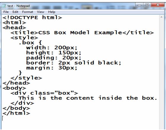
1)open notepad then create Html file (test.html) and write the following code:
<!DOCTYPE html>
<html>
<head>
<title>CSS Box Model Example</title>
<style>
.box {
width: 200px;
height: 150px;
padding: 20px;
border: 2px solid black;
margin: 30px;
}
</style>
</head>
<body>
<div class="box">
This is the content inside the box.
</div>
</body>
</html>
Explanation:
1-In this example, we have a div element with the class name “box”.
2-The CSS styles defined inside the <style> tags are applied to this element.
3-The box has a fixed width of 200 pixels and a height of 150 pixels.
4-It also has padding of 20 pixels on all sides, a 2-pixel solid black border, and a margin of 30 pixels on all sides.
You can save this code in an HTML file and open it in a web browser to see the box rendered with the specified dimensions, padding, border, and margin. Feel free to modify the values and experiment with different styles to observe the changes in the box layout.
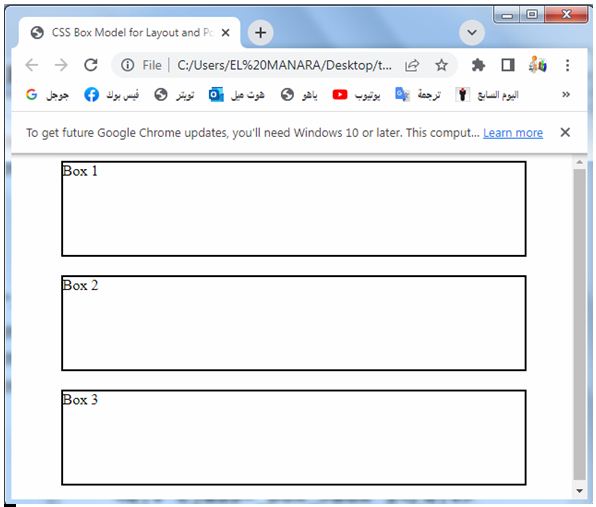
2)open the test.html file by any browser to see the following result:

Uses of The CSS Box Model
The CSS Box Model has several important uses in web development. Here are some of its key applications:
Layout and Positioning:
The Box Model is crucial for controlling the layout and positioning of elements on a webpage. By manipulating the dimensions, padding, border, and margin of elements, developers can achieve desired spacing, alignment, and structure within a page.
Here’s a complete HTML code example that demonstrates the use of the CSS Box Model for layout and positioning:
<!DOCTYPE html>
<html>
<head>
<title>CSS Box Model for Layout and Positioning Example</title>
<style>
.container {
width: 500px;
margin: 0 auto;
}
.box {
width: 100%;
height: 100px;
border: 2px solid black;
margin-bottom: 20px;
}
</style>
</head>
<body>
<div class="container">
<div class="box">Box 1</div>
<div class="box">Box 2</div>
<div class="box">Box 3</div>
</div>
</body>
</html>
Explanation:
1-In this example, we have a container div with the class name “container”. 2-The container has a fixed width of 500 pixels and margin: 0 auto is used to horizontally center it on the page.
3-Inside the container, we have three div elements with the class name “box”. Each box has a width of 100% of its parent container, a fixed height of 100 pixels, a 2-pixel solid black border, and a margin-bottom of 20 pixels.
4-By setting the width of the boxes to 100% and specifying a fixed height, they will expand horizontally to fill the entire width of the container. The margin-bottom property creates spacing between each box, resulting in a vertical layout.
You can save this code in an HTML file and open it in a web browser to see the boxes arranged vertically within the container with the specified dimensions, border, and margin. Feel free to modify the values and experiment with different styles to explore different layout and positioning effects.
Responsive Design:
The Box Model is essential for creating responsive web designs that adapt to different screen sizes and devices.
By adjusting the dimensions, padding, and margin of elements using media queries or other techniques, developers can create layouts that resize and reflow gracefully on various devices.
Responsive Design: complete code in html
Here’s a complete HTML code example that demonstrates the use of the CSS Box Model for responsive design:
<!DOCTYPE html>
<html>
<head>
<title>Responsive Design with CSS Box Model Example</title>
<style>
.container {
width: 100%;
max-width: 800px;
margin: 0 auto;
padding: 20px;
box-sizing: border-box;
}
.box {
width: 100%;
height: 150px;
border: 2px solid black;
margin-bottom: 20px;
}
@media (max-width: 600px) {
.box {
height: 100px;
}
}
</style>
</head>
<body>
<div class="container">
<div class="box">Box 1</div>
<div class="box">Box 2</div>
<div class="box">Box 3</div>
</div>
</body>
</html>
Explanation:
1-In this example, we have a container div with the class name “container”. 2-The container has a width of 100% of its parent element, a maximum width of 800 pixels, and is horizontally centered using margin: 0 auto.
3-The padding: 20px is used to provide spacing inside the container.
4-The box-sizing: border-box property ensures that the padding is included within the specified width, making it easier to create a responsive layout.
5-Inside the container, we have three div elements with the class name “box”. Each box has a width of 100% of its parent container, a fixed height of 150 pixels, a 2-pixel solid black border, and a margin-bottom of 20 pixels.
6-Additionally, a media query is used to modify the height of the boxes when the viewport width is 600 pixels or less. In this case, the height is changed to 100 pixels using the @media rule.
This example demonstrates a responsive design where the height of the boxes adjusts based on the viewport width. When the viewport width is 600 pixels or less, the boxes become shorter to fit smaller screens.
You can save this code in an HTML file and open it in a web browser. Try resizing the browser window to see how the height of the boxes changes based on the specified media query. Feel free to modify the values and experiment with different styles and media queries to create different responsive layouts.

Box Sizing:
The Box Model allows developers to control how the width and height of an element are calculated.
The default behavior is “content-box,” where the specified width and height represent only the content area.
By using the box-sizing property with a value of “border-box,” the width and height values include the padding and border, simplifying the calculation and making it easier to create consistent layouts.
Here’s a complete HTML code example that demonstrates the use of the CSS Box Model with box sizing:
<!DOCTYPE html>
<html>
<head>
<title>Box Sizing with CSS Box Model Example</title>
<style>
.box {
width: 200px;
height: 150px;
padding: 20px;
border: 2px solid black;
margin: 30px;
box-sizing: border-box;
}
</style>
</head>
<body>
<div class="box">
This is the content inside the box.
</div>
</body>
</html>
Explanation:
1-In this example, we have a div element with the class name “box”.
2-The box has a fixed width of 200 pixels and a height of 150 pixels.
3-It also has padding of 20 pixels on all sides, a 2-pixel solid black border, and a margin of 30 pixels on all sides.
4-The important part to note is the box-sizing: border-box; property applied to the box.
5-This property changes the box model behavior so that the width and height values specified for the box include the padding and border dimensions.
6-This ensures that the total size of the box (content area, padding, and border) remains fixed at the specified width and height.
7-Without box-sizing: border-box;, the padding and border would be added to the specified width and height, resulting in a larger overall size for the box.
You can save this code in an HTML file and open it in a web browser to see the box rendered with the specified dimensions, including the padding and border. Feel free to modify the values and experiment with different styles and dimensions to observe the effects of using box-sizing: border-box; versus the default behavior (content-box) of the box model.

Visual Styling:
The Box Model is essential for applying visual styles to elements. Developers can set the width, height, padding, border color, border width, margin, and other properties to achieve desired visual effects and create visually appealing designs.
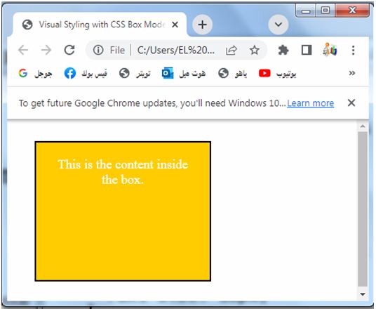
Here’s a complete HTML code example that demonstrates the use of the CSS Box Model for visual styling:
<!DOCTYPE html>
<html>
<head>
<title>Visual Styling with CSS Box Model Example</title>
<style>
.box {
width: 200px;
height: 150px;
padding: 20px;
border: 2px solid black;
margin: 30px;
background-color: #ffcc00;
color: white;
text-align: center;
font-size: 18px;
}
</style>
</head>
<body>
<div class="box">
This is the content inside the box.
</div>
</body>
</html>
Explanation:
1-In this example, we have a div element with the class name “box”.
2-The box has a fixed width of 200 pixels and a height of 150 pixels.
3-It also has padding of 20 pixels on all sides, a 2-pixel solid black border, and a margin of 30 pixels on all sides.
4-To apply visual styling, the following properties are used:
-background-color: Sets the background color of the box. In this example, it is set to a yellow color with the hexadecimal value #ffcc00.
-color: Sets the text color inside the box. Here, it is set to white.
-text-align: Aligns the text inside the box. It is set to center to horizontally center the text.
-font-size: Specifies the size of the font used inside the box. It is set to 18 pixels.
These properties can be customized to achieve different visual effects and styles for the box and its content. Feel free to modify the values and experiment with different styles to create the desired visual appearance.
You can save this code in an HTML file and open it in a web browser to see the box rendered with the specified visual styles.
Collision Avoidance:
The Box Model’s margin property helps prevent elements from overlapping or colliding with each other. By adjusting margins appropriately, developers can create sufficient space between elements, improving readability and preventing visual conflicts.
Here’s a complete HTML code example that demonstrates the use of the CSS Box Model for collision avoidance:
<!DOCTYPE html>
<html>
<head>
<title>Collision Avoidance with CSS Box Model Example</title>
<style>
.box {
width: 200px;
height: 150px;
border: 2px solid black;
margin-bottom: 20px;
}
</style>
</head>
<body>
<div class="box">Box 1</div>
<div class="box">Box 2</div>
<div class="box">Box 3</div>
</body>
</html>
Explanation:
1-In this example, we have three div elements with the class name “box”. 2-Each box has a fixed width of 200 pixels and a height of 150 pixels.
3-They also have a 2-pixel solid black border and a margin-bottom of 20 pixels.
3-By adding the margin-bottom property to each box, we create spacing between the boxes, preventing them from colliding or overlapping with each other. This helps improve readability and visual separation between the boxes.
You can save this code in an HTML file and open it in a web browser to see the boxes rendered with the specified dimensions and spacing. Feel free to modify the values and experiment with different styles and margins to observe the effects of collision avoidance and adjust the spacing between the boxes to your liking.

Box Model Hacks:
The Box Model can be used creatively to create specific effects or workarounds.
Techniques such as negative margins, box-shadow, and pseudo-elements can be employed to achieve complex layouts, decorative effects, or unique designs.
Box Model Hacks: complete code in html
Here’s a complete HTML code example that demonstrates the use of the box model
<!DOCTYPE html>
<html>
<head>
<title>Box Model Hacks with CSS Box Model Example</title>
<style>
.box {
width: 200px;
height: 200px;
background-color: #ffcc00;
margin: 30px;
position: relative;
}
.box:before {
content: "";
position: absolute;
top: -20px;
left: -20px;
width: 100%;
height: 100%;
border: 2px dashed black;
}
</style>
</head>
<body>
<div class="box">
This is the content inside the box.
</div>
</body>
</html>
Explanation:
1-In this example, we have a div element with the class name “box”.
2-The box has a fixed width and height of 200 pixels, a background color of #ffcc00, and a margin of 30 pixels on all sides.
3-To create a box model hack effect, we use the ::before pseudo-element to create an additional element that overlays the box.
4-The ::before pseudo-element is absolutely positioned and has a width and height of 100% of the box, extending beyond the box dimensions. It also has a dashed black border of 2 pixels.
5-This technique allows us to create a border effect around the box without modifying the original box’s dimensions or adding an extra element to the HTML structure.
You can save this code in an HTML file and open it in a web browser to see the box rendered with the specified dimensions, background color, and the border hack effect. Feel free to modify the values and experiment with different styles and pseudo-elements to create other box model hacks and achieve unique visual effects.

Quiz with answers
Here’s a multiple-choice quiz about the CSS Box Model:
1-Which of the following properties is NOT a part of the CSS Box Model?
a) Width
b) Margin
c) Font-size
d) Border
2-Which property is used to specify the spacing between an element’s content and its border?
a) Width
b) Padding
c) Margin
d) Border
3-How can you include an element’s padding and border in its total width and height?
a) box-sizing: content-box;
b) box-sizing: border-box;
c) box-sizing: padding-box;
d) box-sizing: margin-box;
4-Which property is used to control the space between elements on a webpage?
a) Width
b) Margin
c) Padding
d) Border
5-How can you prevent elements from overlapping or colliding with each other?
a) Adjusting the margin
b) Adjusting the padding
c) Adjusting the border
d) All of the above
Answers:
- c) Font-size
- b) Padding
- b) box-sizing: border-box;
- b) Margin
- d) All of the above
6-What does the CSS Box Model consist of?
a) Width, padding, and border
b) Width, height, and margin
c) Width, padding, border, and margin
d) Width, padding, border, margin, and background color
7-Which property is used to specify the space between an element’s content and its border?
a) width
b) padding
c) margin
d) border-spacing
8-Which box-sizing property value includes the padding and border within the total width and height of an element?
a) content-box
b) border-box
c) padding-box
d) margin-box
9-Which property is used to create space between elements on a webpage?
a) width
b) margin
c) padding
d) border
10-What is the default value of the box-sizing property?
a) content-box
b) border-box
c) padding-box
d) margin-box
Answers:
- c) Width, padding, border, and margin
- b) padding
- b) border-box
- b) margin
- a) content-box
11-Which property is used to specify the width of an element’s border?
a) width
b) padding
c) border-width
d) margin
12-Which property is used to specify the space outside an element’s border?
a) width
b) padding
c) border
d) margin
13-How can you apply different margin values for each side of an element?
a) Use the margin property with a single value
b) Use the margin property with four individual values
c) Use the margin-left, margin-right, margin-top, and margin-bottom properties separately
d) Use the padding property instead
14-What does the CSS box-sizing property do?
a) Determines the shape of the box
b) Adjusts the opacity of the box
c) Specifies the position of the box
d) Controls how the width and height of an element are calculated
15-What is the correct order of the CSS Box Model layers from innermost to outermost?
a) Content, padding, margin, border
b) Content, margin, padding, border
c) Content, border, padding, margin
d) Content, padding, border, margin
Answers:
- c) border-width
- d) margin
- c) Use the margin-left, margin-right, margin-top, and margin-bottom properties separately
- d) Controls how the width and height of an element are calculated
- d) Content, padding, border, margin
16-Which property is used to specify the space between an element’s content and its padding?
a) width
b) padding
c) margin
d) border
17-How can you apply a different border color to each side of an element?
a) Use the border-color property with a single value
b) Use the border-color property with four individual values
c) Use the border-left-color, border-right-color, border-top-color, and border-bottom-color properties separately
d) Use the padding property instead
18-What does the CSS margin-collapse property do?
a) Collapses the margin of an element with its parent element
b) Increases the margin of an element
c) Adjusts the spacing between elements
d) None of the above
19-Which property is used to control the position of an element within its parent container?
a) width
b) padding
c) margin
d) position
20-What is the default value of the overflow property?
a) visible
b) hidden
c) scroll
d) auto
Answers:
- b) padding
- c) Use the border-left-color, border-right-color, border-top-color, and border-bottom-color properties separately
- a) Collapses the margin of an element with its parent element
- d) position
- a) visible
Feel free to use these questions to further test your knowledge of the CSS Box Model!
21-Which property is used to specify the space between an element’s content and its padding?
a) width
b) padding
c) margin
d) border
22-What is the purpose of the CSS margin property?
a) Specifies the space between an element’s content and its border
b) Specifies the space between an element and its parent element
c) Specifies the space between an element’s border and the surrounding elements
d) Specifies the space between an element’s content and its padding
23-What is the purpose of the CSS padding property?
a) Specifies the space between an element’s content and its border
b) Specifies the space between an element and its parent element
c) Specifies the space between an element’s border and the surrounding elements
d) Specifies the space between an element’s content and its padding
24-Which CSS property is used to set the width and height of an element?
a) width
b) height
c) size
d) dimensions
25-How can you make an element’s width and height include its padding and border?
a) box-sizing: content-box;
b) box-sizing: border-box;
c) box-sizing: padding-box;
d) box-sizing: margin-box;
Answers:
- b) padding
- b) Specifies the space between an element and its parent element
- a) Specifies the space between an element’s content and its border
- a) width
- b) box-sizing: border-box;