
CSS Dimension Properties: Understanding Height, Width, and Max-Width
CSS Dimension Properties
Learn about CSS height, width, and max-width properties and their usage in web development. Understand how to set dimensions for elements and images, and control their size with min-width and max-height.
Explore different units and their applications.
In CSS, height, width, and max-width are properties used to control the size of elements on a web page.
Here’s an explanation of each property:
CSS Height:
The height property sets the height of an element.
It determines the vertical size of the element’s content area, excluding any padding, borders, or margins.
You can set the height value using various units such as pixels (px), percentages (%), viewport height (vh), or other relative units.
.example {
height: 200px; /* Fixed height in pixels */
height: 50%; /* Relative height as a percentage */
height: 25vh; /* Height as a percentage of the viewport height */
}
CSS Width:
The width property sets the width of an element.
It determines the horizontal size of the element’s content area, excluding any padding, borders, or margins.
Similar to height, you can use different units to specify the width.
Example:
.example {
width: 300px; /* Fixed width in pixels */
width: 75%; /* Relative width as a percentage */
width: 50vw; /* Width as a percentage of the viewport width */
}
CSS Max-width:
The max-width property sets the maximum width that an element can have.
It restricts the element from growing beyond the specified value, allowing it to shrink if necessary.
This property is particularly useful when creating responsive layouts.
Example
.example {
max-width: 500px; /* Maximum width in pixels */
max-width: 80%; /* Maximum width as a percentage */
}
By using these properties, you can control the dimensions of elements on your web page, ensuring they fit your desired layout and adapt to different screen sizes.
How to use CSS height, width, and max-width properties:
Here’s a complete HTML code example that demonstrates the usage of CSS height, width, and max-width properties
<!DOCTYPE html>
<html>
<head>
<title>CSS Height, Width, and Max-width Example</title>
<style>
.box {
background-color: #f2f2f2;
padding: 20px;
margin: 10px;
border: 1px solid #ccc;
}
.fixed-height {
height: 200px;
}
.relative-height {
height: 50%;
}
.viewport-height {
height: 25vh;
}
.fixed-width {
width: 300px;
}
.relative-width {
width: 75%;
}
.viewport-width {
width: 50vw;
}
.max-width-example {
max-width: 500px;
}
.max-width-percentage {
max-width: 80%;
}
</style>
</head>
<body>
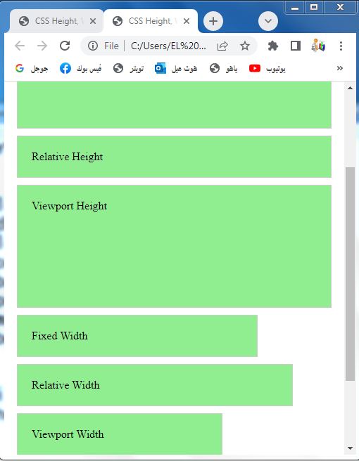
<div class="box fixed-height">Fixed Height</div>
<div class="box relative-height">Relative Height</div>
<div class="box viewport-height">Viewport Height</div>
<div class="box fixed-width">Fixed Width</div>
<div class="box relative-width">Relative Width</div>
<div class="box viewport-width">Viewport Width</div>
<div class="box max-width-example">Max Width Example</div>
<div class="box max-width-percentage">Max Width Percentage</div>
</body>
</html>
Explanation:
1-In this example, we have a series of <div> elements with different classes representing various configurations.
2-Each <div> has a class that applies the respective CSS properties (height, width, or max-width).
3-The CSS styles define the dimensions and appearance of the elements.
Try to copy and paste this code into an HTML file, then open it in a web browser to see the elements rendered with the specified heights, widths, and maximum widths.
CSS Height, Width and Max-width
How to use CSS height, width, and max-width properties:
Here’s an example of how you can use CSS height, width, and max-width properties:
<!DOCTYPE html>
<html>
<head>
<title>CSS Height, Width, and Max-width Example</title>
<style>
.container {
width: 400px;
height: 300px;
background-color: lightblue;
border: 1px solid #ccc;
}
.box {
width: 200px;
height: 150px;
background-color: #ddd;
margin: 10px;
padding: 20px;
border: 1px solid #999;
}
.box-max-width {
max-width: 250px;
}
</style>
</head>
<body>
<div class="container">
<div class="box">Box 1</div>
<div class="box" style="width: 150px; height: 100px;">Box 2</div>
<div class="box box-max-width">Box 3 (Max Width)</div>
</div>
</body>
</html>
Explanation:
1-In this example, we have a container <div> element with a fixed width and height.
2-Inside the container, there are three box elements:
-The first box has the default width and height values defined by the .box class.
-The second box overrides the width and height properties using inline styles. -The third box has an additional class .box-max-width which sets the maximum width to 250 pixels.
3-When you open this HTML file in a browser, you’ll see a container with three boxes inside it:
-The first box has the default size
-The second box is smaller due to the inline styles.
-The third box is wider due to the max-width property.
Play around with the values to see how the dimensions change.

CSS height and width Values
CSS provides various units and values that you can use to specify the height and width of elements.
Here are the commonly used ones:
CSS height and width by Pixels (px):
The most common unit of measurement is pixels. It represents a fixed size on the screen.
.example {
width: 300px;
height: 200px;
}
CSS height and width by Percentage (%):
You can specify the height and width as a percentage of the containing element’s size.
.example {
width: 50%;
height: 25%;
}
CSS height and width Viewport units (vw and vh):
These units represent a percentage of the viewport’s width (vw) or height
.example {
width: 50vw;
height: 75vh;
}
CSS height and width by Auto:
Using auto for height or width allows the element to automatically adjust its size based on its content or the available space.
.example {
width: auto;
height: auto;
}
CSS height and width by Content-based:
You can use fit-content or max-content to make the height or width of an element adjust to fit its content.
.example {
width: fit-content;
height: max-content;
}
CSS Height and width by Viewport-based sizing (vmin, vmax, vm, vh, vw):
These units allow you to specify the size relative to the viewport, with vmin being the minimum between the viewport’s width and height, and vmax being the maximum
.example {
width: vmin(50);
height: vmax(25);
}
CSS height and width by Other relative units:
CSS also provides other relative units like em, rem, ch, ex, etc., that are based on the element’s font size or other characteristics.
These units are primarily used for text-related measurements.
.example {
width: 20em;
height: 2rem;
}
These are some of the common values and units you can use to specify the height and width of elements in CSS.
Choose the appropriate unit based on your layout requirements and design preferences.
CSS height and width by Pixels (px):complete code in html
Here’s a complete HTML code example that demonstrates the usage of the px unit for specifying the height and width of elements in CSS:
<!DOCTYPE html>
<html>
<head>
<title>CSS Height and Width in Pixels Example</title>
<style>
.box {
width: 300px;
height: 200px;
background-color: #f2f2f2;
border: 1px solid #ccc;
}
</style>
</head>
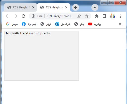
<body>
<div class="box">Box with fixed size in pixels</div>
</body>
</html>
Explanation:
1-In this example, we have a <div> element with the class .box.
2-The .box class has CSS styles that set the width and height properties to 300px and 200px, respectively.
3-This results in a box element with a fixed size of 300 pixels wide and 200 pixels tall.
You can copy and paste this code into an HTML file and open it in a web browser to see the box rendered with the specified dimensions. Feel free to modify the values for width and height to observe the changes in the box’s size.
Percentage (%):complete code in html
Here’s a complete HTML code example that demonstrates the usage of the percentage unit for specifying the height and width of elements in CSS:
<!DOCTYPE html>
<html>
<head>
<title>CSS Height and Width in Percentage Example</title>
<style>
.box {
width: 50%;
height: 75%;
background-color: lightpink;
border: 1px solid #ccc;
}
</style>
</head>
<body>
<div class="box">Box with percentage-based size</div>
</body>
</html>
Explanation:
1-In this example, we have a <div> element with the class .box.
2-The .box class has CSS styles that set the width and height properties to 50% and 75%, respectively.
3-This results in a box element that will occupy 50% of the width and 75% of the height of its containing element.
You can copy and paste this code into an HTML file and open it in a web browser to see the box rendered with the specified dimensions. Feel free to modify the values for width and height to observe the changes in the box’s size relative to its container.

Viewport units (vw and vh): complete code in html
Here’s a complete HTML code example that demonstrates the usage of the viewport units (vw and vh) for specifying the height and width of elements in CSS:
<!DOCTYPE html>
<html>
<head>
<title>CSS Height and Width in Viewport Units Example</title>
<style>
.box {
width: 50vw;
height: 75vh;
background-color: #f2f2f2;
border: 1px solid #ccc;
}
</style>
</head>
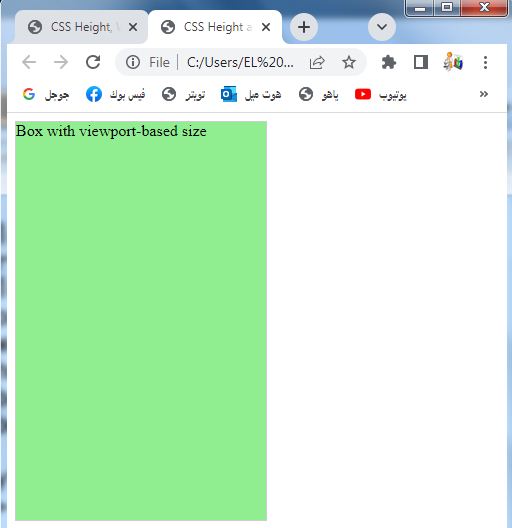
<body>
<div class="box">Box with viewport-based size</div>
</body>
</html>
Explanation:
1-In this example, we have a <div> element with the class .box.
2-The .box class has CSS styles that set the width and height properties to 50vw and 75vh, respectively.
3-This results in a box element that will occupy 50% of the viewport width and 75% of the viewport height.
You can copy and paste this code into an HTML file and open it in a web browser to see the box rendered with the specified dimensions. When you resize the browser window, the box will dynamically adjust its size based on the percentage of the viewport width and height.
Auto:complete code in html
Here’s a complete HTML code example that demonstrates the usage of the auto value for specifying the height and width of elements in CSS:
<!DOCTYPE html>
<html>
<head>
<title>CSS Height and Width with Auto Example</title>
<style>
.box {
width: auto;
height: auto;
background-color: lightblue;
border: 1px solid #ccc;
}
</style>
</head>
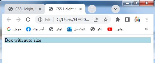
<body>
<div class="box">Box with auto size</div>
</body>
</html>
Explanation:
1-In this example, we have a <div> element with the class .box.
2-The .box class has CSS styles that set the width and height properties to auto.
3-This allows the box to adjust its size automatically based on its content or the available space in its container.
You can copy and paste this code into an HTML file and open it in a web browser to see the box rendered. The box will expand or shrink based on its content or the size of its container.
CSS width and height by Content-based:
Here’s a complete HTML code example that demonstrates the usage of the content-based values (fit-content and max-content) for specifying the height and width of elements in CSS:
<!DOCTYPE html>
<html>
<head>
<title>CSS Height and Width with Content-based Example</title>
<style>
.box-fit-content {
width: fit-content;
height: fit-content;
background-color: pink;
border: 1px solid #ccc;
}
.box-max-content {
width: max-content;
height: max-content;
background-color: #f2f2f2;
border: 1px solid #ccc;
}
</style>
</head>
<body>
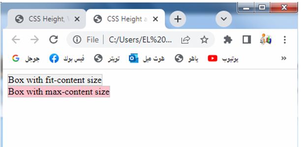
<div class="box-fit-content">Box with fit-content size</div>
<div class="box-max-content">Box with max-content size</div>
</body>
</html>
Explanation:
1-In this example, we have two <div> elements.
2-The first element has the class .box-fit-content, and its width and height properties are set to fit-content.
3-This allows the box to adjust its size based on the content it contains, neither overflowing nor expanding unnecessarily.
4-The second <div> has the class .box-max-content, and its width and height properties are set to max-content.
5-This makes the box expand to accommodate its content, taking up the maximum size required by the content.
You can copy and paste this code into an HTML file and open it in a web browser to see the boxes rendered with their respective sizes based on their content.
Viewport-based sizing: complete code in html
Here’s a complete HTML code example that demonstrates the usage of viewport-based sizing units (vmin, vmax, vm, vh, vw) for specifying the height and width of elements in CSS:
<!DOCTYPE html>
<html>
<head>
<title>CSS Height and Width with Viewport-based Sizing Example</title>
<style>
.box {
width: vmin(50);
height: vmax(25);
background-color: yellow;
border: 1px solid #ccc;
}
</style>
</head>
<body>
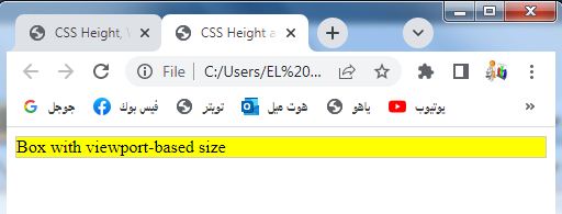
<div class="box">Box with viewport-based size</div>
</body>
</html>
Explanation:
1-In this example, we have a <div> element with the class .box.
2-The .box class has CSS styles that set the width and height properties using viewport-based sizing units.
3-In this case, vmin(50) sets the width to 50% of the minimum value between the viewport’s width and height, and vmax(25) sets the height to 25% of the maximum value between the viewport’s width and height.
You can copy and paste this code into an HTML file and open it in a web browser to see the box rendered with the specified dimensions. As you resize the browser window, the box will dynamically adjust its size based on the percentage of the viewport dimensions.
CSS width and height by Other relative units:
Here’s a complete HTML code example that demonstrates the usage of other relative units (em, rem, ch, ex) for specifying the height and width of elements in CSS:
<!DOCTYPE html>
<html>
<head>
<title>CSS Height and Width with Other Relative Units Example</title>
<style>
.box-em {
width: 20em;
height: 10em;
background-color: pink;
border: 1px solid #ccc;
}
.box-rem {
width: 4rem;
height: 2rem;
background-color: violet;
border: 1px solid #ccc;
}
.box-ch {
width: 15ch;
height: 3ch;
background-color: blue;
border: 1px solid #ccc;
}
.box-ex {
width: 5ex;
height: 2ex;
background-color: green;
border: 1px solid #ccc;
}
</style>
</head>
<body>
<div class="box-em">Box with em size</div>
<div class="box-rem">Box with rem size</div>
<div class="box-ch">Box with ch size</div>
<div class="box-ex">Box with ex size</div>
</body>
</html>
Explanation:
1-In this example, we have four <div> elements.
2-The first element has the class .box-em, and its width and height properties are set using the em unit.
3-The second element has the class .box-rem, and its width and height properties are set using the rem unit.
4-The third element has the class .box-ch, and its width and height properties are set using the ch unit.
5-The fourth element has the class .box-ex, and its width and height properties are set using the ex unit.
You can copy and paste this code into an HTML file and open it in a web browser to see the boxes rendered with their respective sizes based on the relative units specified. The size of the boxes will depend on the element’s font size or other characteristics associated with the specific relative unit.

Uses of CSS Height, Width and Max-width
Here are the uses of CSS height, width, and max-width properties with complete code examples in HTML:
CSS Height:
How to use CSS height property ?
The height property is used to set the height of an element.
Here’s an example:
<!DOCTYPE html>
<html>
<head>
<title>CSS Height Example</title>
<style>
.box {
height: 200px;
background-color:pink;
}
</style>
</head>
<body>
<div class="box">This is a box with a fixed height of 200 pixels.</div>
</body>
</html>
Explanation:
1-In this example, we have a <div> element with the class .box.
2-The .box class has a CSS style that sets the height property to 200px.
3-This results in a box with a fixed height of 200 pixels.

CSS Width:
How to use the CSS width property ?
The width property is used to set the width of an element.
Here’s an example:
<!DOCTYPE html>
<html>
<head>
<title>CSS Width Example</title>
<style>
.box {
width: 300px;
background-color: #f2f2f2;
}
</style>
</head>
<body>
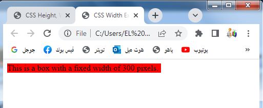
<div class="box">This is a box with a fixed width of 300 pixels.</div>
</body>
</html>
Explanation:
1-In this example, we have a <div> element with the class .box.
2-The .box class has a CSS style that sets the width property to 300px.
3-This results in a box with a fixed width of 300 pixels.

CSS Max-width:
How to use The max-width property ?
The max-width property is used to set the maximum width of an element. Here’s an example:
<!DOCTYPE html>
<html>
<head>
<title>CSS Max-width Example</title>
<style>
.box {
max-width: 500px;
background-color: pink;
}
</style>
</head>
<body>
<div class="box">This is a box with a maximum width of 500 pixels.</div>
</body>
</html>
Explanation:
1-In this example, we have a <div> element with the class .box.
2-The .box class has a CSS style that sets the max-width property to 500px. This means the box can be smaller than 500 pixels, but it will not exceed a width of 500 pixels.
You can copy and paste each example into separate HTML files and open them in a web browser to see the boxes rendered with the specified dimensions.

CSS height and width Examples:
Here are complete HTML code examples that demonstrate the usage of CSS height and width properties:
CSS Height Example:
<!DOCTYPE html>
<html>
<head>
<title>CSS Height Example</title>
<style>
.box {
height: 200px;
background-color: #f2f2f2;
}
</style>
</head>
<body>
<div class="box">This is a box with a fixed height of 200 pixels.</div>
</body>
</html>
In this example, we have a <div> element with the class .box. The .box class has a CSS style that sets the height property to 200px. This results in a box with a fixed height of 200 pixels.

CSS Width Example:
<!DOCTYPE html>
<html>
<head>
<title>CSS Width Example</title>
<style>
.box {
width: 300px;
background-color: #f2f2f2;
}
</style>
</head>
<body>
<div class="box">This is a box with a fixed width of 300 pixels.</div>
</body>
</html>
In this example, we have a <div> element with the class .box. The .box class has a CSS style that sets the width property to 300px. This results in a box with a fixed width of 300 pixels.
You can copy and paste each example into separate HTML files and open them in a web browser to see the boxes rendered with the specified dimensions.
Setting max-width: complete code in html
Here’s a complete HTML code example that demonstrates the usage of the CSS max-width property:
<!DOCTYPE html>
<html>
<head>
<title>CSS max-width Example</title>
<style>
.box {
max-width: 500px;
background-color: #f2f2f2;
}
</style>
</head>
<body>
<div class="box">This is a box with a maximum width of 500 pixels.</div>
</body>
</html>
Explanation:
1-In this example, we have a <div> element with the class .box.
2-The .box class has a CSS style that sets the max-width property to 500px.
3-This means the box can be smaller than 500 pixels, but it will not exceed a width of 500 pixels.
You can copy and paste this code into an HTML file and open it in a web browser to see the box rendered with the specified maximum width of 500 pixels.

How to Set the CSS height and width of elements?
Here’s a complete HTML code example that demonstrates setting the height and width of elements using CSS:
<!DOCTYPE html>
<html>
<head>
<title>CSS Height and Width Example</title>
<style>
.box {
width: 300px;
height: 200px;
background-color: #f2f2f2;
}
</style>
</head>
<body>
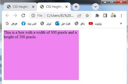
<div class="box">This is a box with a width of 300 pixels and a height of 200 pixels.</div>
</body>
</html>
Explanation:
1-In this example, we have a <div> element with the class .box.
2-The .box class has CSS styles that set the width property to 300px and the height property to 200px.
3-This results in a box with a fixed width of 300 pixels and a fixed height of 200 pixels.
You can copy and paste this code into an HTML file and open it in a web browser to see the box rendered with the specified dimensions.
How to Set the height and width of an image using percent?
Here’s a complete HTML code example that demonstrates setting the height and width of an image using percentage values:
<!DOCTYPE html>
<html>
<head>
<title>CSS Height and Width for Image using Percent Example</title>
<style>
.image-container {
width: 50%;
height: auto;
}
.image-container img {
width: 100%;
height: auto;
}
</style>
</head>
<body>
<div class="image-container">
<img src="image.jpg" alt="Your Image">
</div>
</body>
</html>
Explanation:
1-In this example, we have an <img> element wrapped inside a <div> element with the class .image-container.
2-The .image-container class sets the container’s width to 50% of its parent element’s width and automatically adjusts the height based on the image’s aspect ratio.
3-The <img> element within the container has CSS styles that set its width to 100% of the container’s width, ensuring that the image scales proportionally within the container.
Replace ‘your-image.jpg’ with the path to your desired image file.
You can copy and paste this code into an HTML file, replace ‘your-image.jpg’ with your actual image path, and open it in a web browser to see the image rendered with the specified percentage-based dimensions.

How to Set min-width and max-width of an element?
Here’s a complete HTML code example that demonstrates setting the min-width and max-width properties of an element:
<!DOCTYPE html>
<html>
<head>
<title>CSS Min-width and Max-width Example</title>
<style>
.box {
min-width: 200px;
max-width: 500px;
background-color: #f2f2f2;
padding: 20px;
}
</style>
</head>
<body>
<div class="box">
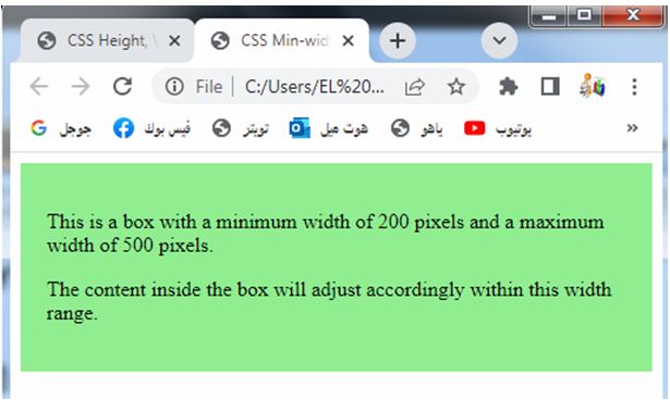
<p>This is a box with a minimum width of 200 pixels and a maximum width of 500 pixels.</p>
<p>The content inside the box will adjust accordingly within this width range.</p>
</div>
</body>
</html>
Explanation:
1-In this example, we have a <div> element with the class .box.
2-The .box class has CSS styles that set the min-width property to 200px and the max-width property to 500px.
3-This means the box will have a minimum width of 200 pixels and will not exceed a maximum width of 500 pixels.
You can copy and paste this code into an HTML file and open it in a web browser to see the box rendered with the specified minimum and maximum widths.
The box’s width will adjust accordingly based on the content inside it, but it will not go below the minimum width or exceed the maximum width.
How to Set min-height and max-height of an element?
Here’s a complete HTML code example that demonstrates setting the min-height and max-height properties of an element:
<!DOCTYPE html>
<html>
<head>
<title>CSS Min-height and Max-height Example</title>
<style>
.box {
min-height: 100px;
max-height: 300px;
background-color: #f2f2f2;
padding: 20px;
}
</style>
</head>
<body>
<div class="box">
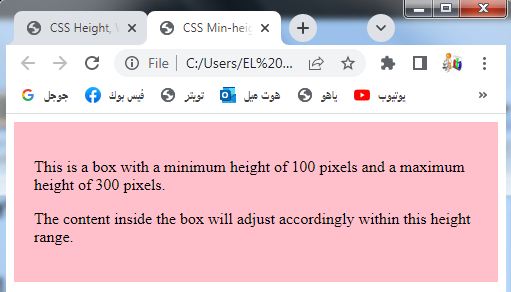
<p>This is a box with a minimum height of 100 pixels and a maximum height of 300 pixels.</p>
<p>The content inside the box will adjust accordingly within this height range.</p>
</div>
</body>
</html>
Explanation:
1-In this example, we have a <div> element with the class .box.
2-The .box class has CSS styles that set the min-height property to 100px and the max-height property to 300px.
3-This means the box will have a minimum height of 100 pixels and will not exceed a maximum height of 300 pixels.
You can copy and paste this code into an HTML file and open it in a web browser to see the box rendered with the specified minimum and maximum heights. The box’s height will adjust accordingly based on the content inside it, but it will not go below the minimum height or exceed the maximum height.
All CSS Dimension Properties:
Here’s a complete HTML code example that demonstrates the usage of all CSS dimension properties (width, height, min-width, max-width, min-height, max-height) with various values:
<!DOCTYPE html>
<html>
<head>
<title>CSS Dimension Properties Example</title>
<style>
.box {
width: 300px;
height: 200px;
min-width: 100px;
max-width: 500px;
min-height: 100px;
max-height: 300px;
background-color: #f2f2f2;
padding: 20px;
}
</style>
</head>
<body>
<div class="box">
<p>This is a box with various CSS dimension properties.</p>
<p>It has a fixed width of 300 pixels and a fixed height of 200 pixels.</p>
<p>The minimum width is set to 100 pixels, and the maximum width is set to 500 pixels.</p>
<p>The minimum height is set to 100 pixels, and the maximum height is set to 300 pixels.</p>
<p>The box will adjust its dimensions based on these properties.</p>
</div>
</body>
</html>
Explanation:
1-In this example, we have a <div> element with the class .box.
2-The .box class has CSS styles that set the following dimension properties:
-width: Sets the width of the box to 300px.
-height: Sets the height of the box to 200px.
-min-width: Sets the minimum width of the box to 100px.
-max-width: Sets the maximum width of the box to 500px.
-min-height: Sets the minimum height of the box to 100px.
-max-height: Sets the maximum height of the box to 300px.
You can copy and paste this code into an HTML file and open it in a web browser to see the box rendered with the specified dimension properties. The box’s dimensions will adjust based on the specified constraints.

Quiz with answers bout this lesson
Here’s a multiple-choice quiz with answers related to the CSS dimension properties:
Quiz example 1:
<!DOCTYPE html>
<html>
<head>
<title>CSS Dimension Properties Quiz</title>
</head>
<body>
<h1>CSS Dimension Properties Quiz</h1>
<form>
<h3>Question 1:</h3>
<p>Which CSS property is used to set the height of an element?</p>
<input type="radio" name="q1" value="a"> a) width<br>
<input type="radio" name="q1" value="b"> b) height<br>
<input type="radio" name="q1" value="c"> c) max-height<br>
<h3>Question 2:</h3>
<p>Which CSS property is used to set the maximum width of an element?</p>
<input type="radio" name="q2" value="a"> a) width<br>
<input type="radio" name="q2" value="b"> b) height<br>
<input type="radio" name="q2" value="c"> c) max-width<br>
<h3>Question 3:</h3>
<p>Which CSS property is used to set both minimum and maximum width of an element?</p>
<input type="radio" name="q3" value="a"> a) width<br>
<input type="radio" name="q3" value="b"> b) height<br>
<input type="radio" name="q3" value="c"> c) min-width/max-width<br>
<h3>Question 4:</h3>
<p>Which CSS property is used to set the height and width of an image in percentage?</p>
<input type="radio" name="q4" value="a"> a) width<br>
<input type="radio" name="q4" value="b"> b) height<br>
<input type="radio" name="q4" value="c"> c) both width and height<br>
<h3>Question 5:</h3>
<p>Which CSS property is used to set the minimum height of an element?</p>
<input type="radio" name="q5" value="a"> a) min-height<br>
<input type="radio" name="q5" value="b"> b) max-height<br>
<input type="radio" name="q5" value="c"> c) height<br>
<br>
<input type="submit" value="Submit Quiz">
</form>
<script>
const answers = ['b', 'c', 'c', 'c', 'a'];
const form = document.querySelector('form');
form.addEventListener('submit', function(event) {
event.preventDefault();
let score = 0;
for (let i = 1; i <= 5; i++) {
const question = 'q' + i;
const selectedAnswer = document.querySelector(`input[name=${question}]:checked`).value;
if (selectedAnswer === answers[i - 1]) {
score++;
}
}
alert(`Your score is: ${score} out of 5`);
});
</script>
</body>
</html>
In this quiz, there are five multiple-choice questions related to CSS dimension properties. After submitting the quiz, the JavaScript code will calculate the score and display it in an alert box.
Please note that the correct answers are: b, c, c,

Quiz example 2:
<!DOCTYPE html>
<html>
<head>
<title>CSS Dimension Properties Quiz</title>
</head>
<body>
<h1>CSS Dimension Properties Quiz</h1>
<form>
<h3>Question 1:</h3>
<p>Which CSS property is used to set the height of an element?</p>
<input type="radio" name="q1" value="a"> a) width<br>
<input type="radio" name="q1" value="b"> b) height<br>
<input type="radio" name="q1" value="c"> c) max-height<br>
<h3>Question 2:</h3>
<p>Which CSS property is used to set the maximum width of an element?</p>
<input type="radio" name="q2" value="a"> a) width<br>
<input type="radio" name="q2" value="b"> b) height<br>
<input type="radio" name="q2" value="c"> c) max-width<br>
<h3>Question 3:</h3>
<p>Which CSS property is used to set both minimum and maximum width of an element?</p>
<input type="radio" name="q3" value="a"> a) width<br>
<input type="radio" name="q3" value="b"> b) height<br>
<input type="radio" name="q3" value="c"> c) min-width/max-width<br>
<h3>Question 4:</h3>
<p>Which CSS property is used to set the height and width of an image in percentage?</p>
<input type="radio" name="q4" value="a"> a) width<br>
<input type="radio" name="q4" value="b"> b) height<br>
<input type="radio" name="q4" value="c"> c) both width and height<br>
<h3>Question 5:</h3>
<p>Which CSS property is used to set the minimum height of an element?</p>
<input type="radio" name="q5" value="a"> a) min-height<br>
<input type="radio" name="q5" value="b"> b) max-height<br>
<input type="radio" name="q5" value="c"> c) height<br>
<br>
<input type="submit" value="Submit Quiz">
</form>
<script>
const answers = ['b', 'c', 'c', 'c', 'a'];
const form = document.querySelector('form');
form.addEventListener('submit', function(event) {
event.preventDefault();
let score = 0;
for (let i = 1; i <= 5; i++) {
const question = 'q' + i;
const selectedAnswer = document.querySelector(`input[name=${question}]:checked`).value;
if (selectedAnswer === answers[i - 1]) {
score++;
}
}
alert(`Your score is: ${score} out of 5`);
});
</script>
</body>
</html>
Please use this updated code to run the quiz with the correct
Quiz example 3:
Here’s an extended version of the quiz with more questions about CSS dimension properties:
<!DOCTYPE html>
<html>
<head>
<title>CSS Dimension Properties Quiz</title>
</head>
<body>
<h1>CSS Dimension Properties Quiz</h1>
<form>
<h3>Question 1:</h3>
<p>Which CSS property is used to set the width of an element?</p>
<input type="radio" name="q1" value="a"> a) height<br>
<input type="radio" name="q1" value="b"> b) width<br>
<input type="radio" name="q1" value="c"> c) max-width<br>
<input type="radio" name="q1" value="d"> d) min-width<br>
<h3>Question 2:</h3>
<p>Which CSS property is used to set the maximum height of an element?</p>
<input type="radio" name="q2" value="a"> a) height<br>
<input type="radio" name="q2" value="b"> b) max-height<br>
<input type="radio" name="q2" value="c"> c) min-height<br>
<input type="radio" name="q2" value="d"> d) width<br>
<h3>Question 3:</h3>
<p>Which CSS property is used to set both minimum and maximum width of an element?</p>
<input type="radio" name="q3" value="a"> a) width<br>
<input type="radio" name="q3" value="b"> b) height<br>
<input type="radio" name="q3" value="c"> c) min-width/max-width<br>
<input type="radio" name="q3" value="d"> d) max-height/min-height<br>
<h3>Question 4:</h3>
<p>Which CSS property is used to set the height and width of an image in percentage?</p>
<input type="radio" name="q4" value="a"> a) width<br>
<input type="radio" name="q4" value="b"> b) height<br>
<input type="radio" name="q4" value="c"> c) both width and height<br>
<input type="radio" name="q4" value="d"> d) max-width/max-height<br>
<h3>Question 5:</h3>
<p>Which CSS property is used to set the minimum height of an element?</p>
<input type="radio" name="q5" value="a"> a) min-height<br>
<input type="radio" name="q5" value="b"> b) max-height<br>
<input type="radio" name="q5" value="c"> c) height<br>
<input type="radio" name="q5" value="d"> d) min-width<br>
<h3>Question 6:</h3>
<p>Which CSS property is used to set the width and height of an element to automatically fit its content?</p>
<input type="radio" name="q6" value="a"> a) width<br>
<input type="radio" name="q6" value="b"> b) height<br>
<input type="radio" name="q6" value="c"> c) auto<br>
<input type="radio" name="q6" value="d"> d) max-width/max-height<br>
<br>
<input type="submit" value="Submit Quiz">
</form>
<script>
const answers = ['b', 'b', 'c', 'c', 'a', 'c'];
const form = document.querySelector('form');
form.addEventListener('submit', function(event) {
event.preventDefault();
let score = 0;
for (let i = 1; i <= 6; i++) {
const question = 'q' + i;
const selectedAnswer = document.querySelector(`input[name=${question}]:checked`).value;
if (selectedAnswer === answers[i - 1]) {
score++;
}
}
alert(`Your score is: ${score} out of 6`);
});
</script>
</body>
</html>
This extended quiz includes six questions about CSS dimension properties. You can copy and paste this code into an HTML file, open it in a web browser, and test your knowledge of CSS dimension properties by answering the questions. After submitting the quiz, the JavaScript code will calculate the score and display it in an alert box.
References of this lesson
Here are some references you can use to learn more about CSS dimension properties:
MDN Web Docs – height property: