
CSS Layout :The position Property
CSS Layout – The position Property
Learn about the CSS position property and its different values for controlling element positioning and layout on web pages.
Understand how to use static, relative, absolute, fixed, and sticky positioning, and their applications in web development.
The position property in CSS is used to specify the positioning method for an element. It allows you to control how an element is positioned within its containing element or the viewport. The position property can take several values:
CSS static position property:
This is the default value. Elements with position: static are positioned according to the normal flow of the document. The top, right, bottom, left, and z-index properties have no effect on elements with position: static.
Here’s an example of HTML code using the position: static property:
<!DOCTYPE html>
<html>
<head>
<title>Static Position Example</title>
<style>
.box {
width: 200px;
height: 200px;
background-color: red;
position: static;
}
</style>
</head>
<body>
<div class="box">
This is a static positioned element.
</div>
</body>
</html>
In this example, we have a <div> element with the class name “box”. The .box CSS class defines the width, height, background color, and position property set to static. As a result, the <div> element will be positioned according to the normal flow of the document.
Note that specifying position: static explicitly is not necessary since it’s the default value for the position property. However, I included it in the code for clarity and demonstration purposes.
CSS relative position property:
Elements with position: relative are positioned relative to their normal position in the document flow. You can use the top, right, bottom, and left properties to offset the element from its original position. However, position: relative does not remove the element from the normal flow, so it still occupies space in the document.
Here’s an example of HTML code using the position: relative property:
<!DOCTYPE html>
<html>
<head>
<title>Relative Position Example</title>
<style>
.box {
width: 200px;
height: 200px;
background-color: blue;
position: relative;
top: 50px;
left: 50px;
}
</style>
</head>
<body>
<div class="box">
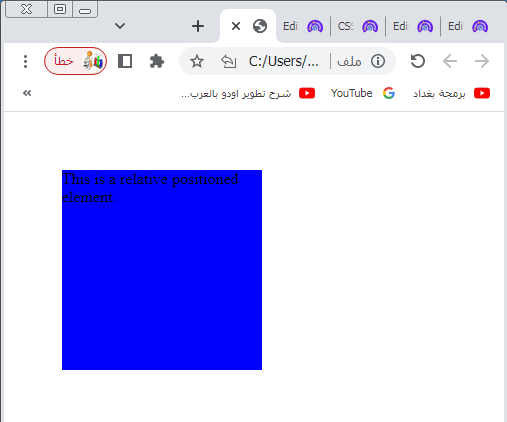
This is a relative positioned element.
</div>
</body>
</html>
In this example, we have a <div> element with the class name “box”. The .box CSS class defines the width, height, background color, and position property set to relative. Additionally, we use the top and left properties to offset the element 50 pixels from the top and left of its normal position.
When the page is rendered, the <div> element will be positioned relative to its original position in the document flow. In this case, it will be shifted 50 pixels down and 50 pixels to the right from its default position.
Try to adjust the top and left values to see how the element moves accordingly.
CSS fixed position property:
Elements with position: fixed are positioned relative to the viewport, which means they will stay in the same position even if the page is scrolled. You can use the top, right, bottom, and left properties to specify the exact position of the element on the screen.
Here’s an example of HTML code using the position: fixed property:
<!DOCTYPE html>
<html>
<head>
<title>Fixed Position Example</title>
<style>
.box {
width: 200px;
height: 200px;
background-color: green;
position: fixed;
top: 50px;
left: 50px;
}
</style>
</head>
<body>
<div class="box">
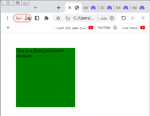
This is a fixed positioned element.
</div>
</body>
</html>
Explanation:
1-In this example, we have a <div> element with the class name “box”.
2-The .box CSS class defines the width, height, background color, and position property set to fixed.
3-Additionally, we use the top and left properties to position the element 50 pixels from the top and 50 pixels from the left of the viewport.
4-When the page is rendered, the <div> element will be positioned fixed relative to the viewport.
5-This means that even if you scroll the page, the element will remain in the same position on the screen.
Try to adjust the top and left values to see how the element’s fixed position changes.
CSS absolute position property
Elements with position: absoluteare positioned relative to their nearest positioned ancestor, if any. If there is no positioned ancestor, they are positioned relative to the initial containing block, which is usually the viewport. Like position: fixed, you can use the top, right, bottom, and left properties to specify the exact position.
Here’s an example of HTML code using the position: absolute property:
<!DOCTYPE html>
<html>
<head>
<title>Absolute Position Example</title>
<style>
.container {
position: relative;
height: 300px;
width: 500px;
}
.box {
width: 200px;
height: 200px;
background-color: yellow;
position: absolute;
top: 50px;
left: 50px;
}
</style>
</head>
<body>
<div class="container">
<div class="box">
This is an absolute positioned element.
</div>
</div>
</body>
</html>
Explanation:
1-In this example, we have a container <div> with the class name “container” that has a position: relative property.
2-This allows us to create a positioning context for the absolute positioned element inside it.
3-Inside the container, we have another <div> with the class name “box”.
4-The .box CSS class defines the width, height, background color, and position property set to absolute.
5-Additionally, we use the top and left properties to position the element 50 pixels from the top and 50 pixels from the left of its nearest positioned ancestor, in this case, the container <div>.
6-When the page is rendered, the absolute positioned element will be positioned relative to its nearest positioned ancestor, which is the container <div>.
7-In this case, it will be shifted 50 pixels down and 50 pixels to the right from the top-left corner of the container.

Try to adjust the top and left values to see how the element’s absolute position changes relative to its containing element.
CSS sticky position property
Elements with position: sticky are positioned based on the user’s scroll position.
They are initially positioned according to the normal flow of the document but become “sticky” and remain in that position when the user scrolls to a specified offset. The top, right, bottom, and left properties are used to define the offset.
Here’s an example of HTML code using the position: sticky property:
<!DOCTYPE html>
<html>
<head>
<title>Sticky Position Example</title>
<style>
.container {
height: 600px;
padding: 20px;
background-color: lightgray;
}
.box {
width: 200px;
height: 200px;
background-color: orange;
position: sticky;
top: 20px;
}
</style>
</head>
<body>
<div class="container">
<div class="box">
This is a sticky positioned element.
</div>
</div>
<p>Lorem ipsum dolor sit amet, consectetur adipiscing elit. Curabitur et feugiat mauris. Fusce feugiat lobortis orci, ut iaculis orci. Phasellus euismod tempor nunc ut lacinia. Pellentesque in finibus mauris. Etiam semper nunc non tristique ultrices. Nullam et venenatis eros. Phasellus a dolor vitae velit tempus finibus vel at elit.</p>
</body>
</html>
Explanation:
1-In this example, we have a container <div> with the class name “container”.
2-The container has a fixed height and a background color for visualization purposes.
3-Inside the container, we have another <div> with the class name “box”.
4-The .box CSS class defines the width, height, background color, and position property set to sticky.
5-Additionally, we use the top property to specify the offset of the element from the top of the container. In this case, it is positioned 20 pixels from the top.
6-When the page is rendered, the sticky positioned element will behave as a combination of position: relative and position: fixed.
7-Initially, it will be positioned according to the normal flow of the document.
8-However, as you scroll down and the element reaches the specified top offset, it will become “sticky” and remain fixed at that position within the container.
Try to adjust the top value and scroll the page to see how the sticky positioned element behaves.
Note that elements with position: fixed, position: absolute, or position: sticky are taken out of the normal document flow, so they can overlap other elements. The z-index property can be used to control the stacking order of these elements.
It’s important to consider the implications of using different position values, as they can affect the layout and behavior of your web page. It’s recommended to use them judiciously and with a clear understanding of their intended purpose
How to overlay text on top of an image ?
Positioning Text In an Image
To position text within an image, you can use a combination of HTML and CSS.
Here’s an example of HTML code that demonstrates how to overlay text on top of an image:
<!DOCTYPE html>
<html>
<head>
<title>Positioning Text in an Image</title>
<style>
.container {
position: relative;
width: 500px;
}
.image {
width: 100%;
}
.text-overlay {
position: absolute;
top: 50%;
left: 50%;
transform: translate(-50%, -50%);
color: white;
font-size: 24px;
text-align: center;
}
</style>
</head>
<body>
<div class="container">
<img class=" image.jpg" alt="Your Image">
<div class="text-overlay">
<p>This is the overlaid text</p>
</div>
</div>
</body>
</html>
Explanation:
1-In this example, we wrap the image inside a container <div> with the class name “container”.
2-The container has position: relative to establish a positioning context for the absolute positioned text overlay.
3-The image itself is an <img> element with the class name “image” that occupies 100% of the width within the container.
4-The text overlay is placed inside a <div> with the class name “text-overlay”.
5-It is positioned absolutely using position: absolute.
6-The top: 50% and left: 50% properties place the overlay in the center of the container. 7-The transform: translate(-50%, -50%) property shifts the overlay 50% of its own width and height to bring it exactly to the center.
8-Adjust the percentage values as needed to achieve your desired position.
9-Within the text overlay <div>, you can add your desired text content using HTML tags such as <p>, <h1>, etc.
10-In the example, we have a <p> element with the text “This is the overlaid text”.
11-You can modify the text, styling, font size, and alignment in the CSS for the “text-overlay” class.
Replace the “path/to/your/image.jpg” with the actual path to your image file to display your own image.
Try to adjust the styles and content to suit your needs.
How to set the shape of an element by CSS ?
To set the shape of an element, you can use CSS properties such as border-radius, clip-path, or shape-outside. These properties allow you to create various shapes for elements. Here’s an explanation of each property:
border-radius:
This property is commonly used to create rounded corners on elements. By specifying a value, you can control the radius of the corners. For example, border-radius: 10px; will create rounded corners with a radius of 10 pixels. You can also specify different values for each corner using the border-radius shorthand property or individually with border-top-left-radius, border-top-right-radius, border-bottom-right-radius, and border-bottom-left-radius.
clip-path:
This property allows you to define a clipping path to clip the visible area of an element. It can be used to create various shapes such as circles, polygons, or custom shapes. You can use predefined shapes like circle(), ellipse(), or polygon(), or use SVG path commands to define custom shapes. For example, clip-path: circle(50%); will create a circular shape that clips the element.
shape-outside:
This property is used to define the shape around which content should flow. It is commonly used with floated elements or in CSS shaping layout contexts. The shape-outside property can accept values like circle(), ellipse(), inset(), polygon(), or url() to define the shape of the element. For example, shape-outside: circle(50%); will shape the content flow around a circular shape.
Here’s an example of how you can use these properties to create different shapes:
<!DOCTYPE html>
<html>
<head>
<title>Element Shapes Example</title>
<style>
.rounded {
width: 200px;
height: 200px;
background-color: red;
border-radius: 50%;
}
.clipped {
width: 200px;
height: 200px;
background-color: blue;
clip-path: polygon(50% 0%, 100% 50%, 50% 100%, 0% 50%);
}
.shaped {
width: 200px;
height: 200px;
background-color: green;
shape-outside: circle(50%);
float: left;
margin-right: 20px;
}
</style>
</head>
<body>
<div class="rounded"></div>
<div class="clipped"></div>
<div class="shaped"></div>
<p>This is some text that flows around the shaped element.</p>
</body>
</html>
In this example, we have three elements with different shapes:
The first element with the class “rounded” has a rounded shape created by setting border-radius: 50%. It appears as a circle due to the equal width and height.
The second element with the class “clipped” has a custom shape created by setting clip-path to a polygon. The polygon defines four points to create a diamond shape.
The third element with the class “shaped” uses shape-outside with circle(50%) to create a circular shape around which the content will flow. It is floated to the left to allow text to wrap around it.
Try to modify the styles and experiment with different shape values to achieve the desired effect.
All CSS Positioning Properties
Here are all the CSS positioning properties:
position:
Specifies the positioning method for an element. It can take the values static, relative, absolute, fixed, or sticky.
top:
Specifies the offset from the top edge of the element’s containing element or the viewport, depending on the position value.
right:
Specifies the offset from the right edge of the element’s containing element or the viewport, depending on the position value.
bottom:
Specifies the offset from the bottom edge of the element’s containing element or the viewport, depending on the position value.
left:
Specifies the offset from the left edge of the element’s containing element or the viewport, depending on the position value.
z-index:
Specifies the stacking order of positioned elements. Elements with a higher z-index value will appear on top of elements with a lower value. This property only affects elements with a position value other than static.
Those are the main CSS positioning properties that allow you to control the placement and stacking order of elements on a web page.
position:complete code in html
Here’s an example of complete HTML code that showcases the CSS position property with different values:
<!DOCTYPE html>
<html>
<head>
<title>Positioning Example</title>
<style>
.box {
width: 200px;
height: 200px;
background-color: yellow;
border: 1px solid black;
}
.static {
position: static;
}
.relative {
position: relative;
top: 50px;
left: 50px;
}
.absolute {
position: absolute;
top: 100px;
left: 100px;
}
.fixed {
position: fixed;
top: 50px;
right: 50px;
}
.sticky {
position: sticky;
top: 50px;
}
</style>
</head>
<body>
<h1>Positioning Example</h1>
<div class="box static">
<p>Static Position</p>
</div>
<div class="box relative">
<p>Relative Position</p>
</div>
<div class="box absolute">
<p>Absolute Position</p>
</div>
<div class="box fixed">
<p>Fixed Position</p>
</div>
<div class="box sticky">
<p>Sticky Position</p>
</div>
<p>Lorem ipsum dolor sit amet, consectetur adipiscing elit. Sed at nunc non dolor ultricies volutpat. Fusce porttitor sapien nec libero malesuada, non sollicitudin mi tristique. Etiam facilisis lobortis arcu a feugiat.</p>
</body>
</html>
1-In this example, we have a series of <div> elements with the class name “box” to represent different positioning methods.
2-The first <div> has position: static, which is the default value.
3-It follows the normal flow of the document.
3-The second <div> has position: relative.
4- It is positioned relative to its normal position using the top and left properties.
5-The third <div> has position: absolute.
6-It is positioned absolutely, relative to its nearest positioned ancestor or the initial containing block if none exists.
7-The fourth <div> has position: fixed. It is positioned fixed relative to the viewport, and its position remains the same even when the page is scrolled.
8-The fifth <div> has position: sticky. It is positioned based on the user’s scroll position, and it becomes “sticky” once it reaches a specified offset.
Try to modify the styles and content to see how each positioning method behaves.
CSS top property : complete code in html
Here’s an example of complete HTML code that showcases the CSS top property:
<!DOCTYPE html>
<html>
<head>
<title>Top Property Example</title>
<style>
.box {
width: 200px;
height: 200px;
background-color: yellow;
position: relative;
border: 1px solid black;
}
.top-offset {
top: 50px;
}
</style>
</head>
<body>
<h1>Top Property Example</h1>
<div class="box">
<p>This is a box without a top offset.</p>
</div>
<div class="box top-offset">
<p>This is a box with a top offset of 50px.</p>
</div>
<p>Lorem ipsum dolor sit amet, consectetur adipiscing elit. Sed at nunc non dolor ultricies volutpat. Fusce porttitor sapien nec libero malesuada, non sollicitudin mi tristique. Etiam facilisis lobortis arcu a feugiat.</p>
</body>
</html>
Explanation:
1-In this example, we have two <div> elements with the class name “box” to demonstrate the top property.
2-The first <div> does not have any top offset specified, so it is positioned at its normal position within the document flow.
3-The second <div> has a top offset of 50px.
4-This means it is shifted down by 50 pixels from its normal position.
5-Both <div> elements have position: relative, which establishes a positioning context for the top property to take effect.
Try to modify the styles, content, and the top value to see how it affects the position of the elements.
CSS right property :complete code in html
Here’s an example of complete HTML code that showcases the CSS right property:
<!DOCTYPE html>
<html>
<head>
<title>Right Property Example</title>
<style>
.box {
width: 200px;
height: 200px;
background-color: yellow;
position: relative;
border: 1px solid black;
}
.right-offset {
right: 50px;
}
</style>
</head>
<body>
<h1>Right Property Example</h1>
<div class="box">
<p>This is a box without a right offset.</p>
</div>
<div class="box right-offset">
<p>This is a box with a right offset of 50px.</p>
</div>
<p>Lorem ipsum dolor sit amet, consectetur adipiscing elit. Sed at nunc non dolor ultricies volutpat. Fusce porttitor sapien nec libero malesuada, non sollicitudin mi tristique. Etiam facilisis lobortis arcu a feugiat.</p>
</body>
</html>
Explanation:
1-In this example, we have two <div> elements with the class name “box” to demonstrate the right property.
2-The first <div> does not have any right offset specified, so it is positioned at its normal position within the document flow.
3-The second <div> has a right offset of 50px. This means it is shifted 50 pixels to the left from its normal position.
4-Both <div> elements have position: relative, which establishes a positioning context for the right property to take effect.
Try to modify the styles, content, and the right value to see how it affects the position of the elements.
CSS bottom property: complete code in html
Here’s an example of complete HTML code that showcases the CSS bottom property:
<!DOCTYPE html>
<html>
<head>
<title>Bottom Property Example</title>
<style>
.box {
width: 200px;
height: 200px;
background-color: yellow;
position: relative;
border: 1px solid black;
}
.bottom-offset {
bottom: 50px;
}
</style>
</head>
<body>
<h1>Bottom Property Example</h1>
<div class="box">
<p>This is a box without a bottom offset.</p>
</div>
<div class="box bottom-offset">
<p>This is a box with a bottom offset of 50px.</p>
</div>
<p>Lorem ipsum dolor sit amet, consectetur adipiscing elit. Sed at nunc non dolor ultricies volutpat. Fusce porttitor sapien nec libero malesuada, non sollicitudin mi tristique. Etiam facilisis lobortis arcu a feugiat.</p>
</body>
</html>
Explanation:
1-In this example, we have two <div> elements with the class name “box” to demonstrate the bottom property.
2-The first <div> does not have any bottom offset specified, so it is positioned at its normal position within the document flow.
3-The second <div> has a bottom offset of 50px. This means it is shifted up by 50 pixels from its normal position.
4-Both <div> elements have position: relative, which establishes a positioning context for the bottom property to take effect.
Try to modify the styles, content, and the bottom value to see how it affects the position of the elements.
CSS left Property : complete code in html
Here’s an example of complete HTML code that showcases the CSS left property:
<!DOCTYPE html>
<html>
<head>
<title>Left Property Example</title>
<style>
.box {
width: 200px;
height: 200px;
background-color: yellow;
position: relative;
border: 1px solid black;
}
.left-offset {
left: 50px;
}
</style>
</head>
<body>
<h1>Left Property Example</h1>
<div class="box">
<p>This is a box without a left offset.</p>
</div>
<div class="box left-offset">
<p>This is a box with a left offset of 50px.</p>
</div>
<p>Lorem ipsum dolor sit amet, consectetur adipiscing elit. Sed at nunc non dolor ultricies volutpat. Fusce porttitor sapien nec libero malesuada, non sollicitudin mi tristique. Etiam facilisis lobortis arcu a feugiat.</p>
</body>
</html>
Explanation:
1-In this example, we have two <div> elements with the class name “box” to demonstrate the left property.
2-The first <div> does not have any left offset specified, so it is positioned at its normal position within the document flow.
3-The second <div> has a left offset of 50px. This means it is shifted 50 pixels to the right from its normal position.
4-Both <div> elements have position: relative, which establishes a positioning context for the left property to take effect.
Try to modify the styles, content, and the left value to see how it affects the position of the elements.
CSS z-index property : complete code in html
Here’s an example of complete HTML code that showcases the CSS z-index property:
<!DOCTYPE html>
<html>
<head>
<title>Z-Index Property Example</title>
<style>
.box {
width: 200px;
height: 200px;
position: relative;
border: 1px solid black;
margin-bottom: 20px;
}
.box-1 {
background-color: red;
z-index: 1;
}
.box-2 {
background-color: blue;
z-index: 2;
}
.box-3 {
background-color: green;
z-index: 3;
}
</style>
</head>
<body>
<h1>Z-Index Property Example</h1>
<div class="box box-1">
<p>This is box 1 with a z-index of 1.</p>
</div>
<div class="box box-2">
<p>This is box 2 with a z-index of 2.</p>
</div>
<div class="box box-3">
<p>This is box 3 with a z-index of 3.</p>
</div>
<p>Lorem ipsum dolor sit amet, consectetur adipiscing elit. Sed at nunc non dolor ultricies volutpat. Fusce porttitor sapien nec libero malesuada, non sollicitudin mi tristique. Etiam facilisis lobortis arcu a feugiat.</p>
</body>
</html>
Explanation:
1-In this example, we have three <div> elements with the class name “box” to demonstrate the z-index property.
2-The first <div> has a z-index of 1 and a red background color.
3-The second <div> has a z-index of 2 and a blue background color.
3-The third <div> has a z-index of 3 and a green background color.
4-The higher the z-index value, the closer the element is to the top of the stacking order. 5-In this case, the third box (box 3) will be visually stacked above the second box (box 2), and the second box will be stacked above the first box.
Try to modify the styles, content, and the z-index values to see how it affects the stacking order of the elements.
CSS clip property: complete code in html
I apologize for the confusion, but the clip property in CSS has been deprecated and is no longer recommended for use. It has been replaced by the more powerful and flexible clip-path property, which allows for complex shapes and paths.
Here’s an example of complete HTML code that showcases the CSS clip-path property instead:
<!DOCTYPE html>
<html>
<head>
<title>Clip Path Example</title>
<style>
.box {
width: 200px;
height: 200px;
background-color: yellow;
border: 1px solid black;
clip-path: polygon(0 0, 100% 0, 100% 75%, 0 100%);
}
</style>
</head>
<body>
<h1>Clip Path Example</h1>
<div class="box">
<p>This is a box with a clipped shape.</p>
</div>
<p>Lorem ipsum dolor sit amet, consectetur adipiscing elit. Sed at nunc non dolor ultricies volutpat. Fusce porttitor sapien nec libero malesuada, non sollicitudin mi tristique. Etiam facilisis lobortis arcu a feugiat.</p>
</body>
</html>
Explanation:
1-In this example, we have a <div> element with the class name “box” to demonstrate the clip-path property.
2-The clip-path property is set to polygon(0 0, 100% 0, 100% 75%, 0 100%). This creates a clipped shape for the box by defining the coordinates of each point in the polygon.
3-The shape is a quadrilateral that starts from the top-left corner, goes to the top-right corner, then to 75% of the right edge, and finally to the bottom-left corner.
Try to modify the styles and the clip-path value to create different shapes and experiment with the clipping behavior.
multichoice quiz with answers about this lesson
Here’s a multiple-choice quiz with answers related to the CSS positioning properties discussed in this lesson:
1-Which CSS property is used to specify the positioning method for an element?
a) display
b) position
c) float
d) margin
Answer: b) position
2-What is the default value for the position property?
a) static
b) relative
c) absolute
d) fixed
Answer: a) static
3-Which positioning value is used to position an element relative to its nearest positioned ancestor?
a) static
b) relative
c) absolute
d) fixed
Answer: c) absolute
4-Which CSS property is used to control the stacking order of positioned elements?
a) z-index
b) top
c) left
d) right
Answer: a) z-index
5-Which positioning value is used to make an element stick to a specific position in the viewport, even when scrolling?
a) static
b) relative
c) absolute
d) fixed
Answer: d) fixed
6-Which CSS property is used to control the distance between the top edge of an element and its containing element or the viewport?
a) top
b) right
c) bottom
d) left
Answer: a) top
7-What is the purpose of the relative positioning value?
a) To position an element relative to its normal position
b) To position an element relative to the viewport
c) To position an element at a fixed position
d) To position an element at the top-left corner of its containing element
Answer: a) To position an element relative to its normal position
8-What is the purpose of the sticky positioning value?
a) To make an element stick to a specific position in the viewport
b) To position an element relative to its nearest positioned ancestor
c) To position an element at a fixed position
d) To make an element float to the left or right side of its containing element
Answer: a) To make an element stick to a specific position in the viewport
9-Which CSS property is used to create rounded corners on an element?
a) border-radius
b) clip-path
c) shape-outside
d) z-index
Answer: a) border-radius
10-Which CSS property is used to define a custom shape around which content should flow?
a) clip-path
b) border-radius
c) shape-outside
d) position
Answer: c) shape-outside
11-Which positioning value is used to position an element based on its normal position within the document flow?
a) static
b) relative
c) absolute
d) fixed
Answer: a) static
12-What happens to an element with position: fixed when the page is scrolled?
a) It remains fixed in its specified position.
b) It scrolls along with the page content.
c) It becomes hidden from view.
d) It loses its positioning and returns to the normal flow.
Answer: a) It remains fixed in its specified position.
13-What CSS property is used to specify the stacking order of elements when they overlap?
a) position
b) z-index
c) clip-path
d) overflow
Answer: b) z-index
14-Which CSS property is used to control the flow of content around a shaped element?
a) position
b) z-index
c) shape-outside
d) clip-path
Answer: c) shape-outside
15-Which CSS property is used to define a clipping path to hide or show parts of an element?
a) position
b) z-index
c) shape-outside
d) clip-path
Answer: d) clip-path
16-What is the purpose of the static positioning value?
a) To position an element at a fixed positionb)
b)To position an element relative to the viewport
c) To position an element based on its normal position within the document flow
d) To make an element stick to a specific position in the viewport
Answer: c) To position an element based on its normal position within the document flow
17-Which CSS property is used to create a circular shape for an element?
a) border-radius
b) clip-path
c) shape-outside
d) z-index
Answer: a) border-radius
18-What happens to an element with position: sticky when the user scrolls past a certain point?
a) It remains sticky in its specified position.
b) It scrolls along with the page content.
c) It becomes hidden from view.
d) It loses its positioning and returns to the normal flow.
Answer: a) It remains sticky in its specified position.
19-Which CSS property is used to create a custom clipping path using SVG path commands?
a) position
b) z-index
c) shape-outside
d) clip-path
Answer: d) clip-path
20-Which positioning value is used to position an element relative to the initial containing block?
a) static
b) relative
c) absolute
d) fixed
Answer: c) absolute
21-What is the purpose of the float property in CSS?
a) To position an element relative to its normal position
b) To position an element at a fixed position
c) To make an element stick to a specific position in the viewport
d) To make an element float to the left or right side of its containing element
Answer: d) To make an element float to the left or right side of its containing element
22-Which CSS property is used to create a shape around which text should wrap?
a) position
b) z-index
c) shape-outside
d) clip-path
Answer: c) shape-outside
23-What is the purpose of the overflow property in CSS?
a) To control the flow of content around a shaped element
b) To specify the positioning method for an element
c) To define a clipping path to hide or show parts of an element
d) To control the behavior of overflowing content within an element
Answer: d) To control the behavior of overflowing content within an element
24-Which CSS property is used to specify the distance between an element’s content and its border?
a) padding
b) margin
c) top
d) bottom
Answer: a) padding
25-What is the purpose of the clear property in CSS?
a) To specify the positioning method for an element
b) To create space between elements
c) To control the flow of content around a shaped element
d) To prevent elements from floating beside a specified side of the cleared element
Answer: d) To prevent elements from floating beside a specified side of the cleared element
Application about this lesson:complete code
Here’s an example of an application that allows users to position and style a box using CSS properties covered in this lesson. The user can adjust the position and style of the box by modifying the values in the input fields:
<!DOCTYPE html>
<html>
<head>
<title>Positioning and Styling Application</title>
<style>
.box {
width: 200px;
height: 200px;
background-color: yellow;
position: relative;
border: 1px solid black;
margin-bottom: 20px;
}
</style>
<script>
function updateBox() {
var box = document.getElementById('box');
var topValue = document.getElementById('top').value + 'px';
var leftValue = document.getElementById('left').value + 'px';
var backgroundColor = document.getElementById('bg-color').value;
var widthValue = document.getElementById('width').value + 'px';
var heightValue = document.getElementById('height').value + 'px';
box.style.top = topValue;
box.style.left = leftValue;
box.style.backgroundColor = backgroundColor;
box.style.width = widthValue;
box.style.height = heightValue;
}
</script>
</head>
<body>
<h1>Positioning and Styling Application</h1>
<div class="box" id="box"></div>
<h2>Position and Style Settings</h2>
<form>
<label for="top">Top:</label>
<input type="number" id="top" name="top" onchange="updateBox()">
<label for="left">Left:</label>
<input type="number" id="left" name="left" onchange="updateBox()">
<label for="bg-color">Background Color:</label>
<input type="color" id="bg-color" name="bg-color" onchange="updateBox()">
<label for="width">Width:</label>
<input type="number" id="width" name="width" onchange="updateBox()">
<label for="height">Height:</label>
<input type="number" id="height" name="height" onchange="updateBox()">
</form>
</body>
</html>
In this example, we have an application that allows the user to position and style a box using CSS properties. The box is represented by a <div> element with the class name “box” and the id “box”.
The user can adjust the position and style of the box by modifying the input fields:
The “Top” and “Left” input fields control the top and left positioning properties respectively.
The “Background Color” input field controls the background-color property.
The “Width” and “Height” input fields control the width and height properties respectively.
Whenever the user modifies the values in any of the input fields, the updateBox() JavaScript function is called, which retrieves the values from the input fields and applies them to the box element by updating its corresponding CSS properties.
Try to modify the styles and add more CSS properties or input fields to experiment with different positioning and styling options.