
CSS Margins: A Complete Guide to Margin Properties
CSS Margins:
Learn all about CSS margins, including margin properties, values, and usage. This comprehensive guide explains how to set margins on individual sides, collapse margins, and use shorthand and length values. Enhance your web design skills with CSS margins.
Here’s an example of how you can use CSS margins in HTML:
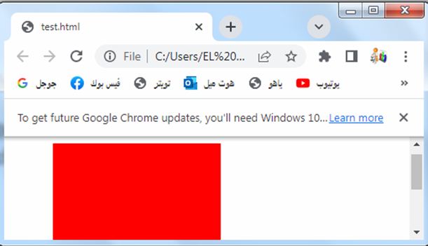
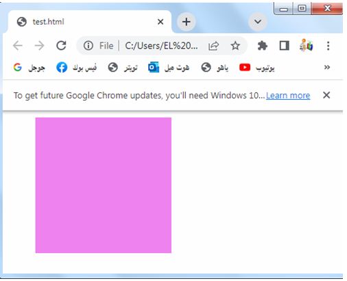
1-Open notepad then write the following code
<!DOCTYPE html>
<html>
<head>
<style>
.box {
width: 200px;
height: 200px;
background-color: red;
margin: 20px;
}
</style>
</head>
<body>
<div class="box"></div>
</body>
</html>
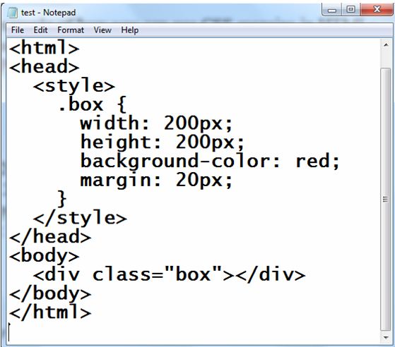
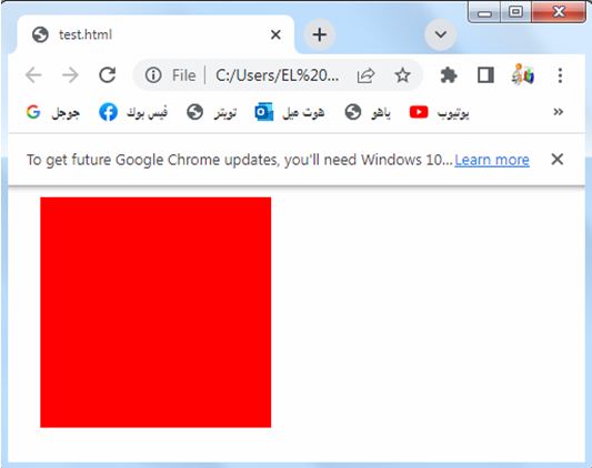
2-Save the file with :test.html
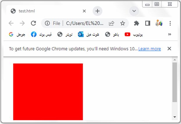
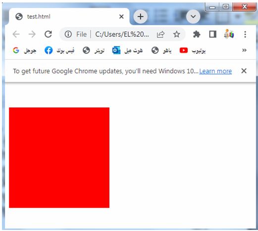
3- open the test.html by web browser to see the following result:
Explanation:
1-In the above code, we define a CSS class called “box” that represents a div element.
2-The box has a width and height of 200 pixels and a background color of red.
3-The margin property is set to 20 pixels, which adds equal spacing around the box.
You can adjust the values of the margin property to change the spacing as per your requirements.
For example, you can set margin: 10px 20px to have a top and bottom margin of 10 pixels and left and right margin of 20 pixels.
Try to modify the code to suit your needs or incorporate it into your existing HTML file.
All CSS Margin Properties
The CSS margin property allows you to control the spacing around elements.
Here are the different margin properties you can use:
margin:
Sets the margin on all four sides of an element.
Example: margin: 10px;
margin-top:
Sets the margin on the top side of an element.
Example: margin-top: 10px;
margin-right:
Sets the margin on the right side of an element.
Example: margin-right: 20px;
margin-bottom:
Sets the margin on the bottom side of an element.
Example: margin-bottom: 15px;
margin-left:
Sets the margin on the left side of an element.
Example: margin-left: 30px;
margin-x:
Sets the margin on the left and right sides of an element.
Example: margin-x: 10px;
margin-y:
Sets the margin on the top and bottom sides of an element.
Example: margin-y: 15px;
margin-collapse:
Specifies whether adjacent margins should be collapsed into a single margin or not.
Example: margin-collapse: collapse;
margin-inline-start:
Sets the margin on the start side of an element, depending on the text direction.
Example: margin-inline-start: 10px;
margin-inline-end:
Sets the margin on the end side of an element, depending on the text direction.
Example: margin-inline-end: 10px;
You can specify values in different units such as pixels (px), percentages (%), em, rem, etc., or use keywords like auto or inherit for specific cases.
Remember to apply these margin properties to the appropriate elements in your CSS code to control the spacing around them according to your design requirements.
margin: complete code in html
Here’s an example of how you can use the margin property in HTML:
1-create HTML file (test.html) including the following CSS code :
<!DOCTYPE html>
<html>
<head>
<style>
.box {
width: 100px;
height: 100px;
background-color: GREEN;
margin: 20px;
}
</style>
</head>
<body>
<div class="box"></div>
</body>
</html>
Explanation:
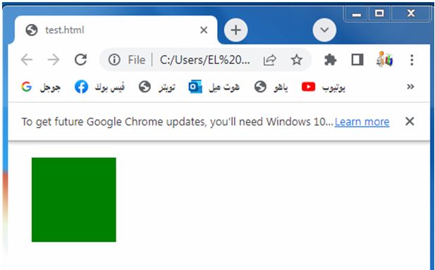
1-In the above code, we define a CSS class called “box” that represents a div element.
2-The box has a width and height of 100 pixels and a background color of red.
3-The margin property is set to 20 pixels, which adds equal spacing around the box.
You can adjust the values of the margin property to change the spacing as per your requirements.
For example, you can set margin: 10px 20px to have a top and bottom margin of 10 pixels and left and right margin of 20 pixels.
Try to modify the code to suit your needs or incorporate it into your existing HTML file.
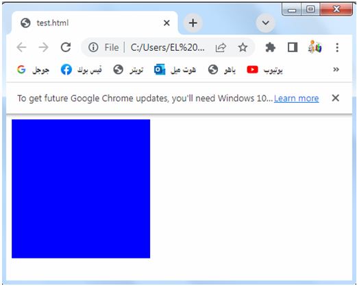
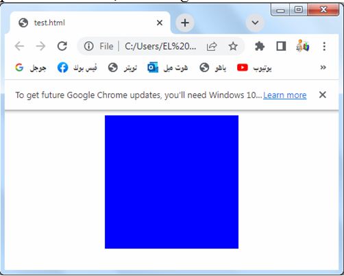
margin-top: complete code in html
How to set margin at the top of the element?
Here’s an example of how you can use the margin-top property in HTML:
<!DOCTYPE html>
<html>
<head>
<style>
.box {
width: 200px;
height: 200px;
background-color: blue;
margin-top: 20px;
}
</style>
</head>
<body>
<div class="box"></div>
</body>
</html>
Explanation:
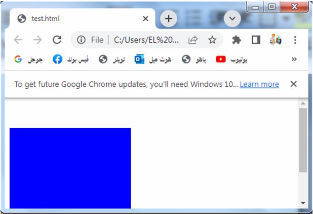
1-In the above code, we define a CSS class called “box” that represents a div element.
2-The box has a width and height of 200 pixels and a background color of red.
3-The margin-top property is set to 20 pixels, which adds spacing only to the top side of the box.
You can adjust the value of the margin-top property to change the spacing as per your requirements.
Try to modify the code to suit your needs or incorporate it into your existing HTML file.
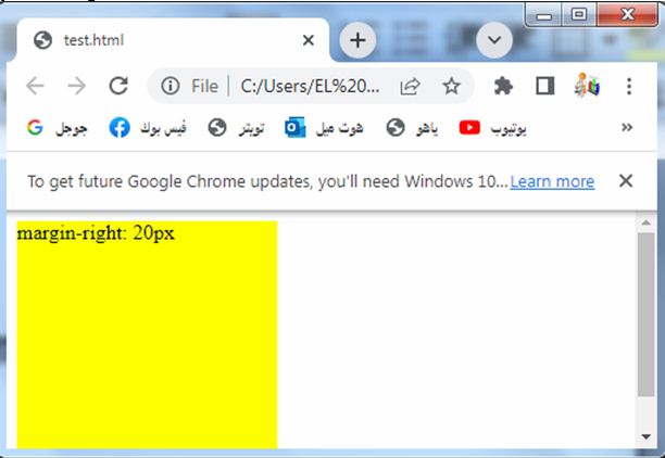
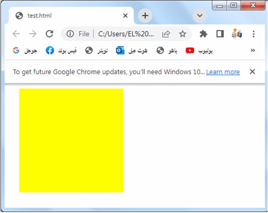
margin-right: complete code in html
How to set margin at the right of the element?
Here’s an example of how you can use the margin-right property in HTML:
<!DOCTYPE html>
<html>
<head>
<style>
.box {
width: 200px;
height: 200px;
background-color: yellow;
margin-right: 20px;
}
</style>
</head>
<body>
<div class="box"></div>
</body>
</html>
Explanation:
1-In the above code, we define a CSS class called “box” that represents a div element.
2-The box has a width and height of 200 pixels and a background color of red.
3-The margin-right property is set to 20 pixels, which adds spacing only to the right side of the box.
You can adjust the value of the margin-right property to change the spacing as per your requirements.
Try to modify the code to suit your needs or incorporate it into your existing HTML file.
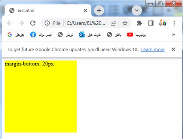
margin-bottom: complete code in html
How to set margin at the bottom of the element?
Here’s an example of how you can use the margin-bottom property in HTML:
<!DOCTYPE html>
<html>
<head>
<style>
.box {
width: 200px;
height: 200px;
background-color: red;
margin-bottom: 20px;
}
</style>
</head>
<body>
<div class="box"></div>
</body>
</html>
Explanation:
1-In the above code, we define a CSS class called “box” that represents a div element.
2-The box has a width and height of 200 pixels and a background color of red.
3-The margin-bottom property is set to 20 pixels, which adds spacing only to the bottom side of the box.
You can adjust the value of the margin-bottom property to change the spacing as per your requirements.
Try to modify the code to suit your needs or incorporate it into your existing HTML file.
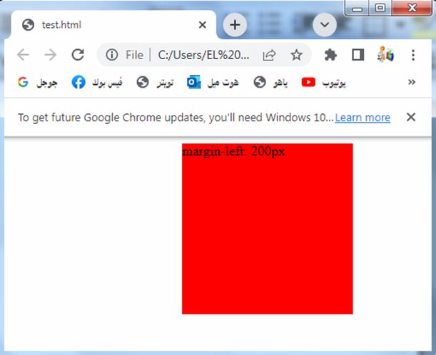
Margin-left: complete code in html
How to set margin at the left of the element?
Here’s an example of how you can use the margin-left property in HTML:
<!DOCTYPE html>
<html>
<head>
<style>
.box {
width: 200px;
height: 200px;
background-color: red;
margin-left: 20px;
}
</style>
</head>
<body>
<div class="box"></div>
</body>
</html>
Explanation:
1-In the above code, we define a CSS class called “box” that represents a div element.
2-The box has a width and height of 200 pixels and a background color of red.
3-The margin-left property is set to 20 pixels, which adds spacing only to the left side of the box.
You can adjust the value of the margin-left property to change the spacing as per your requirements.
Try to modify the code to suit your needs or incorporate it into your existing HTML file.
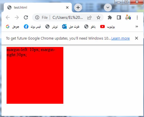
How to set margin at the top of the element?
To set margins on both the left and right sides of an element, you can use the margin-left and margin-right properties separately.
Here’s an example of how you can set the horizontal margins using individual properties:
<!DOCTYPE html>
<html>
<head>
<style>
.box {
width: 200px;
height: 200px;
background-color: red;
margin-left: 10px;
margin-right: 30px;
}
</style>
</head>
<body>
<div class="box"></div>
</body>
</html>
Explanation:
1-In the above code, we define a CSS class called “box” that represents a div element.
2-The box has a width and height of 200 pixels and a background color of red.
3-The margin-left property is set to 20 pixels and the margin-right property is also set to 20 pixels, which adds equal spacing to both the left and right sides of the box.
Try to modify the code to suit your needs or incorporate it into your existing HTML file.
Margin :top and bottom complete code in html
To set margins on both the top and bottom sides of an element, you can use the margin-top and margin-bottom properties separately.
Here’s an example of how you can set the vertical margins using individual properties:
<!DOCTYPE html>
<html>
<head>
<style>
.box {
width: 200px;
height: 200px;
background-color: red;
margin-top: 20px;
margin-bottom: 20px;
}
</style>
</head>
<body>
<div class="box"></div>
</body>
</html>
Explanation:
In the above code, we define a CSS class called “box” that represents a div element. The box has a width and height of 200 pixels and a background color of red. The margin-top property is set to 20 pixels and the margin-bottom property is also set to 20 pixels, which adds equal spacing to both the top and bottom sides of the box.
Try to modify the code to suit your needs or incorporate it into your existing HTML file.
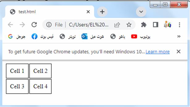
Margin- collapse: complete code in html
The margin-collapse property is used to control the collapsing of margins between adjacent elements.
However, it is typically used in CSS for table elements (<table>, <tr>, <td>, etc.). Here’s an example of how you can use the margin-collapse property in HTML for a table:
<!DOCTYPE html>
<html>
<head>
<style>
table {
margin-collapse: collapse;
}
td {
padding: 10px;
border: 1px solid black;
}
</style>
</head>
<body>
<table>
<tr>
<td>Cell 1</td>
<td>Cell 2</td>
</tr>
<tr>
<td>Cell 3</td>
<td>Cell 4</td>
</tr>
</table>
</body>
</html>
Explanation:
1-In the above code, we define a CSS rule for the table element where margin-collapse is set to collapse.
2-This property collapses the margins between adjacent table cells, resulting in a cleaner and more compact layout.
Additionally, we apply some basic styling to the table cells (td elements) by setting padding and border properties for clarity.
Try to modify the code or incorporate it into your existing HTML file to suit your needs.
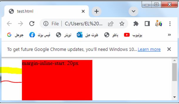
Margin-inline-start: complete code in html
Here’s an example of how you can use the margin-inline-start property in HTML:
<!DOCTYPE html>
<html>
<head>
<style>
.box {
width: 200px;
height: 200px;
background-color: red;
margin-inline-start: 20px;
}
</style>
</head>
<body>
<div class="box"></div>
</body>
</html>
Explanation:
1-In the above code, we define a CSS class called “box” that represents a div element.
2-The box has a width and height of 200 pixels and a background color of red.
3-The margin-inline-start property is set to 20 pixels, which adds spacing to the start side of the box.
4-The specific side that is considered the start side depends on the directionality of the text, so it can be the left side in a left-to-right language or the right side in a right-to-left language.
You can adjust the value of the margin-inline-start property to change the spacing as per your requirements.
Try to modify the code to suit your needs or incorporate it into your existing HTML file.
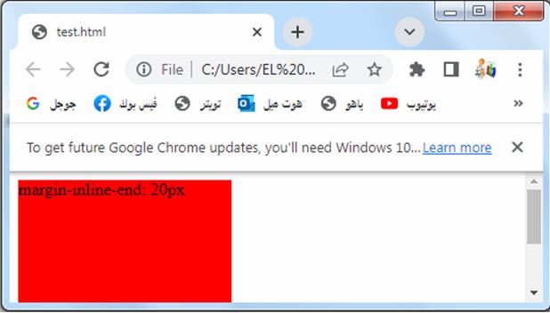
margin-inline-end: complete code in html
Here’s an example of how you can use the margin-inline-end property in HTML
<!DOCTYPE html>
<html>
<head>
<style>
.box {
width: 200px;
height: 200px;
background-color: red;
margin-inline-end: 20px;
}
</style>
</head>
<body>
<div class="box"></div>
</body>
</html>
Explanation:
1-In the above code, we define a CSS class called “box” that represents a div element.
2-The box has a width and height of 200 pixels and a background color of red.
3-The margin-inline-end property is set to 20 pixels, which adds spacing to the end side of the box.
4-The specific side that is considered the end side depends on the directionality of the text, so it can be the right side in a left-to-right language or the left side in a right-to-left language.
You can adjust the value of the margin-inline-end property to change the spacing as per your requirements.
Try to modify the code to suit your needs or incorporate it into your existing HTML file.
Margin-inline-end: complete code in html
Here’s an example of how you can use the margin-inline-end property in HTML:
<!DOCTYPE html>
<html>
<head>
<style>
.box {
width: 200px;
height: 200px;
background-color: red;
margin-inline-end: 20px;
}
</style>
</head>
<body>
<div class="box"></div>
</body>
</html>
Explanation:
1-In the above code, we define a CSS class called “box” that represents a div element.
2-The box has a width and height of 200 pixels and a background color of red.
3-The margin-inline-end property is set to 20 pixels, which adds spacing to the end side of the box.
4-The specific side that is considered the end side depends on the directionality of the text, so it can be the right side in a left-to-right language or the left side in a right-to-left language.
You can adjust the value of the margin-inline-end property to change the spacing as per your requirements.
Try to modify the code to suit your needs or incorporate it into your existing HTML file.
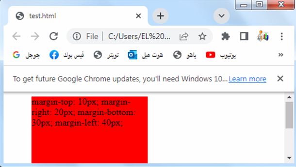
Margin – Individual Sides: complete code in html
Here’s an example of how you can use individual margin properties to set margins on each side of an element in HTML:
<!DOCTYPE html>
<html>
<head>
<style>
.box {
width: 200px;
height: 200px;
background-color: red;
margin-top: 10px;
margin-right: 20px;
margin-bottom: 30px;
margin-left: 40px;
}
</style>
</head>
<body>
<div class="box"></div>
</body>
</html>
Explanation:
1-In the above code, we define a CSS class called “box” that represents a div element.
2-The box has a width and height of 200 pixels and a background color of red.
3-We set different margin values for each side of the box:
margin-top is set to 10 pixels.
margin-right is set to 20 pixels.
margin-bottom is set to 30 pixels.
margin-left is set to 40 pixels.
You can adjust the values of these individual margin properties to control the spacing on each side of the element as per your requirements.
Try to modify the code to suit your needs or incorporate it into your existing HTML file.
All values of the margin properties
Here are all the possible values you can use for the margin properties (margin-top, margin-right, margin-bottom, margin-left) in CSS:
Length values:
You can specify a specific length for the margin using units like pixels (px), ems (em), rems (rem), or other CSS length units.
Example: margin-top: 20px;
Percentage values:
You can specify the margin as a percentage of the width of the containing element.
Example: margin-right: 10%;
Auto value:
The browser automatically calculates the margin. This is often used to horizontally center an element by setting margin-left and margin-right to auto.
Example: margin-left: auto;
Inherit value:
The margin value is inherited from the parent element.
Example: margin-bottom: inherit;
Initial value:
The margin is set to its default initial value.
Example: margin-top: initial;
Unset value:
The margin is set to its default value, but it can also be inherited.
Example: margin-right: unset;
You can combine these values to set margins on each side of an element individually or use shorthand notation to set margins for multiple sides simultaneously.
Try to experiment with these values to control the margins in your HTML and
Length values: complete code in html
Here’s an example of how you can use length values for the margin properties in HTML:
<!DOCTYPE html>
<html>
<head>
<style>
.box {
width: 200px;
height: 200px;
background-color: red;
margin-top: 20px;
margin-right: 30px;
margin-bottom: 40px;
margin-left: 50px;
}
</style>
</head>
<body>
<div class="box"></div>
</body>
</html>
Explanation:
1-In the above code, we define a CSS class called “box” that represents a div element.
2-The box has a width and height of 200 pixels and a background color of red.
3-We set different margin values for each side of the box using length values:
margin-top is set to 20 pixels.
margin-right is set to 30 pixels.
margin-bottom is set to 40 pixels.
margin-left is set to 50 pixels.
You can adjust these length values to control the spacing on each side of the element as per your requirements.
Try to modify the code to suit your needs or incorporate it into your existing HTML file.
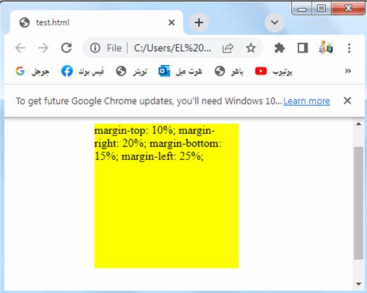
Percentage values: complete code in html
Here’s an example of how you can use percentage values for the margin properties in HTML:
<!DOCTYPE html>
<html>
<head>
<style>
.box {
width: 200px;
height: 200px;
background-color: red;
margin-top: 10%;
margin-right: 20%;
margin-bottom: 15%;
margin-left: 25%;
}
</style>
</head>
<body>
<div class="box"></div>
</body>
</html>
Explanation:
1-In the above code, we define a CSS class called “box” that represents a div element.
2-The box has a width and height of 200 pixels and a background color of red.
3-We set different margin values for each side of the box using percentage values:
margin-top is set to 10%.
margin-right is set to 20%.
margin-bottom is set to 15%.
margin-left is set to 25%.
These percentage values are calculated relative to the width of the containing element.
You can adjust these percentage values to control the spacing on each side of the element as per your requirements.
Try to modify the code to suit your needs or incorporate it into your existing HTML file.
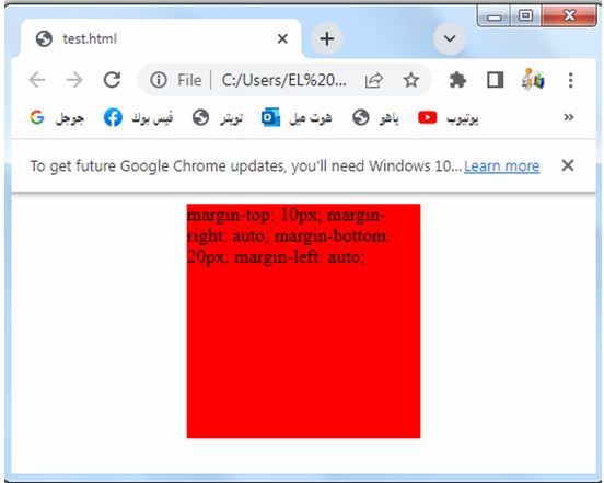
Auto value: complete code in html
Here’s an example of how you can use the auto value for the margin properties in HTML:
<!DOCTYPE html>
<html>
<head>
<style>
.box {
width: 200px;
height: 200px;
background-color: red;
margin-top: 10px;
margin-right: auto;
margin-bottom: 20px;
margin-left: auto;
}
</style>
</head>
<body>
<div class="box"></div>
</body>
</html>
Explanation:
1-In the above code, we define a CSS class called “box” that represents a div element.
2-The box has a width and height of 200 pixels and a background color of red.
3-We set different margin values for each side of the box:
margin-top is set to 10 pixels.
margin-right is set to auto, which automatically calculates the margin and horizontally centers the element.
margin-bottom is set to 20 pixels.
margin-left is set to auto, which automatically calculates the margin and horizontally centers the element.
Using auto for the margin-right and margin-left properties horizontally centers the element within its container.
Try to modify the code to suit your needs or incorporate it into your existing HTML file.
Inherit value: complete code in html
Here’s an example of how you can use the inherit value for the margin properties in HTML:
<!DOCTYPE html>
<html>
<head>
<style>
.parent {
margin: 10px;
}
.child {
width: 200px;
height: 200px;
background-color: red;
margin: inherit;
}
</style>
</head>
<body>
<div class="parent">
<div class="child"></div>
</div>
</body>
</html>
Explanation:
1-In the above code, we define two CSS classes: “parent” and “child”.
2-The “parent” class represents a parent div element, and the “child” class represents a child div element inside the parent.
3-The “parent” class has a margin of 10 pixels set on all sides using the shorthand margin property.
4-The “child” class inherits the margin value from its parent using the margin: inherit; declaration.
This means that the child element will have the same margin as the parent, which in this case is 10 pixels on all sides.
You can adjust the margin value of the parent element to see how it affects the child element.
Try to modify the code to suit your needs or incorporate it into your existing HTML file.
Initial value: complete code in html
Here’s an example of how you can use the initial value for the margin properties in HTML:
<!DOCTYPE html>
<html>
<head>
<style>
.box {
width: 200px;
height: 200px;
background-color:blue;
margin-top: initial;
margin-right: initial;
margin-bottom: initial;
margin-left: initial;
}
</style>
</head>
<body>
<div class="box"></div>
</body>
</html>
Explanation:
1-In the above code, we define a CSS class called “box” that represents a div element.
2-The box has a width and height of 200 pixels and a background color of red.
3-We set each margin property (margin-top, margin-right, margin-bottom, margin-left) to the initial value.
4-The initial value sets the margin property to its default initial value.
5-In the case of margins, the initial value typically depends on the browser’s default stylesheet or the margin property of the parent element.
By setting all the margin properties to initial, the margins of the box element will be set to their respective default initial values.
Try to modify the code to suit your needs or incorporate it into your existing HTML file.
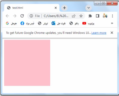
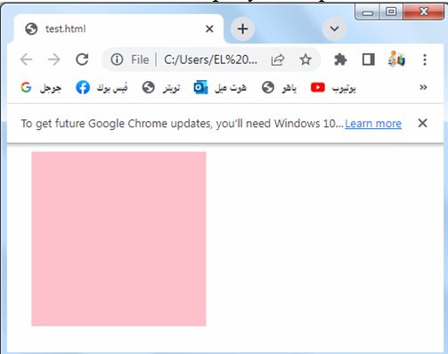
Unset value: complete code in html
Here’s an example of how you can use the unset value for the margin properties in HTML:
<!DOCTYPE html>
<html>
<head>
<style>
.box {
width: 200px;
height: 200px;
background-color: pink;
margin-top: unset;
margin-right: unset;
margin-bottom: unset;
margin-left: unset;
}
</style>
</head>
<body>
<div class="box"></div>
</body>
</html>
Explanation:
1-In the above code, we define a CSS class called “box” that represents a div element.
2-The box has a width and height of 200 pixels and a background color of red.
3-We set each margin property (margin-top, margin-right, margin-bottom, margin-left) to the unset value.
The unset value sets the margin property to its default value, but it can also be inherited from the parent element.
It allows the margin to take on either the default value or the inherited value, depending on the specific situation.
By setting all the margin properties to unset, the margins of the box element will be set to their respective default values or inherited values from the parent element.
Try to modify the code to suit your needs or incorporate it into your existing HTML file.
Margin – Shorthand Property: complete code in html
Here’s an example of how you can use the shorthand margin property in HTML:
<!DOCTYPE html>
<html>
<head>
<style>
.box {
width: 200px;
height: 200px;
background-color: red;
margin: 10px 20px 30px 40px;
}
</style>
</head>
<body>
<div class="box"></div>
</body>
</html>
Explanation:
1-In the above code, we define a CSS class called “box” that represents a div element.
2-The box has a width and height of 200 pixels and a background color of red.
3-We use the shorthand margin property to set margins on all sides of the box.
4-The values provided in the margin property are in the order of top, right, bottom, and left. So in this case:
margin-top is set to 10 pixels.
margin-right is set to 20 pixels.
margin-bottom is set to 30 pixels.
margin-left is set to 40 pixels.
You can adjust the values in the margin property to control the margins on all sides of the element as per your requirements.
Try to modify the code to suit your needs or incorporate it into your existing HTML file.
If the margin property has four values: complete code in html
The margin property indeed has four values.
Here’s an example of how you can use the margin property with four values in HTML:
<!DOCTYPE html>
<html>
<head>
<style>
.box {
width: 200px;
height: 200px;
background-color: violet;
margin: 10px 20px 30px 40px;
}
</style>
</head>
<body>
<div class="box"></div>
</body>
</html>
Explanation:
1-In the above code, we define a CSS class called “box” that represents a div element.
2-The box has a width and height of 200 pixels and a background color of red.
3-We use the margin property to set margins on all sides of the box.
4-The values provided in the margin property are in the order of top, right, bottom, and left.
So in this case:
margin-top is set to 10 pixels.
margin-right is set to 20 pixels.
margin-bottom is set to 30 pixels.
margin-left is set to 40 pixels.
You can adjust the values in the margin property to control the margins on all sides of the element as per your requirements.
Try to modify the code to suit your needs or incorporate it into your existing HTML file.
When the margin property has three values: complete code in html
The margin property indeed has three values.
Here’s an example of how you can use the margin property with three values in HTML:
<!DOCTYPE html>
<html>
<head>
<style>
.box {
width: 200px;
height: 200px;
background-color: pink;
margin: 10px 20px 30px;
}
</style>
</head>
<body>
<div class="box"></div>
</body>
</html>
In the above code, we define a CSS class called “box” that represents a div element. The box has a width and height of 200 pixels and a background color of red. We use the margin property to set margins on all sides of the box.
The values provided in the margin property are in the order of top, right/left, and bottom. So in this case:
margin-top is set to 10 pixels.
margin-right and margin-left are set to 20 pixels.
margin-bottom is set to 30 pixels.
The right and left margins will have the same value since they share a single value in the shorthand property.
You can adjust the values in the margin property to control the margins on all sides of the element as per your requirements.
Try to modify the code to suit your needs or incorporate it into your existing HTML file.
When the margin property has two values: complete code in html
The margin property indeed has two values. Here’s an example of how you can use the margin property with two values in HTML:
<!DOCTYPE html>
<html>
<head>
<style>
.box {
width: 200px;
height: 200px;
background-color: green;
margin: 10px 20px;
}
</style>
</head>
<body>
<div class="box"></div>
</body>
</html>
Explanation:
1-In the above code, we define a CSS class called “box” that represents a div element.
2-The box has a width and height of 200 pixels and a background color of red.
3-We use the margin property to set margins on all sides of the box.
4-The values provided in the margin property are in the order of top/bottom and right/left.
So in this case:
margin-top and margin-bottom are set to 10 pixels.
margin-right and margin-left are set to 20 pixels.
The top and bottom margins will have the same value since they share a single value in the shorthand property.
Similarly, the right and left margins will have the same value.
You can adjust the values in the margin property to control the margins on all sides of the element as per your requirements.
Try to modify the code to suit your needs or incorporate it into your existing HTML file.
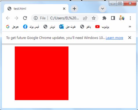
When the margin property has one value
The margin property can indeed have a single value that applies to all four sides. Here’s an example of how you can use the margin property with a single value in HTML:
<!DOCTYPE html>
<html>
<head>
<style>
.box {
width: 200px;
height: 200px;
background-color: red;
margin: 20px;
}
</style>
</head>
<body>
<div class="box"></div>
</body>
</html>
Explanation:
1-In the above code, we define a CSS class called “box” that represents a div element.
2-The box has a width and height of 200 pixels and a background color of red.
3-We use the margin property to set the same margin value on all sides of the box.
4-The single value provided in the margin property, in this case, 20px, applies to all four sides of the box.
This means that the top, right, bottom, and left margins will all have the same value of 20px.
You can adjust the value in the margin property to control the margin on all sides of the element as per your requirements.
Try to modify the code to suit your needs or incorporate it into your existing HTML file.
The auto Value: complete code in html
Here’s an example of how you can use the auto value for the margin properties in HTML:
<!DOCTYPE html>
<html>
<head>
<style>
.box {
width: 200px;
height: 200px;
background-color:blue;
margin: auto;
}
</style>
</head>
<body>
<div class="box"></div>
</body>
</html>
Explanation:
1-In the above code, we define a CSS class called “box” that represents a div element.
2-The box has a width and height of 200 pixels and a background color of red.
3-We use the margin property with the value auto.
When you set the margin property to auto, it automatically calculates and distributes equal margins on all sides of the element.
This horizontally centers the element within its container.
By setting the margin to auto, the box will be horizontally centered within its parent container, assuming the container has a defined width.
Try to modify the code to suit your needs or incorporate it into your existing HTML file.
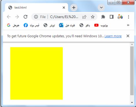
The inherit Value: complete code in html
Here’s an example of how you can use the inherit value for the margin properties in HTML:
<!DOCTYPE html>
<html>
<head>
<style>
.parent {
margin: 10px;
}
.child {
width: 200px;
height: 200px;
background-color:yellow;
margin: inherit;
}
</style>
</head>
<body>
<div class="parent">
<div class="child"></div>
</div>
</body>
</html>
Explanation:
1-In the above code, we define two CSS classes: “parent” and “child”.
2-The “parent” class represents a parent div element, and the “child” class represents a child div element inside the parent.
3-The “parent” class has a margin of 10 pixels set on all sides using the shorthand margin property.
4-The “child” class inherits the margin value from its parent using the margin: inherit; declaration.
This means that the child element will have the same margin as the parent, which in this case is 10 pixels on all sides.
By setting the child’s margin to inherit, it will inherit the margin value from its closest parent element that has a defined margin value.
You can adjust the margin value of the parent element to see how it affects the child element.
Try to modify the code to suit your needs or incorporate it into your existing HTML file.
Usage of CSS Margins
CSS margins are a fundamental aspect of web design and layout. They are used to create space around elements, control the positioning of elements within a container, and establish visual separation between elements. Here are some common use cases for CSS margins:
Spacing between Elements:
Margins are commonly used to create space between elements. By applying margins to elements, you can control the distance between them, both horizontally and vertically. This helps improve readability and visual organization of content.
Here’s an example of how you can use CSS margins to create spacing between elements in HTML:
<!DOCTYPE html>
<html>
<head>
<title>Spacing Between Elements</title>
<style>
.box {
width: 200px;
height: 100px;
background-color: lightgray;
margin-bottom: 20px; /* Add margin at the bottom for spacing */
}
</style>
</head>
<body>
<div class="box"></div>
<div class="box"></div>
<div class="box"></div>
</body>
</html>
Explanation:
1-In this example, we have a CSS class called “box” that sets the width, height, and background color of the elements.
2-The margin-bottom property is set to 20px to add spacing between each element.
3-As a result, there will be a 20-pixel gap between each div with the “box” class
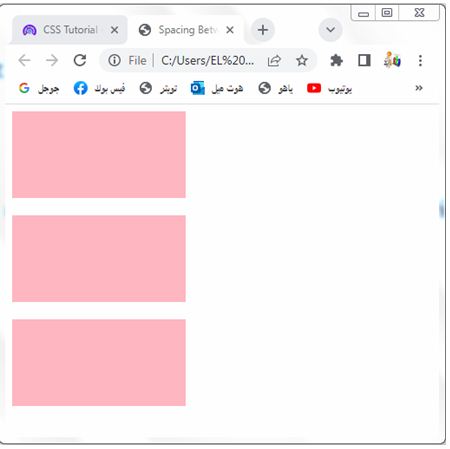
You can adjust the margin value as per your requirement to increase or decrease the spacing between the elements.
Try to add more elements with the “box” class to see the spacing effect
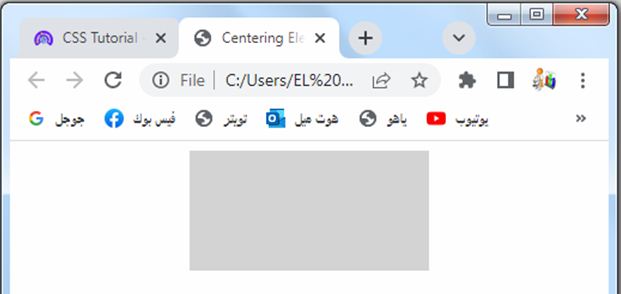
Centering Elements:
Margins can be used to center elements horizontally within their parent container. By setting the left and right margins to “auto” and specifying a width for the element, it will be horizontally centered on the page.
Here’s an example of how you can use CSS margins to center elements horizontally within their parent container:
<!DOCTYPE html>
<html>
<head>
<title>Centering Elements</title>
<style>
.container {
display: flex;
justify-content: center;
}
.box {
width: 200px;
height: 100px;
background-color: lightgray;
}
</style>
</head>
<body>
<div class="container">
<div class="box"></div>
</div>
</body>
</html>
Explanation:
1-In this example, we have a container div with the class “container” that uses flexbox to horizontally center its child element.
2-The justify-content: center; property aligns the content in the center of the container.
3-Inside the container, we have a div with the class “box” that represents the element you want to center.
4-You can modify the width, height, and background color of the box to suit your needs.
5-By using the flexbox layout and setting the justify-content property to “center”, the box element will be horizontally centered within the container.
Clearing Floats:
When using CSS floats for layout, margins can be used to clear the space around floated elements. By applying appropriate margins to subsequent elements or using clearfix techniques, you can prevent elements from overlapping with floated elements.
Clearing Floats: complete code in html
Here’s an example of how you can use CSS margins to clear the space around floated elements in HTML:
<!DOCTYPE html>
<html>
<head>
<title>Clearing Floats</title>
<style>
.container {
overflow: auto; /* Clear floats using the overflow property */
}
.box {
width: 200px;
height: 100px;
background-color: lightgray;
float: left; /* Float the elements to create a layout */
margin-right: 20px; /* Add margin to create space between floated elements */
}
.clearfix::after {
content: "";
display: table;
clear: both;
}
</style>
</head>
<body>
<div class="container">
<div class="box"></div>
<div class="box"></div>
<div class="box"></div>
<div class="clearfix"></div> <!-- Add clearfix to clear floats -->
</div>
</body>
</html>
Explanation:
1-In this example, we have a container div with the class “container” that wraps the floated elements.
2-The overflow: auto; property is used to clear the floats and create a block formatting context within the container. This ensures that the container expands to encompass the floated elements and prevents any overlapping issues.
3-Inside the container, we have multiple div elements with the class “box” that are floated to the left using the float: left; property.
4-The margin-right: 20px; property adds margin to create space between the floated elements.
5-To clear the floats and ensure proper layout, we also add a clearfix class to a pseudo-element using the ::after selector.
6-This clearfix class clears the floats and creates a new block formatting context after the floated elements.
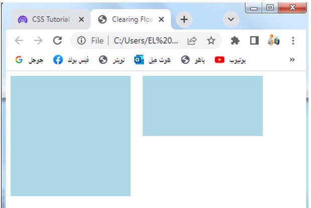
By applying these techniques, you can create a layout with floated elements while ensuring that subsequent content flows properly and doesn’t overlap with the floated elements.
Creating Margins on Specific Sides:
CSS margins allow you to set margins on specific sides of an element. This is useful when you want to create space on only one or a few sides of an element while keeping others tightly aligned.
Creating Margins on Specific Sides:complete code in html
Here’s an example of how you can use CSS margins to create margins on specific sides of an element in HTML:
<!DOCTYPE html>
<html>
<head>
<title>Creating Margins on Specific Sides</title>
<style>
.box {
width: 200px;
height: 100px;
background-color: lightgray;
margin-top: 20px; /* Add margin to the top */
margin-right: 30px; /* Add margin to the right */
margin-bottom: 40px; /* Add margin to the bottom */
margin-left: 50px; /* Add margin to the left */
}
</style>
</head>
<body>
<div class="box"></div>
</body>
</html>
Explanation:
1-In this example, we have a div element with the class “box”.
2-By using CSS margins, we can create margins on specific sides of the element.
3-The margin-top: 20px; property adds a 20-pixel margin to the top of the element. The margin-right: 30px; property adds a 30-pixel margin to the right side. The margin-bottom: 40px; property adds a 40-pixel margin to the bottom. Lastly, the margin-left: 50px; property adds a 50-pixel margin to the left side.
css margin 30
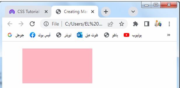
You can adjust the margin values as per your requirement to create margins of different sizes on specific sides of the element.
By using these margin properties, you can precisely control the spacing and positioning of elements in your web page layout.
Collapse Margins:
Margins of adjacent elements can collapse or combine into a single margin. This behavior is useful in creating consistent spacing between elements, especially in vertical layouts.
Collapse Margins: complete code in html
Here’s an example of how you can use CSS to demonstrate the collapsing margins effect in HTML:
<!DOCTYPE html>
<html>
<head>
<title>Collapse Margins</title>
<style>
.box {
width: 200px;
height: 100px;
background-color: lightgray;
margin: 20px; /* Set equal margins on all sides */
}
</style>
</head>
<body>
<div class="box"></div>
<div class="box"></div>
</body>
</html>
Explanation:
1-In this example, we have two div elements with the class “box”.
2-The margin: 20px; property sets an equal margin of 20 pixels on all sides of the elements.
3-When adjacent margins collapse, the resulting margin is the larger of the two margins. In this case, since the margins are equal, the collapsed margin between the two elements will be 20 pixels.
4-You can see the collapsing margins effect by inspecting the space between the two boxes.
5-The vertical gap between the boxes will be 20 pixels, reflecting the collapsed margins.
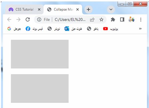
Collapsing margins is a useful feature for creating consistent spacing between elements, especially in vertical layouts where adjacent elements have margins.
Responsive Design:
CSS margins can be used in conjunction with media queries to create responsive designs. By adjusting the margin values at different breakpoints, you can control the spacing and layout of elements based on the screen size or device.
Responsive Design: complete code in html
Here’s an example of how you can use media queries and CSS margins to create a responsive design in HTML:
<!DOCTYPE html>
<html>
<head>
<title>Responsive Design</title>
<style>
.box {
width: 200px;
height: 100px;
background-color: lightgray;
margin: 20px;
}
@media (max-width: 600px) {
.box {
margin: 10px;
}
}
</style>
</head>
<body>
<div class="box"></div>
<div class="box"></div>
</body>
</html>
Explanation:
1-In this example, we have two div elements with the class “box”.
2-The .box class sets a width, height, background color, and a margin of 20 pixels on all sides of the elements.
3-We use a media query with @media (max-width: 600px) to target screens with a maximum width of 600 pixels.
4-Inside the media query, we override the margin property for the .box class and set it to 10 pixels on all sides.
5-When the screen width is 600 pixels or less, the boxes will have a smaller margin of 10 pixels. This allows for a more compact layout on smaller screens.
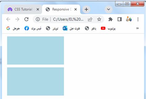
You can modify the media query and margin values as per your specific responsive design needs.
By using media queries, you can adjust the CSS properties, including margins, based on different screen sizes or device breakpoints, ensuring a responsive layout for your web page.
Overall, CSS margins play a crucial role in controlling the spacing and layout of elements on a web page. They provide flexibility in positioning and create visual balance, allowing designers to achieve the desired aesthetic and improve user experience.
Quiz with answers about this lesson
Here’s a multi-choice quiz with answers related to the lesson on CSS margins:
1-What does the margin property control in CSS?
a) Padding around an element
b) Space outside an element’s border
c) Space inside an element
d) Border width of an element
Answer: b) Space outside an element’s border
2-Which CSS property is used to set the margin on all sides of an element?
a) margin-all
b) margin-total
c) margin
d) margin-sides
Answer: c) margin
3-How many values can the margin property accept?
a) 1
b) 2
c) 3
d) 4
Answer: d) 4
4-What is the default value of the margin property?
a) initial
b) auto
c) 0
d) inherit
Answer: a) initial
5-Which value of the margin property horizontally centers an element?
a) auto
b) center
c) 0
d) inherit
Answer: a) auto
6-Which CSS property is used to set the margin on the top side of an element?
a) margin-top
b) margin-left
c) margin-right
d) margin-bottom
Answer: a) margin-top
7-What is the default unit of measurement for the margin property?
a) Pixels (px)
b) Percent (%)
c) Em (em)
d) Points (pt)
Answer: a) Pixels (px)
8-When using the shorthand margin property, what is the order of values for top, right, bottom, and left margins?
a) Top, Right, Bottom, Left
b) Right, Top, Left, Bottom
c) Bottom, Left, Top, Right
d) Left, Bottom, Right, Top
Answer: a) Top, Right, Bottom, Left
9-What is the purpose of the auto value for the margin property?
a) Centers the element horizontally
b) Sets the margin to zero
c) Inherits the margin value from the parent element
d) Adjusts the margin based on the element’s content
Answer: a) Centers the element horizontally
10-Which CSS property is used to collapse the margins between adjacent elements?
a) margin-collapse
b) margin-combine
c) margin-group
d) margin-merge
Answer: a) margin-collapse
11-What is the purpose of the inherit value for the margin property?
a) Sets the margin to a specific length value
b) Inherits the margin value from the parent element
c) Sets the margin to a percentage value relative to the parent element
d) Resets the margin to the initial default value
Answer: b) Inherits the margin value from the parent element
12-Which CSS property is used to set the margin on the right side of an element?
a) margin-right
b) margin-top
c) margin-bottom
d) margin-left
Answer: a) margin-right
13-What is the purpose of the initial value for the margin property?
a) Centers the element vertically
b) Sets the margin to zero
c) Inherits the margin value from the parent element
d) Resets the margin to the default value
Answer: d) Resets the margin to the default value
14-Which CSS property is used to set the margin on the left side of an element?
a) margin-left
b) margin-top
c) margin-right
d) margin-bottom
Answer: a) margin-left
15-Which CSS property is used to set the margin on all sides of an element except the top side?
a) margin-bottom
b) margin-right
c) margin-left
d) margin-inline-start
Answer: a) margin-bottom
16-Which CSS property is used to set the margin on all sides of an element to a specific length value?
a) margin-all
b) margin-total
c) margin
d) margin-sides
Answer: c) margin
17-What is the purpose of the unset value for the margin property?
a) Centers the element vertically
b) Sets the margin to zero
c) Resets the margin to the default value inherited from the parent
d) Removes any previously set margin values
Answer: d) Removes any previously set margin values
18-Which CSS property is used to set the margin on the top and bottom sides of an element?
a) margin-top
b) margin-bottom
c) margin-inline-start
d) margin-inline-end
Answer: b) margin-bottom
19-What is the purpose of using percentage values for the margin property?
a) Centers the element vertically and horizontally
b) Sets the margin relative to the element’s font size
c) Adjusts the margin based on the element’s content
d) Sets the margin relative to the parent element’s width
Answer: d) Sets the margin relative to the parent element’s width
20-Which CSS property is used to collapse the margins between child elements of a parent container?
a) margin-collapse
b) margin-combine
c) margin-group
d) margin-merge
Answer: a) margin-collapse
21-Which CSS property is used to set the margin on the start and end sides of an element?
a) margin-start
b) margin-end
c) margin-inline-start
d) margin-inline-end
Answer: c) margin-inline-start
22-What is the purpose of the rem unit for margin values in CSS?
a) Sets the margin relative to the element’s font size
b) Sets the margin relative to the parent element’s width
c) Sets the margin to a specific pixel value
d) Sets the margin based on the element’s content
Answer: a) Sets the margin relative to the element’s font size
23-Which CSS property is used to set the margin on the inline axis of an element?
a) margin-inline-axis
b) margin-inline
c) margin-inline-axis-start
d) margin-inline-axis-end
Answer: b) margin-inline
24-What is the purpose of the ch unit for margin values in CSS?
a) Sets the margin relative to the element’s font size
b) Sets the margin relative to the parent element’s width
c) Sets the margin to a specific pixel value
d) Sets the margin based on the width of the character “0”
Answer: d) Sets the margin based on the width of the character “0”
25-Which CSS property is used to set the margin on the block axis of an element?
a) margin-block
b) margin-block-start
c) margin-block-end
d) margin-block-axis
Answer: a) margin-block
26-Which CSS property is used to set the margin on the left and right sides of an element?
a) margin-top
b) margin-bottom
c) margin-left
d) margin-right
Answer: d) margin-right
27-What is the purpose of the vw unit for margin values in CSS?
a) Sets the margin relative to the element’s font size
b) Sets the margin relative to the viewport width
c) Sets the margin to a specific pixel value
d) Sets the margin based on the element’s content
Answer: b) Sets the margin relative to the viewport width
28-Which CSS property is used to collapse the margins between adjacent elements in a flex container?
a) margin-collapse
b) margin-combine
c) margin-group
d) margin-merge
Answer: b) margin-combine
29-What is the purpose of the fr unit for margin values in CSS Grid Layout?
a) Sets the margin relative to the element’s font size
b) Sets the margin relative to the parent element’s width
c) Sets the margin to a specific pixel value
d) Sets the margin based on the available space in the grid container
Answer: d) Sets the margin based on the available space in the grid container
30-Which CSS property is used to set the margin on all sides of an element to different values?
a) margin-top
b) margin-bottom
c) margin-left
d) margin
31-What is the purpose of the calc() function in CSS when used with margin values?
a) It calculates the sum of multiple margin values
b) It adjusts the margin based on the element’s content
c) It sets the margin to a specific pixel value
d) It calculates a dynamic margin value based on a mathematical expression
Answer: d) It calculates a dynamic margin value based on a mathematical expression
32-Which CSS property is used to set the margin on all sides of an element to the same value except the bottom side?
a) margin-top
b) margin-right
c) margin-left
d) margin-bottom
Answer: d) margin-bottom
33-What is the purpose of the max-width property when used with margin values?
a) Sets the maximum margin value for an element
b) Limits the element’s width while adjusting the margins accordingly
c) Sets a maximum width for the parent element and adjusts margins accordingly
d) Doesn’t have any effect on margin values
Answer: b) Limits the element’s width while adjusting the margins accordingly
34-Which CSS property is used to create a space between the margin edge of an element and its parent container?
a) margin-space
b) margin-gap
c) margin-space-between
d) margin-auto
Answer: b) margin-gap
35-What is the purpose of the overflow property when used with margin values?
a) Clips the content that overflows the margins
b) Expands the margin area to fit the content
c) Controls the visibility of the margin area
d) Doesn’t have any effect on margin values
Answer: d) Doesn’t have any effect on margin values