
CSS Padding: A Complete Guide | Tutorial
Understanding CSS Padding
Learn how to use CSS padding property to add spacing inside elements, adjust element size, create visual effects, and more.
Get a comprehensive guide on CSS padding with examples and best practices.
CSS padding is a property that allows you to specify the space between an element’s content and its border. It defines the amount of space inside an element, creating a gap between the content and the edges of the element.
The padding property can be set for individual sides of an element (top, right, bottom, left) or as a shorthand to set all sides at once.
Here are the different ways you can use the padding property:
Shorthand:
You can set the padding for all sides simultaneously using a shorthand notation. The order of values is as follows: padding: top right bottom left; You can provide one, two, three, or four values.
If you provide one value, it sets the same padding for all sides.
If you provide two values, the first value sets the top and bottom padding, and the second value sets the right and left padding.
If you provide three values, the first value sets the top padding, the second value sets the right and left padding, and the third value sets the bottom padding.
If you provide four values, each value sets the padding for the respective side.
Individual sides:
You can set the padding for individual sides using the following properties:
padding-top: Specifies the padding on the top side.
padding-right: Specifies the padding on the right side.
padding-bottom: Specifies the padding on the bottom side.
padding-left: Specifies the padding on the left side.
The padding values can be specified in various units, such as pixels (px), percentages (%), ems (em), rems (rem), etc.
Example usage:
/* Shorthand */ padding: 10px; /* same padding for all sides */ padding: 10px 20px; /* 10px top/bottom, 20px right/left */ padding: 10px 20px 30px; /* 10px top, 20px right/left, 30px bottom */ padding: 10px 20px 30px 40px; /* 10px top, 20px right, 30px bottom, 40px left */ /* Individual sides */ padding-top: 10px; padding-right: 20px; padding-bottom: 30px; padding-left: 40px;
It’s worth noting that the padding property affects the element’s layout by increasing its total size.
The space created by padding is within the element itself and does not include the element’s border or margin.
How to create the CSS padding ?
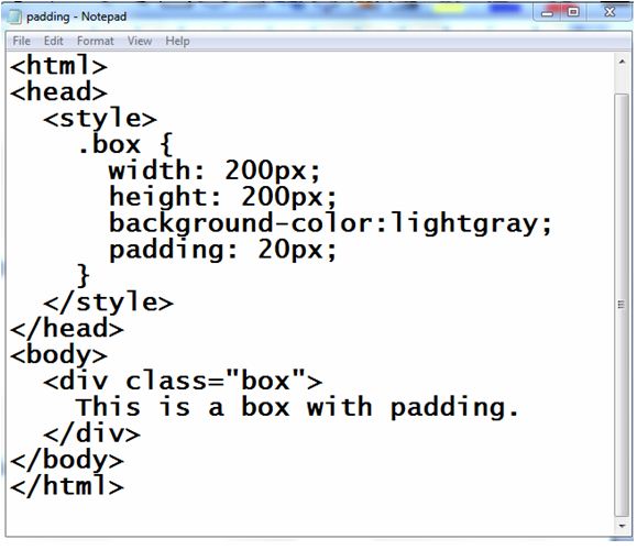
Here’s a complete HTML code example that demonstrates the usage of CSS padding:
<!DOCTYPE html>
<html>
<head>
<style>
.box {
width: 200px;
height: 200px;
background-color: lightgray;
padding: 20px;
}
</style>
</head>
<body>
<div class="box">
This is a box with padding.
</div>
</body>
</html>
Explanation:
1-In the above example, we have a <div> element with the class name “box.”
2-We apply CSS styles to the “box” class within the <style> tag in the <head> section of the HTML file.
3-The .box selector targets the <div> element with the “box” class.
4-We set the width and height properties to 200 pixels, and the background-color property to light gray.
5-The padding property is set to 20 pixels, which adds space inside the box between its content and the edges.

When you open this HTML file in a web browser, you will see a gray box with a 20-pixel gap between its content and the edges.
You can modify the values of padding, width, and height to experiment with different styles and see how the padding affects the layout of the box.
All the padding properties
Here’s a complete HTML code example that demonstrates the usage of all the padding properties:
<!DOCTYPE html>
<html>
<head>
<style>
.box {
width: 200px;
height: 200px;
background-color: lightgray;
padding-top: 20px;
padding-right: 30px;
padding-bottom: 40px;
padding-left: 10px;
}
</style>
</head>
<body>
<div class="box">
This is a box with individual padding properties.
</div>
</body>
</html>
Explanation:
1-In the above example, we have a <div> element with the class name “box.” .
2-We apply CSS styles to the “box” class within the <style> tag in the <head> section of the HTML file.
3-The .box selector targets the <div> element with the “box” class.
4-We set the width and height properties to 200 pixels, and the background-color property to light gray.
5-Then, we use individual padding properties to set different values for each side of the box:
padding-top is set to 20 pixels.
padding-right is set to 30 pixels.
padding-bottom is set to 40 pixels.
padding-left is set to 10 pixels.
When you open this HTML file in a web browser, you will see a gray box with different padding values applied to each side.
The top has 20 pixels of padding, the right has 30 pixels, the bottom has 40 pixels, and the left has 10 pixels.
You can modify the values of each padding property to experiment with different styles and observe how it affects the box’s layout.

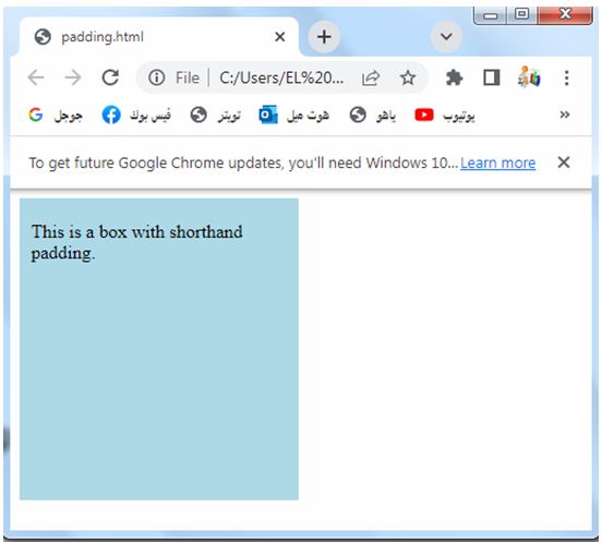
Padding – Shorthand Property
Here’s an HTML code example that demonstrates the usage of the shorthand property for padding:
<!DOCTYPE html>
<html>
<head>
<style>
.box {
width: 200px;
height: 200px;
background-color: lightblue;
padding: 20px 30px 40px 10px;
}
</style>
</head>
<body>
<div class="box">
This is a box with shorthand padding.
</div>
</body>
</html>
Explanation:
1-In the above example, we have a <div> element with the class name “box.”
2-We apply CSS styles to the “box” class within the <style> tag in the <head> section of the HTML file.
3-The .box selector targets the <div> element with the “box” class.
4-We set the width and height properties to 200 pixels, and the background-color property to light gray.
5-Then, we use the shorthand padding property to set different padding values for each side of the box.
6-The values provided in the padding property, in order, represent the top, right, bottom, and left padding values.
7-In this example, we set the padding values to 20 pixels (top), 30 pixels (right), 40 pixels (bottom), and 10 pixels (left) using the shorthand notation.
8-When you open this HTML file in a web browser, you will see a gray box with different padding values applied to each side.
9-The top has 20 pixels of padding, the right has 30 pixels, the bottom has 40 pixels, and the left has 10 pixels.
10-You can modify the values in the padding property to experiment with different styles and observe how it affects the box’s layout.
If the padding property has four values:complete code in html
Here’s a complete HTML code example that demonstrates the usage of the padding property with four values:
<!DOCTYPE html>
<html>
<head>
<style>
.box {
width: 200px;
height: 200px;
background-color: lightgray;
padding: 20px 30px 40px 10px;
}
</style>
</head>
<body>
<div class="box">
This is a box with four values for padding.
</div>
</body>
</html>
Explanation:
1-In the above example, we have a <div> element with the class name “box.”
2-We apply CSS styles to the “box” class within the <style> tag in the <head> section of the HTML file.
3-The .box selector targets the <div> element with the “box” class.
4-We set the width and height properties to 200 pixels, and the background-color property to light gray.
5-Then, we use the padding property to set different padding values for each side of the box.
5-The four values provided in the padding property, in order, represent the top, right, bottom, and left padding values.
6-In this example, we set the padding values to 20 pixels (top), 30 pixels (right), 40 pixels (bottom), and 10 pixels (left).
7-When you open this HTML file in a web browser, you will see a gray box with different padding values applied to each side.
8-The top has 20 pixels of padding, the right has 30 pixels, the bottom has 40 pixels, and the left has 10 pixels.
9-You can modify the values in the padding property to experiment with different styles and observe how it affects the box’s layout.
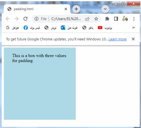
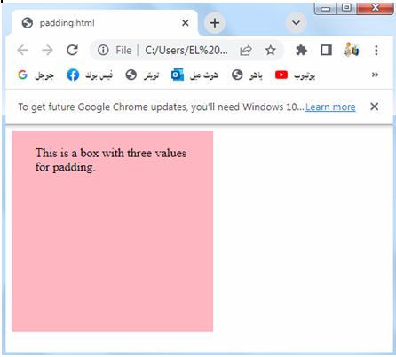
If the padding property has three values:complete code in html
Here’s a complete HTML code example that demonstrates the usage of the padding property with three values:
<!DOCTYPE html>
<html>
<head>
<style>
.box {
width: 200px;
height: 200px;
background-color: lightpink;
padding: 20px 30px 40px;
}
</style>
</head>
<body>
<div class="box">
This is a box with three values for padding.
</div>
</body>
</html>
Explanation:
1-In the above example, we have a <div> element with the class name “box.”
2-We apply CSS styles to the “box” class within the <style> tag in the <head> section of the HTML file.
3-The .box selector targets the <div> element with the “box” class.
4-We set the width and height properties to 200 pixels, and the background-color property to light gray.
5-Then, we use the padding property to set different padding values for each side of the box.
6-The three values provided in the padding property, in order, represent the top, right/left, and bottom padding values.
7-In this example, we set the padding values to 20 pixels (top), 30 pixels (right/left), and 40 pixels (bottom).
8-When you open this HTML file in a web browser, you will see a gray box with different padding values applied to each side.
9-The top has 20 pixels of padding, the right and left sides have 30 pixels, and the bottom has 40 pixels.
10-You can modify the values in the padding property to experiment with different styles and observe how it affects the box’s layout.
If the padding property has two values:complete code in html
Here’s a complete HTML code example that demonstrates the usage of the padding property with two values:
<!DOCTYPE html>
<html>
<head>
<style>
.box {
width: 200px;
height: 200px;
background-color: lightblue;
padding: 20px 30px;
}
</style>
</head>
<body>
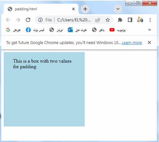
<div class="box">
This is a box with two values for padding.
</div>
</body>
</html>
Explanation:
1-In the above example, we have a <div> element with the class name “box.”
2-We apply CSS styles to the “box” class within the <style> tag in the <head> section of the HTML file.
3-The .box selector targets the <div> element with the “box” class.
4-We set the width and height properties to 200 pixels, and the background-color property to light gray.
5-Then, we use the padding property to set different padding values for each side of the box.
6-The two values provided in the padding property, in order, represent the top/bottom and right/left padding values.
7-In this example, we set the padding values to 20 pixels (top/bottom) and 30 pixels (right/left).
8-When you open this HTML file in a web browser, you will see a gray box with different padding values applied to each side.
9-The top and bottom have 20 pixels of padding, and the right and left sides have 30 pixels.
10-You can modify the values in the padding property to experiment with different styles and observe how it affects the box’s layout.
Padding and Element Width:complete code in html
Here’s a complete HTML code example that demonstrates the effect of padding on an element’s width:
<!DOCTYPE html>
<html>
<head>
<style>
.box {
width: 200px;
height: 200px;
background-color: lightgray;
padding: 20px;
}
</style>
</head>
<body>
<div class="box">
This is a box with padding.
</div>
</body>
</html>
Explanation:
1-In the above example, we have a <div> element with the class name “box.”
2-We apply CSS styles to the “box” class within the <style> tag in the <head> section of the HTML file.
3-The .box selector targets the <div> element with the “box” class.
4-We set the width and height properties of the box to 200 pixels.
5-The background-color property is set to light gray to give the box a visible appearance.
6-The padding property is set to 20 pixels, which adds space inside the box between its content and the edges.
7-When you open this HTML file in a web browser, you will see a gray box with a width and height of 200 pixels.
However, due to the padding, the total width of the box, including the padding, will be larger than 200 pixels. The content of the box will have a gap of 20 pixels between its edges and the box boundaries.

Please note that the padding is added to the content area of the box and increases the total size of the element.
This means that the actual width of the box, including the padding, will be wider than the specified width of 200 pixels.
How to set the left padding of a <p> element:complete code in html
Here’s a complete HTML code example that demonstrates how to set the left padding of a <p> element:
<!DOCTYPE html>
<html>
<head>
<style>
.paragraph {
padding-left: 30px;
}
</style>
</head>
<body>
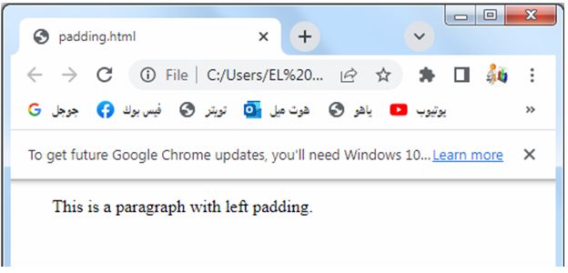
<p class="paragraph">
This is a paragraph with left padding.
</p>
</body>
</html>
Explanation:
1-In the above example, we have a <p> element with the class name “paragraph.” 2-We apply CSS styles to the “paragraph” class within the <style> tag in the <head> section of the HTML file.
3-The .paragraph selector targets the <p> element with the “paragraph” class.
4-We set the padding-left property of the .paragraph class to 30 pixels. This will add 30 pixels of padding to the left side of the <p> element.
5-When you open this HTML file in a web browser, you will see a paragraph of text with a left padding of 30 pixels.
6-The text will be indented on the left side by 30 pixels.
7-You can modify the value in the padding-left property to experiment with different padding sizes and observe how it affects the appearance of the paragraph.
How to set the right padding of a <p> element: complete code in html
Here’s a complete HTML code example that demonstrates how to set the right padding of a <p> element:
<!DOCTYPE html>
<html>
<head>
<style>
.paragraph {
padding-right: 30px;
}
</style>
</head>
<body>
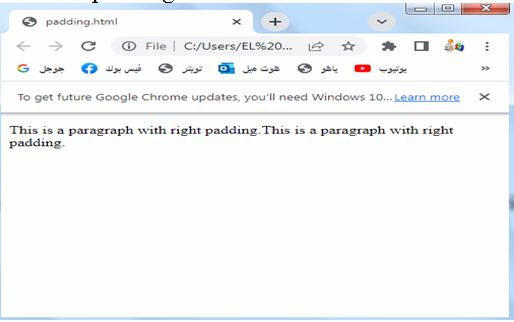
<p class="paragraph">
This is a paragraph with right padding.
</p>
</body>
</html>
Explanation:
1-In the above example, we have a <p> element with the class name “paragraph.” 2-We apply CSS styles to the “paragraph” class within the <style> tag in the <head> section of the HTML file.
3-The .paragraph selector targets the <p> element with the “paragraph” class.
4-We set the padding-right property of the .paragraph class to 30 pixels. This will add 30 pixels of padding to the right side of the <p> element.
5-When you open this HTML file in a web browser, you will see a paragraph of text with a right padding of 30 pixels. The text will have space on the right side, creating a gap between the text and the right edge of the element.
6-You can modify the value in the padding-right property to experiment with different padding sizes and observe how it affects the appearance of the paragraph
How to set the top padding of a <p> element:complete code in html
Here’s a complete HTML code example that demonstrates how to set the top padding of a <p> element:
<!DOCTYPE html>
<html>
<head>
<style>
.paragraph {
padding-top: 20px;
}
</style>
</head>
<body>
<p class="paragraph">
This is a paragraph with top padding.
</p>
</body>
</html>
Explanation:
1-In the above example, we have a <p> element with the class name “paragraph.” 2-We apply CSS styles to the “paragraph” class within the <style> tag in the <head> section of the HTML file.
3- The .paragraph selector targets the <p> element with the “paragraph” class.
4-We set the padding-top property of the .paragraph class to 20 pixels. This will add 20 pixels of padding to the top side of the <p> element.
5-When you open this HTML file in a web browser, you will see a paragraph of text with a top padding of 20 pixels. The text will have space above it, creating a gap between the text and the top edge of the element.
6-You can modify the value in the padding-top property to experiment with different padding sizes and observe how it affects the appearance of the paragraph.

How to set the bottom padding of a <p> element:
Here’s a complete HTML code example that demonstrates how to set the bottom padding of a <p> element:
<!DOCTYPE html>
<html>
<head>
<style>
.paragraph {
padding-bottom:20px;
}
</style>
</head>
<body>
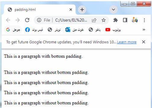
<p class="paragraph">
This is a paragraph with bottom padding.
</p>
<p> This is a paragraph without bottom padding.</p>
<p> This is a paragraph without bottom padding.</p>
<p> This is a paragraph without bottom padding.</p>
<p> This is a paragraph without bottom padding.</p>
</body>
</html>
Explanation:
1-In the above example, we have a <p> element with the class name “paragraph.” 2-We apply CSS styles to the “paragraph” class within the <style> tag in the <head> section of the HTML file.
3-The .paragraph selector targets the <p> element with the “paragraph” class.
4-We set the padding-bottom property of the .paragraph class to 20 pixels. This will add 20 pixels of padding to the bottom side of the <p> element.
5-When you open this HTML file in a web browser, you will see a paragraph of text with a bottom padding of 20 pixels. The text will have space below it, creating a gap between the text and the bottom edge of the element.
6-You can modify the value in the padding-bottom property to experiment with different padding sizes and observe how it affects the appearance of the paragraph.
Usage of css padding
CSS padding is a versatile property that offers several uses in web development. Here are some common use cases and benefits of CSS padding:
Spacing content:
Padding allows you to add space between the content and the edges of an element, such as paragraphs, images, or buttons.
It helps improve readability and visual separation between elements.
Spacing content: complete code example in html
Here’s a complete HTML code example that demonstrates how to use CSS padding to space content:
<!DOCTYPE html>
<html>
<head>
<style>
.container {
padding: 20px;
background-color: lightgray;
}
.paragraph {
padding: 10px;
background-color: white;
}
</style>
</head>
<body>
<div class="container">
<p class="paragraph">
This is a paragraph with spacing using CSS padding.
</p>
<p class="paragraph">
Another paragraph with spacing.
</p>
</div>
</body>
</html>
Explanation:
1-In the above example, we have a <div> element with the class name “container” that acts as a container for the content.
2-We apply CSS styles to the “container” class within the <style> tag in the <head> section of the HTML file. The .container selector targets the <div> element with the “container” class.
3-We set the padding property of the .container class to 20 pixels, creating spacing between the content and the edges of the container.
4-We also set the background-color property to light gray to give the container a visible appearance.
4-Within the container, we have two <p> elements with the class name “paragraph.” We apply CSS styles to the “paragraph” class, targeting the <p> elements.
5-We set the padding property of the .paragraph class to 10 pixels, creating spacing between the text and the edges of each paragraph.
6-We also set the background-color property to white to differentiate the paragraphs from the container.
7-When you open this HTML file in a web browser, you will see two paragraphs of text within a container. The paragraphs have spacing around them due to the padding applied.
8-The container has additional padding, creating space between its content and the edges.
9-You can modify the padding values in the CSS to experiment with different spacing and observe how it affects the layout of the content.

Creating breathing room:
By applying padding to containers or sections, you can create visual breathing room around the content, giving it a clean and organized appearance.
Creating breathing room: complete code in html
Here’s a complete HTML code example that demonstrates how to use CSS padding to create breathing room:
<!DOCTYPE html>
<html>
<head>
<style>
.container {
padding: 20px;
background-color: lightgray;
}
.content {
padding: 10px;
background-color: white;
}
</style>
</head>
<body>
<div class="container">
<div class="content">
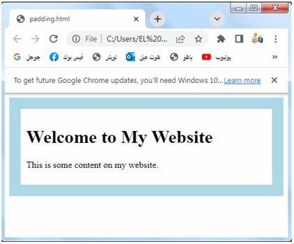
<h1>Welcome to My Website</h1>
<p>This is some content on my website.</p>
</div>
</div>
</body>
</html>
Explanation:
1-In the above example, we have a <div> element with the class name “container” that acts as a container for the content.
2-We apply CSS styles to the “container” class within the <style> tag in the <head> section of the HTML file.
3-The .container selector targets the <div> element with the “container” class.
4-We set the padding property of the .container class to 20 pixels, creating breathing room around the content within the container.
5-We also set the background-color property to light gray to give the container a visible appearance.
6-Within the container, we have another <div> element with the class name “content” that holds the actual content.
7-We apply CSS styles to the “content” class, targeting the <div> element.
8-We set the padding property of the .content class to 10 pixels, creating additional breathing room between the content and the edges of the content container.
9-We also set the background-color property to white to differentiate the content from the container.
10-Inside the content <div>, we have a heading <h1> and a paragraph <p> to represent some example content on the website.
11-When you open this HTML file in a web browser, you will see the content within a container. The container provides breathing room around the content, creating space between the content and the edges. The content itself has additional padding, creating further breathing room between the text and the container’s edges.
12-You can modify the padding values in the CSS to experiment with different breathing room sizes and observe how it affects the layout of the content.
Adjusting element size:
Padding affects the size of an element, as it expands the content area within the specified width and height. By using padding strategically, you can control the overall size of an element without modifying its actual dimensions.
Adjusting element size: complete code in html
Here’s a complete HTML code example that demonstrates how to use CSS padding to adjust the size of an element:
<!DOCTYPE html>
<html>
<head>
<style>
.box {
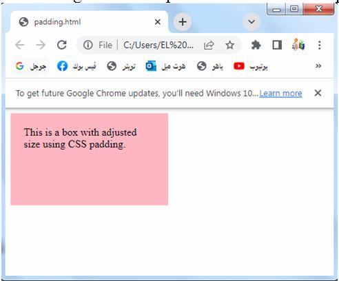
width: 200px;
height: 100px;
background-color: lightgray;
padding: 20px;
}
</style>
</head>
<body>
<div class="box">
This is a box with adjusted size using CSS padding.
</div>
</body>
</html>
Explanation:
1-In the above example, we have a <div> element with the class name “box”.
2-We apply CSS styles to the “box” class within the <style> tag in the <head> section of the HTML file.
3-The .box selector targets the <div> element with the “box” class.
4-We set the width property of the .box class to 200 pixels and the height property to 100 pixels. This sets the initial dimensions of the box.
5-Additionally, we set the padding property of the .box class to 20 pixels. This adds space inside the box, increasing its total size. The content area within the box will be smaller due to the padding.
6-When you open this HTML file in a web browser, you will see a gray box with a width of 200 pixels and a height of 100 pixels.
However, due to the padding, the actual size of the box, including the padding, will be larger than 200 pixels in width and 100 pixels in height.
Please note that the padding increases the overall size of the box. If you want to adjust the size of an element without affecting its content area, you can use the box-sizing property with the value of border-box.
This property ensures that padding and border are included within the specified width and height of the element.
Creating responsive designs:
Padding is a crucial tool in creating responsive web designs.
By applying padding with percentage values or using media queries, you can ensure that the spacing adjusts dynamically based on the screen size, improving the layout and readability on different devices.
How to Create responsive designs? : complete code in html
Here’s a complete HTML code example that demonstrates how to use CSS padding to create a responsive design:
<!DOCTYPE html>
<html>
<head>
<style>
.container {
padding: 20px;
background-color: lightpink;
}
.content {
padding: 10px;
background-color: white;
}
@media (max-width: 600px) {
.container {
padding: 10px;
}
.content {
padding: 5px;
}
}
</style>
</head>
<body>
<div class="container">
<div class="content">
<h1>Welcome to My Website</h1>
<p>This is some content on my website.</p>
</div>
</div>
</body>
</html>
Explanation:
1-In the above example, we have a <div> element with the class name “container” that acts as a container for the content.
2-We apply CSS styles to the “container” class within the <style> tag in the <head> section of the HTML file.
3-The .container selector targets the <div> element with the “container” class.
4-We set the padding property of the .container class to 20 pixels, creating space around the content within the container.
5-We also set the background-color property to light gray to give the container a visible appearance.
6-Within the container, we have another <div> element with the class name “content” that holds the actual content.
7-We apply CSS styles to the “content” class, targeting the <div> element.
8-We set the padding property of the .content class to 10 pixels, creating space between the content and the edges of the content container.
8-We also set the background-color property to white to differentiate the content from the container.
9-Inside the content <div>, we have a heading <h1> and a paragraph <p> to represent some example content on the website.
10-Additionally, we use a media query @media to specify different styles for different screen sizes. In this example, when the maximum screen width is 600 pixels or less, the container and content elements will have reduced padding.
11-We set the padding property of both the .container and .content classes to 10 pixels and 5 pixels, respectively, within the media query.
12-When you open this HTML file in a web browser, you will see the content within a container.
13-The container provides spacing around the content, creating space between the content and the edges.
14-The content itself has additional padding, creating further space between the text and the container’s edges.
15-When the screen width is 600 pixels or less, the padding decreases due to the media query, allowing for a more responsive design.

You can modify the padding values in the CSS and the screen width in the media query to suit your needs and observe how the responsive design adapts to different screen sizes.
Aligning elements:
Padding can be used to align elements within a container by adjusting the padding values of adjacent elements. It helps in achieving consistent spacing and alignment in layouts.
Aligning elements:complete code in html
Here’s a complete HTML code example that demonstrates how to use CSS padding to align elements:
<!DOCTYPE html>
<html>
<head>
<style>
.container {
padding: 20px;
background-color: lightgray;
}
.left {
padding-right: 20px;
}
.right {
padding-left: 20px;
}
</style>
</head>
<body>
<div class="container">
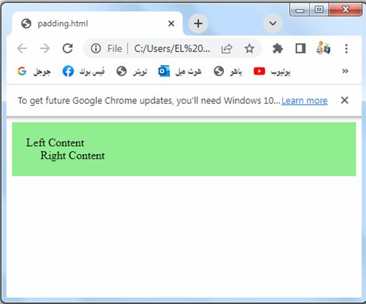
<div class="left">
Left Content
</div>
<div class="right">
Right Content
</div>
</div>
</body>
</html>
Explanation:
1-In the above example, we have a <div> element with the class name “container” that acts as a container for the content.
2-We apply CSS styles to the “container” class within the <style> tag in the <head> section of the HTML file.
3-The .container selector targets the <div> element with the “container” class.
4-We set the padding property of the .container class to 20 pixels, creating space around the content within the container.
5-We also set the background-color property to light gray to give the container a visible appearance.
6-Within the container, we have two additional <div> elements. One has the class name “left” and the other has the class name “right”. These represent the left and right content that we want to align within the container.
7-We apply CSS styles to the “left” and “right” classes, targeting the respective <div> elements.
8-For the “left” class, we set the padding-right property to 20 pixels. This creates spacing on the right side of the “left” content, pushing it away from the “right” content.
9-For the “right” class, we set the padding-left property to 20 pixels. This creates spacing on the left side of the “right” content, pushing it away from the “left” content.
10-When you open this HTML file in a web browser, you will see two sections of content within the container.
11-The “left” content will have spacing on the right side, creating a gap between it and the “right” content. Similarly, the “right” content will have spacing on the left side, creating a gap between it and the “left” content. This aligns the content within the container, providing visual separation between the left and right sections.
You can modify the padding values in the CSS to experiment with different spacing and observe how it affects the alignment of the content.
Styling buttons and links:
Padding is often used to create clickable areas for buttons and links. By applying padding to these elements, you can increase their target area, making them easier to click or tap on mobile devices.
Styling buttons and links: complete code in html
Here’s a complete HTML code example that demonstrates how to use CSS padding to style buttons and links:
<!DOCTYPE html>
<html>
<head>
<style>
.button {
padding: 10px 20px;
background-color: blue;
color: white;
border: none;
text-decoration: none;
display: inline-block;
font-size: 16px;
cursor: pointer;
}
</style>
</head>
<body>
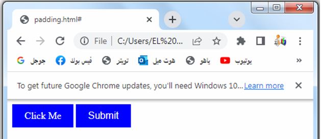
<a href="#" class="button">Click Me</a>
<button class="button">Submit</button>
</body>
</html>
Explanation:
1-In the above example, we have an <a> element and a <button> element that we want to style as buttons.
2-We apply CSS styles to the “button” class within the <style> tag in the <head> section of the HTML file.
3-The .button selector targets elements with the “button” class.
4-We set the padding property of the .button class to 10 pixels on the top and bottom, and 20 pixels on the left and right.
5-This creates spacing between the text and the edges of the buttons, making them visually appealing.
6-We also set the background-color property to blue, the color property to white, and the border property to none. These properties define the visual appearance of the buttons.
7-Additionally, we set the text-decoration property to none to remove the underline from the anchor element.
8-The display property is set to inline-block to ensure the buttons appear side by side.
9-The font-size property is set to 16 pixels to define the size of the button text.
10-Lastly, we set the cursor property to pointer to indicate that the buttons are clickable.
11-When you open this HTML file in a web browser, you will see two styled buttons.
12-The <a> element and the <button> element will have the same appearance, as they both have the “button” class applied to them.
13-The buttons will have padding, a blue background color, white text, no borders, and a pointer cursor. They will be displayed inline-block.
You can modify the padding values and other CSS properties in the .button class to customize the styling of your buttons and links according to your preferences.
Creating visual effects:
Padding can be used creatively to achieve visual effects. For example, by applying different padding values to different sides of an element, you can create asymmetrical layouts or unique shapes.
Creating visual effects: complete code in html
Here’s a complete HTML code example that demonstrates how to use CSS padding to create visual effects:
<!DOCTYPE html>
<html>
<head>
<style>
.box {
width: 200px;
height: 200px;
background-color: lightgray;
padding: 20px;
transition: padding 0.5s;
}
.box:hover {
padding: 40px;
}
</style>
</head>
<body>
<div class="box">
Hover over me
</div>
</body>
</html>
Explanation:
1-In the above example, we have a <div> element with the class name “box”.
2-We apply CSS styles to the “box” class within the <style> tag in the <head> section of the HTML file. The .box selector targets the <div> element with the “box” class.
3-We set the width and height properties of the .box class to 200 pixels, creating a square box.
4-We also set the background-color property to light gray to give the box a visible appearance.
5-Additionally, we set the padding property of the .box class to 20 pixels, creating space inside the box. This will be the initial state of the box.
6-We use the transition property to specify the transition effect for the padding property. In this example, we set the transition duration to 0.5 seconds, so any changes in the padding property will take half a second to animate.
7-We use the :hover pseudo-class selector to define styles that should be applied when the mouse is hovered over the box.
8-Inside the .box:hover selector, we set the padding property to 40 pixels. This increases the padding on hover, creating a visual effect.
9-When you open this HTML file in a web browser, you will see a square box with initial padding of 20 pixels.
10-When you hover the mouse over the box, the padding will increase to 40 pixels smoothly over a duration of 0.5 seconds, creating a visual effect.
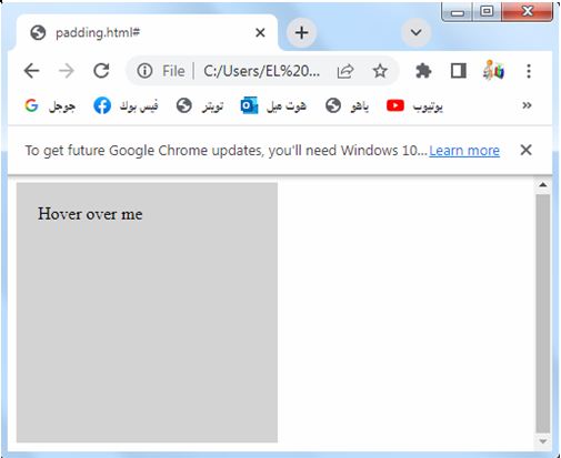
You can modify the padding values, transition duration, and other CSS properties in the .box and .box:hover classes to experiment with different visual effects and observe how they behave on hover.
Overall, CSS padding is a powerful tool for controlling spacing, layout, and visual presentation in web development. It offers flexibility and control over the design, ensuring a pleasant and engaging user experience.
Quiz with answer about this lesson
Here’s a multiple-choice quiz to test your understanding of CSS padding:
<!DOCTYPE html>
<html>
<head>
<style>
.quiz {
margin: 20px;
}
.question {
margin-bottom: 10px;
font-weight: bold;
}
.options label {
display: block;
margin-bottom: 5px;
}
.options input {
margin-right: 5px;
}
.submit-btn {
margin-top: 10px;
}
</style>
</head>
<body>
<div class="quiz">
<div class="question">Question 1: What does CSS padding property do?</div>
<div class="options">
<label>
<input type="radio" name="q1" value="a">
a) Adds space inside an element, between the content and the border
</label>
<label>
<input type="radio" name="q1" value="b">
b) Adds space outside an element, around the border
</label>
<label>
<input type="radio" name="q1" value="c">
c) Adjusts the width and height of an element
</label>
</div>
<div class="question">Question 2: Which CSS property can be used to set the left padding of an element?</div>
<div class="options">
<label>
<input type="radio" name="q2" value="a">
a) padding-left
</label>
<label>
<input type="radio" name="q2" value="b">
b) padding-right
</label>
<label>
<input type="radio" name="q2" value="c">
c) padding-top
</label>
</div>
<div class="question">Question 3: Which of the following is NOT a valid unit for CSS padding property?</div>
<div class="options">
<label>
<input type="radio" name="q3" value="a">
a) px
</label>
<label>
<input type="radio" name="q3" value="b">
b) em
</label>
<label>
<input type="radio" name="q3" value="c">
c) vw
</label>
</div>
<button class="submit-btn" onclick="submitQuiz()">Submit</button>
</div>
<script>
function submitQuiz() {
var q1 = document.querySelector('input[name="q1"]:checked');
var q2 = document.querySelector('input[name="q2"]:checked');
var q3 = document.querySelector('input[name="q3"]:checked');
if (!q1 || !q2 || !q3) {
alert("Please answer all questions.");
return;
}
var score = 0;
if (q1.value === "a") {
score++;
}
if (q2.value === "a") {
score++;
}
if (q3.value === "c") {
score++;
}
alert("Quiz submitted! Your score: " + score + "/3");
}
</script>
</body>
</html>
In the above code, we have created a multiple-choice quiz with three questions related to CSS padding. Each question has three answer choices, and the user can select one option for each question.
