
CSS Table Styling: Enhance Readability and Visual Appeal
CSS Table Styling
Learn how to style HTML tables using CSS to improve readability, visual appeal, and user experience.
Explore techniques for padding, borders, alternating row colors, and more.
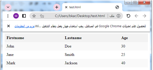
How to style The Table by using CSS ?
CSS (Cascading Style Sheets) can be used to apply various styles to HTML tables.
Here’s an example of how you can style a table using CSS:
<!DOCTYPE html>
<html>
<head>
<style>
table {
border-collapse: collapse;
width: 100%;
}
th, td {
text-align: left;
padding: 8px;
}
th {
background-color: #f2f2f2;
}
tr:nth-child(even) {
background-color: #f9f9f9;
}
tr:hover {
background-color: #ddd;
}
</style>
</head>
<body>
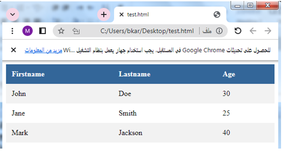
<table>
<tr>
<th>Firstname</th>
<th>Lastname</th>
<th>Age</th>
</tr>
<tr>
<td>John</td>
<td>Doe</td>
<td>30</td>
</tr>
<tr>
<td>Jane</td>
<td>Smith</td>
<td>25</td>
</tr>
<tr>
<td>Mark</td>
<td>Jackson</td>
<td>40</td>
</tr>
</table>
</body>
</html>
Explanation:
In this example, we have applied the following styles to the table:
- border-collapse: collapse;: This property specifies that the table cells should share borders and collapse into a single border where they meet.
- width: 100%;: This property sets the width of the table to 100% of its containing element.
- th, td: These selectors target the table header (th) and table data (td) cells.
- text-align: left;: This property aligns the text within the cells to the left.
- padding: 8px;: This property adds padding around the content within the cells.
- th: This selector targets the table header cells and applies a background color of #f2f2f2.
- tr:nth-child(even): This selector targets the even rows and applies a background color of #f9f9f9.
- tr:hover: This selector targets the rows when hovered over by the mouse and applies a background color of #ddd.
Try to modify these styles according to your requirements to achieve the desired table appearance.
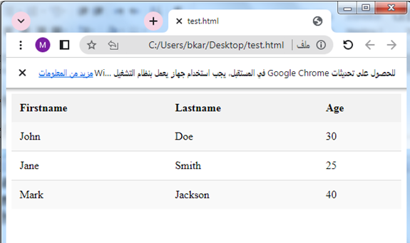
How to apply Table badding by CSS ?
CSS Table Padding
Here’s a complete HTML code example that includes table padding:
<!DOCTYPE html>
<html>
<head>
<style>
table {
border-collapse: collapse;
width: 100%;
}
th, td {
text-align: left;
padding: 12px;
}
th {
background-color: #f2f2f2;
}
tr:nth-child(even) {
background-color: #f9f9f9;
}
tr:hover {
background-color: #ddd;
}
</style>
</head>
<body>
<table>
<tr>
<th>Firstname</th>
<th>Lastname</th>
<th>Age</th>
</tr>
<tr>
<td>John</td>
<td>Doe</td>
<td>30</td>
</tr>
<tr>
<td>Jane</td>
<td>Smith</td>
<td>25</td>
</tr>
<tr>
<td>Mark</td>
<td>Jackson</td>
<td>40</td>
</tr>
</table>
</body>
</html>
Explanation:
1-In this code, I have modified the padding property value from 8px to 12px for both the table header (th) and table data (td) cells.
2-This increases the padding around the content within the cells, providing more space between the content and the cell boundaries.
Try to adjust the padding value as per your preference to achieve the desired table appearance.

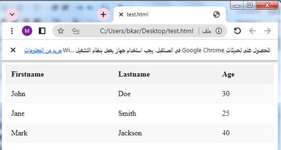
How to set Horizontal Dividers for a table by using CSS?
Here’s a complete HTML code example that includes horizontal dividers in a table:
<!DOCTYPE html>
<html>
<head>
<style>
table {
border-collapse: collapse;
width: 100%;
}
th, td {
text-align: left;
padding: 12px;
}
th {
background-color: #f2f2f2;
}
tr:nth-child(even) {
background-color: #f9f9f9;
}
tr:hover {
background-color: #ddd;
}
tr:not(:last-child) td {
border-bottom: 1px solid #ddd;
}
</style>
</head>
<body>
<table>
<tr>
<th>Firstname</th>
<th>Lastname</th>
<th>Age</th>
</tr>
<tr>
<td>John</td>
<td>Doe</td>
<td>30</td>
</tr>
<tr>
<td>Jane</td>
<td>Smith</td>
<td>25</td>
</tr>
<tr>
<td>Mark</td>
<td>Jackson</td>
<td>40</td>
</tr>
</table>
</body>
</html>
Explanation:
1-In this code, I have added the following CSS rule:
tr:not(:last-child) td {
border-bottom: 1px solid #ddd;
}
2-This rule selects all table rows (tr) except the last row and applies a bottom border of 1px solid color #ddd to the table data cells (td).
3-This creates horizontal dividers between the rows, enhancing the visual separation of table rows.
Try to modify the border properties (e.g., color, thickness) to match your desired style.
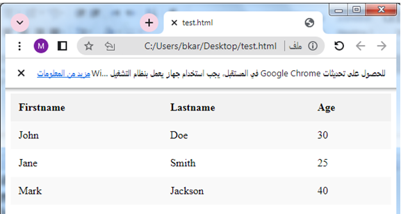
How to create CSS Hoverable Table by using CSS?
CSS Hoverable Table:
Here’s a complete HTML code example that includes a hover effect for a table:
<!DOCTYPE html>
<html>
<head>
<style>
table {
border-collapse: collapse;
width: 100%;
}
th, td {
text-align: left;
padding: 12px;
}
th {
background-color: #f2f2f2;
}
tr:nth-child(even) {
background-color: #f9f9f9;
}
tr:hover {
background-color: #ddd;
}
tr:hover td {
color: #fff;
}
</style>
</head>
<body>
<table>
<tr>
<th>Firstname</th>
<th>Lastname</th>
<th>Age</th>
</tr>
<tr>
<td>John</td>
<td>Doe</td>
<td>30</td>
</tr>
<tr>
<td>Jane</td>
<td>Smith</td>
<td>25</td>
</tr>
<tr>
<td>Mark</td>
<td>Jackson</td>
<td>40</td>
</tr>
</table>
</body>
</html>
Explanation:
1-In this code, I have added the following CSS rule:
tr:hover {
background-color: #ddd;
}
tr:hover td {
color: #fff;
}
2-The first rule applies a background color of #ddd to the table row (tr) when it is being hovered over.
This gives a visual indication of the hover state.
3-The second rule targets the table data cells (td) within the hovered row and changes the text color to #fff (white).
This provides better visibility and contrast between the text and the background color when hovering over a row.
Try to modify the background color and text color values according to your preferred hover effect.
How to create Striped Table by using CSS ?
Striped Tables:complete code in html
Here’s a complete HTML code example that includes striped tables:
<!DOCTYPE html>
<html>
<head>
<style>
table {
border-collapse: collapse;
width: 100%;
}
th, td {
text-align: left;
padding: 12px;
}
th {
background-color: #f2f2f2;
}
tr:nth-child(even) {
background-color: #f9f9f9;
}
tr:nth-child(odd) {
background-color: #ffffff;
}
</style>
</head>
<body>
<table>
<tr>
<th>Firstname</th>
<th>Lastname</th>
<th>Age</th>
</tr>
<tr>
<td>John</td>
<td>Doe</td>
<td>30</td>
</tr>
<tr>
<td>Jane</td>
<td>Smith</td>
<td>25</td>
</tr>
<tr>
<td>Mark</td>
<td>Jackson</td>
<td>40</td>
</tr>
</table>
</body>
</html>
Explanation:
1-In this code, I have used two CSS rules to achieve the striped table effect:
tr:nth-child(even) {
background-color: #f9f9f9;
}
tr:nth-child(odd) {
background-color: #ffffff;
}
2-The first rule selects every even row (tr:nth-child(even)) and applies a background color of #f9f9f9.
This gives those rows a light gray background color.
3-The second rule selects every odd row (tr:nth-child(odd)) and applies a background color of #ffffff, which is white.
This alternates the background color for each odd row.
Try to modify the background colors to match your desired striped table style.
How to Create colored Table by using CSS ?
Table Color
You can customize the colors of your table using CSS.
Here’s a complete HTML code example that includes a table with custom colors:
<!DOCTYPE html>
<html>
<head>
<style>
table {
border-collapse: collapse;
width: 100%;
}
th, td {
text-align: left;
padding: 12px;
}
th {
background-color: #336699;
color: #ffffff;
}
tr:nth-child(even) {
background-color: #f2f2f2;
}
tr:nth-child(odd) {
background-color: #ffffff;
}
tr:hover {
background-color: #dddddd;
}
tr:hover td {
color: #333333;
}
</style>
</head>
<body>
<table>
<tr>
<th>Firstname</th>
<th>Lastname</th>
<th>Age</th>
</tr>
<tr>
<td>John</td>
<td>Doe</td>
<td>30</td>
</tr>
<tr>
<td>Jane</td>
<td>Smith</td>
<td>25</td>
</tr>
<tr>
<td>Mark</td>
<td>Jackson</td>
<td>40</td>
</tr>
</table>
</body>
</html>
Explanation:
1-In this code, I have modified the table colors using CSS. Here are the color-related changes:
2-The background-color property sets the background color of the table header (th) to #336699, a dark blue color.
3-The color property sets the text color of the table header (th) to #ffffff, white color.
4-The even rows (tr:nth-child(even)) have a background color of #f2f2f2, a light gray color.
5-The odd rows (tr:nth-child(odd)) have a background color of #ffffff, white color.
7-The tr:hover rule sets the background color of the hovered row to #dddddd, a light gray color.
8-The tr:hover td rule changes the text color of the cells within the hovered row to #333333, a dark gray color.
Try to modify the color values to match your desired table appearance.
Application
Here’s a complete HTML application that incorporates the concepts we discussed, including table styling, hover effects, and striped rows:
<!DOCTYPE html>
<html>
<head>
<style>
table {
border-collapse: collapse;
width: 100%;
}
th, td {
text-align: left;
padding: 12px;
}
th {
background-color: #336699;
color: #ffffff;
}
tr:nth-child(even) {
background-color: #f2f2f2;
}
tr:nth-child(odd) {
background-color: #ffffff;
}
tr:hover {
background-color: #dddddd;
}
tr:hover td {
color: #333333;
}
</style>
</head>
<body>
<h1>Employee Directory</h1>
<table>
<tr>
<th>Name</th>
<th>Position</th>
<th>Department</th>
</tr>
<tr>
<td>John Doe</td>
<td>Manager</td>
<td>Operations</td>
</tr>
<tr>
<td>Jane Smith</td>
<td>Supervisor</td>
<td>Sales</td>
</tr>
<tr>
<td>Mark Jackson</td>
<td>Developer</td>
<td>IT</td>
</tr>
<tr>
<td>Emily Johnson</td>
<td>Analyst</td>
<td>Finance</td>
</tr>
<tr>
<td>Michael Brown</td>
<td>Designer</td>
<td>Marketing</td>
</tr>
</table>
</body>
</html>
Explanation:
1-In this application, we have created an Employee Directory table with the following features:
2-The table has a dark blue header (th) with white text color.
3-The rows alternate between light gray and white background colors (tr:nth-child(even) and tr:nth-child(odd)).
4-When hovering over a row, it changes to a light gray background color (tr:hover) and the text color in the cells becomes dark gray (tr:hover td).
You can further customize the application by adding more rows, modifying the table headers, or updating the colors to match your specific requirements.
Note: This is a simple static HTML application, and in a real-world scenario, you might want to consider using a dynamic backend technology (such as PHP, Node.js, or a database) to generate the table dynamically or fetch data from a server.

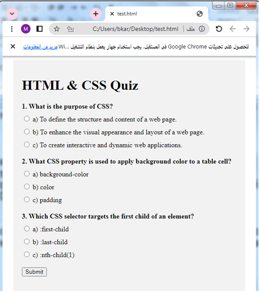
Application :Quiz with answers
Here’s a multiple-choice quiz with answers related to the concepts covered in the lesson:
<!DOCTYPE html>
<html>
<head>
<style>
.quiz-container {
max-width: 500px;
margin: 0 auto;
padding: 20px;
background-color: #f2f2f2;
}
.question {
font-weight: bold;
margin-bottom: 10px;
}
.options {
margin-bottom: 20px;
}
.option {
margin-bottom: 10px;
}
.result {
font-weight: bold;
margin-top: 20px;
}
</style>
</head>
<body>
<div class="quiz-container">
<h1>HTML & CSS Quiz</h1>
<div class="question">
1. What is the purpose of CSS?
</div>
<div class="options">
<div class="option">
<input type="radio" name="q1" value="a">
<label for="a">a) To define the structure and content of a web page.</label>
</div>
<div class="option">
<input type="radio" name="q1" value="b">
<label for="b">b) To enhance the visual appearance and layout of a web page.</label>
</div>
<div class="option">
<input type="radio" name="q1" value="c">
<label for="c">c) To create interactive and dynamic web applications.</label>
</div>
</div>
<div class="question">
2. What CSS property is used to apply background color to a table cell?
</div>
<div class="options">
<div class="option">
<input type="radio" name="q2" value="a">
<label for="a">a) background-color</label>
</div>
<div class="option">
<input type="radio" name="q2" value="b">
<label for="b">b) color</label>
</div>
<div class="option">
<input type="radio" name="q2" value="c">
<label for="c">c) padding</label>
</div>
</div>
<div class="question">
3. Which CSS selector targets the first child of an element?
</div>
<div class="options">
<div class="option">
<input type="radio" name="q3" value="a">
<label for="a">a) :first-child</label>
</div>
<div class="option">
<input type="radio" name="q3" value="b">
<label for="b">b) :last-child</label>
</div>
<div class="option">
<input type="radio" name="q3" value="c">
<label for="c">c) :nth-child(1)</label>
</div>
</div>
<button onclick="showResults()">Submit</button>
<div class="result" id="result"></div>
</div>
<script>
function showResults() {
const answers = ['b', 'a', 'a'];
const questions = document.querySelectorAll('.options');
let score = 0;
for (let i = 0; i < questions.length; i++) {
const selectedOption = questions[i].querySelector('input:checked');
if (selectedOption && selectedOption.value === answers[i]) {
score++;
}
}
const result = document.getElementById('result');
result.textContent = 'Your score: ' + score + ' out of ' + answers.length;
}
</script>
</body>
</html>
Explanation:
1-In this quiz, there are three questions related to the concepts covered in the lesson.
2-Each question has multiple-choice options, and the user can select only one option for each question.
3-Upon submitting the quiz, the script will calculate the score based on the correct answers provided and display the result to the user.
To modify or expand the quiz, you can add more questions by duplicating the HTML code block for a question and its options. Just make sure to update the answer array (answers) and the number of questions accordingly in the JavaScript code.
Try to adjust the styles and customize the quiz layout to match your preferences or the design of your web page.
References
Here are some references that you can use to learn more about CSS table styling and related topics: