
CSS Text Shadow Effects: Learn How to Create Stunning Text Effects
CSS Text Shadow Effects
Master the art of CSS text shadow effects and create captivating text designs. Learn the properties, techniques, and use cases for adding depth, emphasis, and decorative effects to your web typography.
Creating CSS text shadow effects, create stunning text effects, web typography, CSS effects, text design techniques, web development
CSS text shadow is a CSS property that allows you to add shadows to text elements. It can be used to enhance the visual appearance of text and create various text effects. The text-shadow property takes a comma-separated list of values that define the characteristics of the shadow.
Here’s the basic syntax for using the text-shadow property:
selector {
text-shadow: h-shadow v-shadow blur-radius color;
}
Let’s break down each value:
h-shadow:
It specifies the horizontal offset of the shadow from the text.
A positive value moves the shadow to the right, and a negative value moves it to the left.
v-shadow:
It specifies the vertical offset of the shadow from the text.
A positive value moves the shadow downward, and a negative value moves it upward.
blur-radius:
It defines the blurriness or spread of the shadow.
A larger value creates a more blurred shadow, while a smaller value makes it sharper.
A value of 0 means no blur.
color:
It sets the color of the shadow.
You can use named colors, hexadecimal color codes, RGB or RGBA values, or HSL or HSLA values.
Here’s an example that demonstrates the usage of text-shadow property:
h1 {
text-shadow: 2px 2px 4px rgba(0, 0, 0, 0.5);
}
Explanation:
1-In this example, the text shadow is offset by 2 pixels horizontally and 2 pixels vertically, creating a slight diagonal shadow.
2-The blur radius is set to 4 pixels, making the shadow slightly blurred, and the shadow color is black with 50% opacity.
You can apply different combinations of values to create various text shadow effects like multiple shadows, different colors, and more complex shadow styles.
Experimenting with different values and combinations will help you achieve the desired visual effect for your text.
How to use the text-shadow property ?
complete code example in html
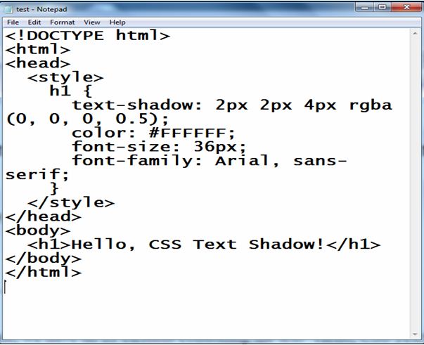
Here’s a complete HTML example that demonstrates the usage of the text-shadow property:
<!DOCTYPE html>
<html>
<head>
<style>
h1 {
text-shadow: 2px 2px 4px rgba(0, 0, 0, 0.5);
color: #FFFFFF;
font-size: 36px;
font-family: Arial, sans-serif;
}
</style>
</head>
<body>
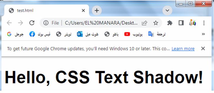
<h1>Hello, CSS Text Shadow!</h1>
</body>
</html>
Explanation:
1-In this example, we have a simple HTML document containing an h1 element.
2-The CSS code within the <style> tags sets the text-shadow property to create a shadow effect for the text.
3-The text-shadow property adds a shadow that is offset by 2 pixels horizontally and 2 pixels vertically.
4-The blur-radius is set to 4 pixels, making the shadow slightly blurred.
5-The shadow color is black (rgba(0, 0, 0, 0.5)), with an opacity of 50%.
6-Additionally, the CSS code sets the color of the text to white (#FFFFFF), a font size of 36 pixels, and the font family to Arial, sans-serif.
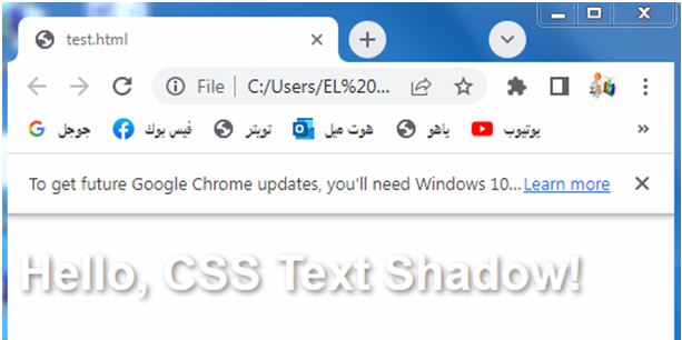
When you open this HTML file in a web browser, you’ll see the text “Hello, CSS Text Shadow!” with a shadow effect applied to it. Feel free to adjust the values and experiment with different shadow effects to achieve the desired result.
Explanation:
1-In this example, we have a simple HTML document containing an h1 element.
2-The CSS code within the <style> tags sets the text-shadow property to create a shadow effect for the text.
3-The text-shadow property adds a shadow that is offset by 2 pixels horizontally and 2 pixels vertically.
4-The blur-radius is set to 4 pixels, making the shadow slightly blurred.
5-The shadow color is black (rgba(0, 0, 0, 0.5)), with an opacity of 50%.
6-Additionally, the CSS code sets the color of the text to white (#FFFFFF), a font size of 36 pixels, and the font family to Arial, sans-serif.
When you open this HTML file in a web browser, you’ll see the text “Hello, CSS Text Shadow!” with a shadow effect applied to it. Feel free to adjust the values and experiment with different shadow effects to achieve the desired result.
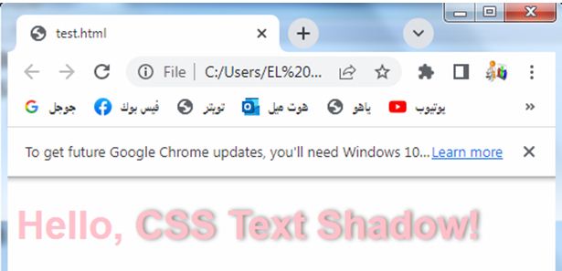
CSS h-shadow:complete code in html
Here’s a complete HTML example that demonstrates the usage of the text-shadow property with different horizontal offsets (h-shadow):
<!DOCTYPE html>
<html>
<head>
<style>
h1 {
color: pink;
font-size: 36px;
font-family: Arial, sans-serif;
}
.shadow {
text-shadow: 2px 0px 4px rgba(0, 0, 0, 0.5);
}
</style>
</head>
<body>
<h1>Hello, <span class="shadow">CSS Text Shadow!</span></h1>
</body>
</html>
Explanation:
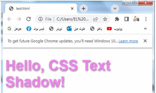
1-In this example, we have an h1 element containing the text “Hello, CSS Text Shadow!”.
2-We apply the text shadow effect to a specific part of the text by wrapping it in a <span> element with the class “shadow”.
3-The CSS code within the <style> tags sets the text-shadow property for the .shadow class.
4-In this case, the shadow has a horizontal offset of 2 pixels (h-shadow: 2px), no vertical offset (v-shadow: 0px), and a blur radius of 4 pixels.
5-The shadow color is black (rgba(0, 0, 0, 0.5)), with an opacity of 50%.
6-Additionally, the CSS code sets the color of the text to white (#FFFFFF), a font size of 36 pixels, and the font family to Arial, sans-serif.
When you open this HTML file in a web browser, you’ll see the text “Hello, CSS Text Shadow!” with a shadow effect applied only to the part wrapped in the <span> element with the “shadow” class. The shadow will have a horizontal offset of 2 pixels. Feel free to adjust the values and experiment with different shadow effects and offsets to achieve the desired result.
CSS v-shadow:complete code in html
Here’s a complete HTML example that demonstrates the usage of the text-shadow property with different vertical offsets (v-shadow):
<!DOCTYPE html>
<html>
<head>
<style>
h1 {
color: #FFFFFF;
font-size: 36px;
font-family: Arial, sans-serif;
}
.shadow {
text-shadow: 0px 2px 4px rgba(0, 0, 0, 0.5);
}
</style>
</head>
<body>
<h1>Hello, <span class="shadow">CSS Text Shadow!</span></h1>
</body>
</html>
Explanation:
1-In this example, we have an h1 element containing the text “Hello, CSS Text Shadow!”.
2-We apply the text shadow effect to a specific part of the text by wrapping it in a <span> element with the class “shadow”.
3-The CSS code within the <style> tags sets the text-shadow property for the .shadow class.
4-In this case, the shadow has a horizontal offset of 0 pixels (h-shadow: 0px), a vertical offset of 2 pixels (v-shadow: 2px), and a blur radius of 4 pixels.
5-The shadow color is black (rgba(0, 0, 0, 0.5)), with an opacity of 50%.
6-Additionally, the CSS code sets the color of the text to white (#FFFFFF), a font size of 36 pixels, and the font family to Arial, sans-serif.
When you open this HTML file in a web browser, you’ll see the text “Hello, CSS Text Shadow!” with a shadow effect applied only to the part wrapped in the <span> element with the “shadow” class. The shadow will have a vertical offset of 2 pixels. Feel free to adjust the values and experiment with different shadow effects and offsets to achieve the desired result.
CSS blur-radius:complete code in html
Here’s a complete HTML example that demonstrates the usage of the text-shadow property with different blur radii (blur-radius):
<!DOCTYPE html>
<html>
<head>
<style>
h1 {
color: red;
font-size: 36px;
font-family: Arial, sans-serif;
}
.shadow {
text-shadow: 2px 2px 8px rgba(0, 0, 0, 0.5);
}
</style>
</head>
<body>
<h1>Hello, <span class="shadow">CSS Text Shadow!</span></h1>
</body>
</html>
Explanation:
1-In this example, we have an h1 element containing the text “Hello, CSS Text Shadow!”.
2-We apply the text shadow effect to a specific part of the text by wrapping it in a <span> element with the class “shadow”.
3-The CSS code within the <style> tags sets the text-shadow property for the .shadow class.
4-In this case, the shadow has a horizontal offset of 2 pixels (h-shadow: 2px), a vertical offset of 2 pixels (v-shadow: 2px), and a blur radius of 8 pixels.
5-The shadow color is black (rgba(0, 0, 0, 0.5)), with an opacity of 50%.
6-Additionally, the CSS code sets the color of the text to white (#FFFFFF), a font size of 36 pixels, and the font family to Arial, sans-serif.
When you open this HTML file in a web browser, you’ll see the text “Hello, CSS Text Shadow!” with a shadow effect applied only to the part wrapped in the <span> element with the “shadow” class. The shadow will have a blur radius of 8 pixels, making it more blurred. Feel free to adjust the values and experiment with different shadow effects and blur radii to achieve the desired result.
How to use the CSS text-shadow property with different colors ?
color:: complete code in html
Here’s a complete HTML example that demonstrates the usage of the text-shadow property with different colors:
<!DOCTYPE html>
<html>
<head>
<style>
h1 {
color: green;
font-size: 36px;
font-family: Arial, sans-serif;
}
.shadow {
text-shadow: 2px 2px 4px #FF0000;
}
</style>
</head>
<body>
<h1>Hello, <span class="shadow">CSS Text Shadow!</span></h1>
</body>
</html>
Explanation:
1-In this example, we have an h1 element containing the text “Hello, CSS Text Shadow!”.
2-We apply the text shadow effect to a specific part of the text by wrapping it in a <span> element with the class “shadow”.
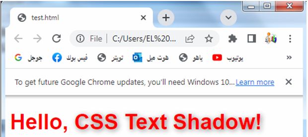
3-The CSS code within the <style> tags sets the text-shadow property for the .shadow class. In this case, the shadow has a horizontal offset of 2 pixels (h-shadow: 2px), a vertical offset of 2 pixels (v-shadow: 2px), a blur radius of 4 pixels, and the color is set to red (#FF0000).
4-Additionally, the CSS code sets the color of the text to white (#FFFFFF), a font size of 36 pixels, and the font family to Arial, sans-serif.
When you open this HTML file in a web browser, you’ll see the text “Hello, CSS Text Shadow!” with a shadow effect applied only to the part wrapped in the <span> element with the “shadow” class. The shadow will have a red color. Feel free to adjust the values and experiment with different shadow effects and colors to achieve the desired result.
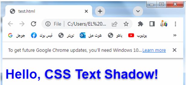
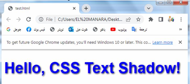
How to use CSS Text shadow effect ?
Here’s a complete HTML example that demonstrates a text shadow effect:
<!DOCTYPE html>
<html>
<head>
<style>
h1 {
color: yellow;
font-size: 36px;
font-family: Arial, sans-serif;
text-shadow: 2px 2px 4px rgba(0, 0, 0, 0.5);
}
</style>
</head>
<body>
<h1>Hello, CSS Text Shadow!</h1>
</body>
</html>
Explanation:
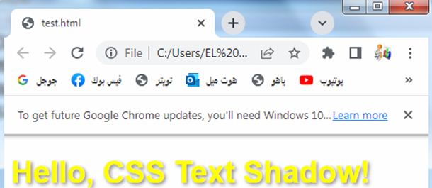
1-In this example, we have an h1 element containing the text “Hello, CSS Text Shadow!”.
2-We apply the text shadow effect to the entire text using the text-shadow property.
3-The CSS code within the <style> tags sets the text-shadow property for the h1 element.
4-In this case, the shadow has a horizontal offset of 2 pixels (h-shadow: 2px), a vertical offset of 2 pixels (v-shadow: 2px), a blur radius of 4 pixels, and the shadow color is black with 50% opacity (rgba(0, 0, 0, 0.5)).
5-Additionally, the CSS code sets the color of the text to white (#FFFFFF), a font size of 36 pixels, and the font family to Arial, sans-serif.
When you open this HTML file in a web browser, you’ll see the text “Hello, CSS Text Shadow!” with a shadow effect applied to it. The shadow will have a slightly blurred appearance and will be offset by 2 pixels both horizontally and vertically. Feel free to adjust the values and experiment with different shadow effects to achieve the desired result.
Uses of CSS Text shadow effect!:
The text shadow effect in CSS can be used to enhance the visual appearance of text and create various text effects.
Here are some common uses of the text shadow effect:
Adding Depth:
By applying a subtle text shadow with a slight offset and blur, you can create a sense of depth and make the text appear lifted from the background.
Adding Depth: complete code in html
Here’s a complete HTML example that demonstrates adding depth to text using the text shadow effect:
<!DOCTYPE html>
<html>
<head>
<style>
h1 {
color: #FFFFFF;
font-size: 48px;
font-family: Arial, sans-serif;
text-shadow: 2px 2px 4px rgba(0, 0, 0, 0.5);
}
</style>
</head>
<body>
<h1>Hello, CSS Text Shadow!</h1>
</body>
</html>
Explanation:
1-In this example, we have an h1 element containing the text “Hello, CSS Text Shadow!”.
2-We apply the text shadow effect to the entire text using the text-shadow property.
3-The CSS code within the <style> tags sets the text-shadow property for the h1 element.
4-In this case, the shadow has a horizontal offset of 2 pixels (h-shadow: 2px), a vertical offset of 2 pixels (v-shadow: 2px), a blur radius of 4 pixels, and the shadow color is black with 50% opacity (rgba(0, 0, 0, 0.5)).
5-Additionally, the CSS code sets the color of the text to white (#FFFFFF), a font size of 48 pixels, and the font family to Arial, sans-serif.
When you open this HTML file in a web browser, you’ll see the text “Hello, CSS Text Shadow!” with a text shadow applied to it. The shadow effect creates a subtle offset and blur, giving the text a sense of depth and making it appear lifted from the background. Feel free to adjust the values and experiment with different shadow effects to achieve the desired depth effect.
Creating Contrast:
Using a text shadow with a contrasting color can help improve the legibility of the text, especially when it overlaps with a similarly colored background.
Creating Contrast: complete code in html
Here’s a complete HTML example that demonstrates creating contrast using the text shadow effect:
<!DOCTYPE html>
<html>
<head>
<style>
h1 {
color: #000000;
font-size: 48px;
font-family: Arial, sans-serif;
text-shadow: 2px 2px 4px rgba(255, 255, 255, 0.5);
}
</style>
</head>
<body>
<h1>Hello, CSS Text Shadow!</h1>
</body>
</html>
Explanation:
1-In this example, we have an h1 element containing the text “Hello, CSS Text Shadow!”.
2-We apply the text shadow effect to the entire text using the text-shadow property.
3-The CSS code within the <style> tags sets the text-shadow property for the h1 element. In this case, the shadow has a horizontal offset of 2 pixels (h-shadow: 2px), a vertical offset of 2 pixels (v-shadow: 2px), a blur radius of 4 pixels, and the shadow color is white with 50% opacity (rgba(255, 255, 255, 0.5)).
4-Additionally, the CSS code sets the color of the text to black (#000000), a font size of 48 pixels, and the font family to Arial, sans-serif.
When you open this HTML file in a web browser, you’ll see the text “Hello, CSS Text Shadow!” with a text shadow applied to it. The contrast created by using a white shadow against the black text color enhances the legibility and makes the text stand out. Feel free to adjust the values and experiment with different shadow effects and color combinations to achieve the desired contrast effect.
Creating Emphasis:
Applying a bold and noticeable text shadow can draw attention to specific words or headings within a block of text, making them stand out.
Creating Emphasis: complete code in html
Here’s a complete HTML example that demonstrates creating emphasis using the text shadow effect:
<!DOCTYPE html>
<html>
<head>
<style>
h1 {
color: #FFFFFF;
font-size: 48px;
font-family: Arial, sans-serif;
text-shadow: 2px 2px 4px rgba(0, 0, 0, 0.8);
}
</style>
</head>
<body>
<h1>Hello, <span class="emphasis">CSS Text Shadow!</span></h1>
</body>
</html>
Explanation:
1-In this example, we have an h1 element containing the text “Hello, CSS Text Shadow!”.
2-We apply the text shadow effect to a specific part of the text by wrapping it in a <span> element with the class “emphasis”.
3-The CSS code within the <style> tags sets the text-shadow property for the h1 element.
4-In this case, the shadow has a horizontal offset of 2 pixels (h-shadow: 2px), a vertical offset of 2 pixels (v-shadow: 2px), a blur radius of 4 pixels, and the shadow color is black with 80% opacity (rgba(0, 0, 0, 0.8)).
5-Additionally, the CSS code sets the color of the text to white (#FFFFFF), a font size of 48 pixels, and the font family to Arial, sans-serif.
6-Inside the h1 element, we wrap the text “CSS Text Shadow!” in a <span> element with the class “emphasis”.
7-This allows us to apply the text shadow effect specifically to that part of the text.
When you open this HTML file in a web browser, you’ll see the text “Hello, CSS Text Shadow!” with the word “CSS Text Shadow!” emphasized with a text shadow. The shadow effect applied to the emphasized text draws attention to it and makes it stand out from the rest of the text. Feel free to adjust the values and experiment with different shadow effects and color combinations to achieve the desired emphasis effect.
Creating Text Effects:
Text shadow can be used to achieve various text effects like a neon glow, metallic sheen, or even a 3D effect, by combining different shadow colors, offsets, and blur radii.
Creating Text Effects: complete code in html
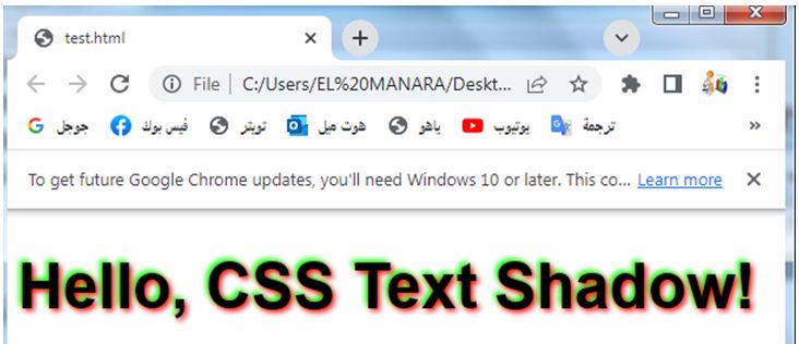
Here’s a complete HTML example that demonstrates creating a text effect using the text shadow property:
<!DOCTYPE html>
<html>
<head>
<style>
h1 {
font-size: 48px;
font-family: Arial, sans-serif;
text-shadow: 2px 2px 4px #FF0000, -2px -2px 4px #00FF00;
}
</style>
</head>
<body>
<h1>Hello, CSS Text Shadow!</h1>
</body>
</html>
Explanation:
1-In this example, we have an h1 element containing the text “Hello, CSS Text Shadow!”.
2-We apply the text shadow effect to the entire text using the text-shadow property.
3-The CSS code within the <style> tags sets the text-shadow property for the h1 element.
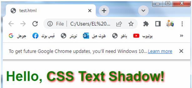
4-In this case, there are two text shadows applied.
5-The first shadow has a horizontal offset of 2 pixels and a vertical offset of 2 pixels, with a blur radius of 4 pixels, and the color is red (#FF0000).
6-The second shadow has a horizontal offset of -2 pixels and a vertical offset of -2 pixels, with a blur radius of 4 pixels, and the color is green (#00FF00).
7-Additionally, the CSS code sets the font size to 48 pixels and the font family to Arial, sans-serif.
When you open this HTML file in a web browser, you’ll see the text “Hello, CSS Text Shadow!” with a text effect applied to it. The combination of the two text shadows with different colors creates an interesting effect where the text appears to have a red shadow on one side and a green shadow on the other side. Feel free to adjust the values and experiment with different shadow effects and color combinations to achieve your desired text effects.
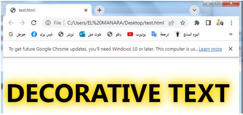
Designing Decorative Text:
Text shadow can be used creatively to design decorative text, such as adding a gradient effect, an engraved look, or a textured appearance.
Designing Decorative Text:complete code in html
Here’s a complete HTML example that demonstrates designing decorative text using the text shadow effect:
<!DOCTYPE html>
<html>
<head>
<style>
h1 {
font-size: 72px;
font-family: 'Segoe UI', Tahoma, Geneva, Verdana, sans-serif;
text-transform: uppercase;
text-shadow: 0 0 10px #FFD700, 0 0 20px #FFD700, 0 0 30px #FFD700, 0 0 40px #FFD700;
}
</style>
</head>
<body>
<h1>Decorative Text</h1>
</body>
</html>
Explanation:
1-In this example, we have an h1 element containing the text “Decorative Text”.
2-We apply the text shadow effect to the entire text using the text-shadow property.
3-The CSS code within the <style> tags sets the text-shadow property for the h1 element.
3-In this case, there are multiple text shadows applied to create a decorative effect.
4-Each shadow has a blur radius that increases progressively, creating a layered and textured appearance.
5-The color of the shadows is gold (#FFD700).
6-Additionally, the CSS code sets the font size to 72 pixels, the font family to ‘Segoe UI’, Tahoma, Geneva, Verdana, sans-serif, and the text is transformed to uppercase using text-transform: uppercase;.
When you open this HTML file in a web browser, you’ll see the text “Decorative Text” with a decorative text effect applied to it. The multiple text shadows with increasing blur radii and the gold color create a layered and textured appearance, giving the text a decorative and visually appealing look. Feel free to adjust the values and experiment with different shadow effects, colors, font families, and text transformations to achieve your desired decorative text design.
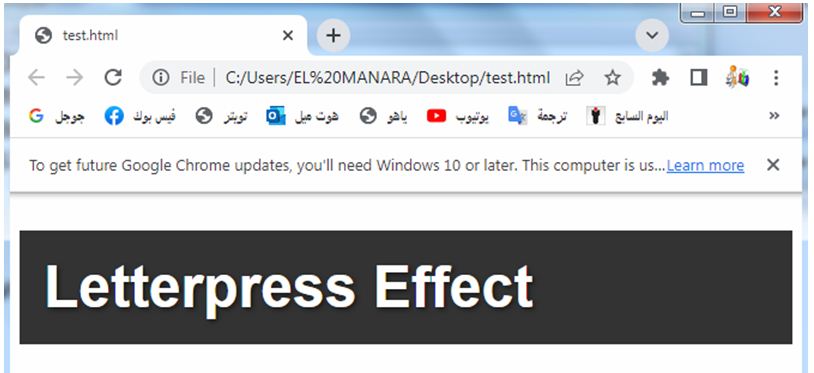
Simulating Letterpress Effect:
By applying a subtle shadow behind the text and adjusting the offset, you can create a letterpress-like effect, giving the text a pressed or stamped appearance.
Simulating Letterpress Effect:complete code in html
Here’s a complete HTML example that demonstrates simulating a letterpress effect using the text shadow effect:
<!DOCTYPE html>
<html>
<head>
<style>
h1 {
font-size: 48px;
font-family: 'Helvetica Neue', Helvetica, Arial, sans-serif;
background-color: #333333;
color: #FFFFFF;
padding: 20px;
text-shadow: 2px 2px 4px rgba(0, 0, 0, 0.5);
}
</style>
</head>
<body>
<h1>Letterpress Effect</h1>
</body>
</html>
Explanation:
1-In this example, we have an h1 element containing the text “Letterpress Effect”.
2-We apply the text shadow effect to the entire text using the text-shadow property.
3-The CSS code within the <style> tags sets the text-shadow property for the h1 element. In this case, the shadow has a horizontal offset of 2 pixels (h-shadow: 2px), a vertical offset of 2 pixels (v-shadow: 2px), a blur radius of 4 pixels, and the shadow color is black with 50% opacity (rgba(0, 0, 0, 0.5)).
4-Additionally, the CSS code sets the font size to 48 pixels, the font family to ‘Helvetica Neue’, Helvetica, Arial, sans-serif, the background color to a dark gray (#333333), the text color to white (#FFFFFF), and adds padding to the element to create space around the text.
When you open this HTML file in a web browser, you’ll see the text “Letterpress Effect” with a simulated letterpress effect. The text shadow applied creates a subtle shadow behind the text, giving it a pressed or stamped appearance as if it were indented into the background. Feel free to adjust the values and experiment with different shadow effects, colors, font families, and background styles to achieve your desired letterpress effect.
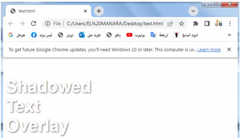
Creating Shadowed Text Overlays:
Overlaying text shadows of different colors and sizes can create unique and visually appealing text overlays, adding style and complexity to your design.
Creating Shadowed Text Overlays:complete code in html
Here’s a complete HTML example that demonstrates creating shadowed text overlays using the text shadow effect:
<!DOCTYPE html>
<html>
<head>
<style>
.overlay-container {
position: relative;
display: inline-block;
}
.overlay-text {
position: absolute;
top: 0;
left: 0;
z-index: 1;
color: #FFFFFF;
font-size: 48px;
font-family: Arial, sans-serif;
}
.overlay-shadow {
text-shadow: 2px 2px 4px rgba(0, 0, 0, 0.5);
}
</style>
</head>
<body>
<div class="overlay-container">
<h1 class="overlay-text overlay-shadow">Shadowed Text Overlay</h1>
</div>
</body>
</html>
Explanation:
1-In this example, we have a <div> container with the class “overlay-container” that wraps an <h1> element with the classes “overlay-text” and “overlay-shadow”.
2-This structure allows us to create a text overlay with a shadow effect.
3-The CSS code within the <style> tags defines the styles for the overlay container, overlay text, and overlay shadow.
4-The overlay container is set to position: relative and display: inline-block to contain the overlay text.
5-The overlay text is set to position: absolute, positioning it at the top-left corner of the container. It has a white color (#FFFFFF), a font size of 48 pixels, and the font family is set to Arial, sans-serif. The overlay shadow is applied using the text-shadow property, with a horizontal offset of 2 pixels, a vertical offset of 2 pixels, a blur radius of 4 pixels, and the shadow color is black with 50% opacity (rgba(0, 0, 0, 0.5)).
When you open this HTML file in a web browser, you’ll see the text “Shadowed Text Overlay” with a shadow effect overlaid on top of the text. The text appears to have a subtle shadow, giving it a sense of depth and making it stand out from the background. Feel free to adjust the values and experiment with different shadow effects, colors, font styles, and overlay positions to achieve your desired shadowed text overlay effect.
These are just a few examples of the uses of the text shadow effect. The possibilities are virtually limitless, and you can experiment with different combinations of shadow values to achieve your desired text effects and visual designs
Quiz with answers about this lesson
Here’s a multi-choice quiz about the CSS text shadow lesson:
1-What CSS property is used to apply a text shadow effect?
a) text-color
b) text-shadow
c) shadow-text
d) shadow-effect
Answer: b) text-shadow
2-Which values are used to define a text shadow in CSS?
a) h-shadow v-shadow blur color
b) blur h-shadow v-shadow color
c) color blur h-shadow v-shadow
d) v-shadow h-shadow color blur
Answer: a) h-shadow v-shadow blur color
3-What is the purpose of adding a text shadow effect to text?
a) To create emphasis and make the text stand out
b) To add depth and simulate a 3D effect
c) To enhance legibility and create contrast
d) All of the above
Answer: d) All of the above
4-How can you simulate a letterpress effect using the text shadow effect?
a) Set a negative blur radius for the text shadow
b) Apply a solid color shadow with no blur
c) Use a large blur radius and a dark shadow color
d) Apply multiple text shadows with increasing blur radii
Answer: c) Use a large blur radius and a dark shadow color
5-What are some common use cases for the text shadow effect?
a) Creating decorative text designs
b) Adding depth and dimension to text
c) Designing text overlays and captions
d) All of the above
Answer: d) All of the above
6-Which CSS property is used to control the horizontal offset of a text shadow?
a) h-shadow
b) v-shadow
c) blur
d) color
Answer: a) h-shadow
7-How can you create a text shadow effect that has multiple shadows applied to the same text?
a) Separate each shadow with a comma in the text-shadow property
b) Use the box-shadow property instead of text-shadow
c) Apply the shadow effect to each individual letter using separate CSS rules
d) It is not possible to apply multiple shadows to the same text
Answer: a) Separate each shadow with a comma in the text-shadow property
8-What does the blur radius value control in the text shadow effect?
a) The size of the shadow’s blur
b) The distance of the shadow from the text
c) The intensity of the shadow’s color
d) The transparency of the shadow
Answer: a) The size of the shadow’s blur
9-How can you adjust the color of a text shadow?
a) Use the text-color property
b) Apply a separate shadow for each color component (red, green, blue)
c) Specify the color using hexadecimal or RGB values in the text-shadow property
d) Use the color property with the shadow keyword
Answer: c) Specify the color using hexadecimal or RGB values in the text-shadow property
10-What is the purpose of using the text-transform property in the context of text shadows?
a) It controls the case sensitivity of the text shadow
b) It adjusts the opacity of the text shadow
c) It applies a 3D transformation to the text shadow
d) It transforms the text to uppercase, lowercase, or capitalize
Answer: d) It transforms the text to uppercase, lowercase, or capitalize
11-Which CSS property can be used to adjust the opacity of a text shadow?
a) opacity
b) text-opacity
c) shadow-opacity
d) Text shadows do not have opacity control
Answer: d) Text shadows do not have opacity control
12-How can you create a text shadow effect that has a diagonal offset?
a) Use a positive value for both h-shadow and v-shadow
b) Use a negative value for both h-shadow and v-shadow
c) Use a positive value for h-shadow and a negative value for v-shadow
d) Use a negative value for h-shadow and a positive value for v-shadow
Answer: c) Use a positive value for h-shadow and a negative value for v-shadow
13-What is the purpose of using the text-decoration property in combination with text shadows?
a) It adjusts the thickness of the text shadow
b) It applies a decorative line effect over the text shadow
c) It changes the font style of the text shadow
d) It has no effect on the text shadow
Answer: d) It has no effect on the text shadow
14-How can you apply a text shadow effect to only a specific portion of the text?
a) Use the <span> element and apply the text shadow to the span
b) Split the text into separate elements and apply different text shadows to each element
c) Apply the text shadow to the entire text and then use negative margins to hide the effect on certain portions
d) It is not possible to apply a text shadow to only a specific portion of the text
Answer: a) Use the <span> element and apply the text shadow to the span
15-What is the purpose of adjusting the font size and font family when using text shadow effects?
a) It helps control the size and visibility of the text shadow
b) It has no impact on the appearance of the text shadow
c) It ensures compatibility with different web browsers
d) It is recommended best practice but not required for text shadows
Answer: b) It has no impact on the appearance of the text shadow
16-Which of the following CSS units can be used for the text shadow properties?
a) Pixels (px)
b) Percentage (%)
c) Rem (rem)
d) All of the above
Answer: d) All of the above
17-What is the default value for the text shadow property if not specified?
a) 0 0 0 black
b) none
c) transparent
d) inherit
Answer: a) 0 0 0 black
18-How can you remove the text shadow effect from a specific element using CSS?
a) Set the text-shadow property to none
b) Set the text-shadow property to transparent
c) Remove the text-shadow property altogether
d) Set the text-shadow property to 0 0 0 transparent
Answer: c) Remove the text-shadow property altogether
19-Can you apply multiple text shadows to different lines of a multi-line text block?
a) Yes, using the line-shadow property
b) No, text shadows can only be applied to the entire text block
c) Yes, using the text-shadow property with multiple comma-separated values
d) No, text shadows are applied to individual letters only
Answer: b) No, text shadows can only be applied to the entire text block
20-Which of the following is an example of a valid text shadow declaration in CSS?
a) text-shadow: 2px 4px #000000;
b) text-shadow: 2px, 4px, #000000;
c) text-shadow: 2px 4px 6px #000000;
d) text-shadow: #000000 2px 4px;
Answer: a) text-shadow: 2px 4px #000000;