
HTML Form Elements: Importance, Syntax, and Uses
HTML Form Elements: Importance, Syntax, and Uses
Learn about HTML Form Elements , the importance of HTML Form Elements, syntax of HTML Form Elements, and uses of HTML form elements in this comprehensive lesson. Explore examples and understand how to implement HTML form elements effectively in your web development projects.
HTML forms are an essential component of web development as HTML Form elements allow users to interact with a website by submitting data. HTML form elements are used to collect information from users, such as usernames, passwords, search queries, and more. HTML forms consist of various input fields, checkboxes, radio buttons, dropdown menus, and buttons.
Syntax:
The basic structure of an HTML form involves using the <form> element, which acts as a container for all the form elements.
Here’s the basic syntax:
<form action="process_form.php" method="post"> <!-- form elements go here --> </form>
The action attribute specifies the URL or file where the form data is sent for processing.
The method attribute determines how the form data is sent. It can be either post or get. post sends the data in the background, while get appends the form data to the URL.
The form elements include:
<input>:
Creates an input field for users to enter data.
<textarea>:
Provides a multiline input field for users to enter larger amounts of text.
<select>:
Creates a dropdown menu for users to select an option.
<checkbox> and <radio>:
Creates checkboxes and radio buttons for multiple and single selections, respectively.
<button>:
Creates a button that can perform a specific action.
Complete Code Example:
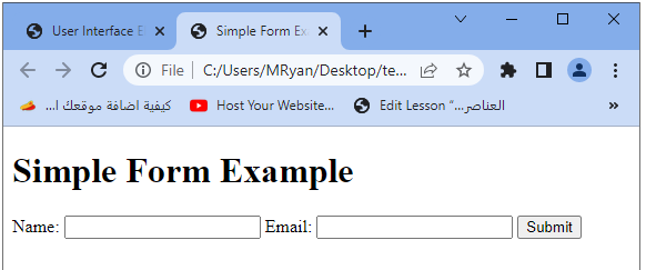
Here’s an example of a simple HTML form that collects a user’s name and email address and submits the data to a processing script on the server:
<!DOCTYPE html>
<html>
<head>
<title>Simple Form Example</title>
</head>
<body>
<h1>Simple Form Example</h1>
<form action="process_form.php" method="post">
<label for="name">Name:</label>
<input type="text" id="name" name="name" required>
<label for="email">Email:</label>
<input type="email" id="email" name="email" required>
<input type="submit" value="Submit">
</form>
</body>
</html>
In this example:
1-The form’s action attribute is set to “process_form.php”, indicating that the form data will be sent to a server-side script named “process_form.php” for processing.
2-The method attribute is set to “post” to send the data using the POST method.
3-The form contains two input fields, one for the name and another for the email address.
Both input fields use the required attribute to ensure that the user must provide the necessary information before submitting the form.
4-The <input type=”submit”> creates a submit button that the user can click to submit the form.
Remember that you need to have a server-side script like “process_form.php” to handle the form data submission and perform any necessary processing or validation.
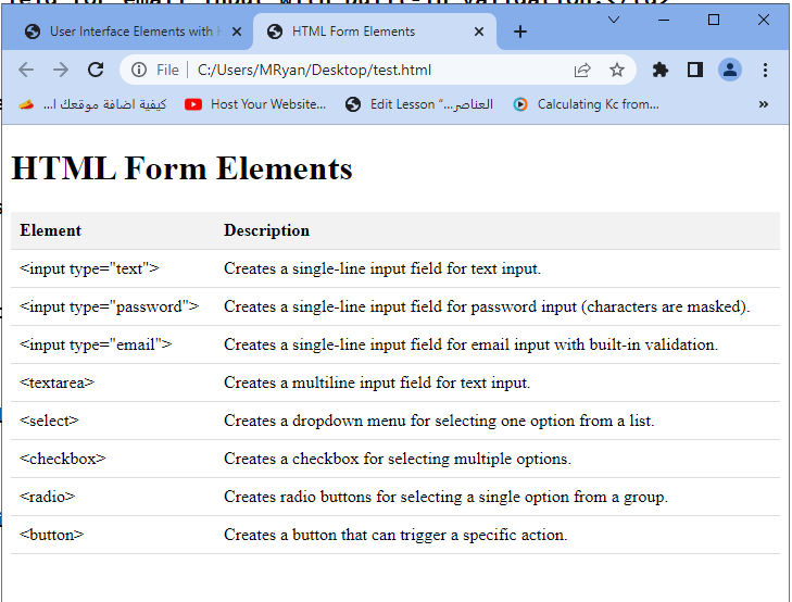
The HTML <form> Elements
Here’s an example of a table that showcases the HTML <form> elements along with their descriptions:
<!DOCTYPE html>
<html>
<head>
<title>HTML Form Elements</title>
<style>
table {
border-collapse: collapse;
width: 100%;
}
th, td {
padding: 8px;
text-align: left;
border-bottom: 1px solid #ddd;
}
th {
background-color: #f2f2f2;
}
</style>
</head>
<body>
<h1>HTML Form Elements</h1>
<table>
<tr>
<th>Element</th>
<th>Description</th>
</tr>
<tr>
<td><input type="text"></td>
<td>Creates a single-line input field for text input.</td>
</tr>
<tr>
<td><input type="password"></td>
<td>Creates a single-line input field for password input (characters are masked).</td>
</tr>
<tr>
<td><input type="email"></td>
<td>Creates a single-line input field for email input with built-in validation.</td>
</tr>
<tr>
<td><textarea></td>
<td>Creates a multiline input field for text input.</td>
</tr>
<tr>
<td><select></td>
<td>Creates a dropdown menu for selecting one option from a list.</td>
</tr>
<tr>
<td><checkbox></td>
<td>Creates a checkbox for selecting multiple options.</td>
</tr>
<tr>
<td><radio></td>
<td>Creates radio buttons for selecting a single option from a group.</td>
</tr>
<tr>
<td><button></td>
<td>Creates a button that can trigger a specific action.</td>
</tr>
</table>
</body>
</html>
In this example:
- the <table> element is used to structure the form elements and their descriptions.
- The <tr> element represents a row in the table, while the <th> element represents a table header cell. The <td> element represents a standard table cell.
- CSS styles are applied to the table to enhance its appearance.
Each form element is listed in a row, with its corresponding description in the adjacent cell. This table provides a clear overview of the HTML form elements and their purposes.
The input HTML form element
<input>:
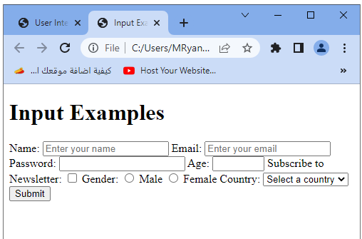
The <input> element is a versatile form element in HTML that allows users to enter various types of data. It is used to create different types of input fields, such as text fields, checkboxes, radio buttons, email fields, password fields, and more.
Here’s an example of using the <input> element with different types and attributes:
<!DOCTYPE html>
<html>
<head>
<title>Input Examples</title>
</head>
<body>
<h1>Input Examples</h1>
<form>
<label for="name">Name:</label>
<input type="text" id="name" name="name" placeholder="Enter your name" required>
<label for="email">Email:</label>
<input type="email" id="email" name="email" placeholder="Enter your email" required>
<label for="password">Password:</label>
<input type="password" id="password" name="password" required>
<label for="age">Age:</label>
<input type="number" id="age" name="age" min="18" max="100" required>
<label for="newsletter">Subscribe to Newsletter:</label>
<input type="checkbox" id="newsletter" name="newsletter">
<label for="gender">Gender:</label>
<input type="radio" id="male" name="gender" value="male">
<label for="male">Male</label>
<input type="radio" id="female" name="gender" value="female">
<label for="female">Female</label>
<label for="country">Country:</label>
<select id="country" name="country" required>
<option value="">Select a country</option>
<option value="us">United States</option>
<option value="uk">United Kingdom</option>
<option value="ca">Canada</option>
</select>
<input type="submit" value="Submit">
</form>
</body>
</html>
In this example:
1-The <input> elements are used to create various input fields.
2-The type attribute determines the type of input field. In this example, we use text, email, password, number, checkbox, and radio types.
3-The id attribute uniquely identifies each input field, and the name attribute associates the field with a name that can be used to retrieve the entered value on the server-side.
4-The placeholder attribute provides a hint or example text to guide the user’s input.
5-The required attribute ensures that the fields must be filled out before the form can be submitted.
For checkboxes and radio buttons, the value attribute specifies the value that will be submitted if the checkbox or radio button is checked.
6-The <select> element creates a dropdown menu with <option> elements representing the available choices.
7-The form includes a submit button (<input type=”submit”>) to trigger the form submission.
Remember that this is just a basic example, and you would typically need server-side processing to handle the form submission and perform actions with the submitted data.
The Label HTML form element:
<label>:
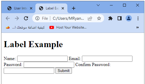
The <label> element in HTML is used to associate a label with a specific form element. It improves the usability and accessibility of the form by providing a textual description or title for the associated input field. The label can be clicked to focus or select the associated input element.
Here’s an example that demonstrates the use of the <label> element:
<!DOCTYPE html>
<html>
<head>
<title>Label Example</title>
</head>
<body>
<h1>Label Example</h1>
<form>
<label for="name">Name:</label>
<input type="text" id="name" name="name" required>
<label for="email">Email:</label>
<input type="email" id="email" name="email" required>
<label for="password">Password:</label>
<input type="password" id="password" name="password" required>
<label for="confirm-password">Confirm Password:</label>
<input type="password" id="confirm-password" name="confirm-password" required>
<input type="submit" value="Submit">
</form>
</body>
</html>
In this example:
1-Each <input> element is associated with a <label> element using the for attribute on the <label> element and the corresponding id attribute on the <input> element. This association allows users to click on the label to focus on the associated input field.
2-The text within the <label> element provides a description or title for the associated input field.
3-The for attribute value in the <label> element matches the id attribute value of the corresponding <input> element.
4-Using <label> elements with <input> elements helps make forms more accessible and user-friendly by providing clear labels and enabling users to interact with the form easily. It also helps improve the form’s compatibility with assistive technologies.
The Select HTML form element:
<select>:
The <select> element in HTML is used to create a dropdown menu or a select box, allowing users to choose one option from a list of predefined options. Here’s an example that demonstrates the use of the <select> element:
<!DOCTYPE html>
<html>
<head>
<title>Select Example</title>
</head>
<body>
<h1>Select Example</h1>
<form>
<label for="country">Country:</label>
<select id="country" name="country">
<option value="">Select a country</option>
<option value="us">United States</option>
<option value="uk">United Kingdom</option>
<option value="ca">Canada</option>
<option value="au">Australia</option>
</select>
<label for="gender">Gender:</label>
<select id="gender" name="gender">
<option value="">Select your gender</option>
<option value="male">Male</option>
<option value="female">Female</option>
<option value="other">Other</option>
</select>
<label for="fav-color">Favorite Color:</label>
<select id="fav-color" name="fav-color">
<option value="">Select your favorite color</option>
<option value="red">Red</option>
<option value="green">Green</option>
<option value="blue">Blue</option>
</select>
<input type="submit" value="Submit">
</form>
</body>
</html>
In this example:
1-Each <select> element is used to create a dropdown menu.
2-The <option> elements are nested within the <select> element and represent the available options within the dropdown menu.
3-The value attribute in each <option> element specifies the value that will be submitted when the corresponding option is selected.
4-The text within the <option> elements represents the visible text that users will see in the dropdown menu.
5-The <label> elements are used to associate a label with each <select> element, providing a textual description or title for the dropdown.
Users can select an option from the dropdown menu by clicking on it. When the form is submitted, the selected option’s value will be sent to the server for further processing.
Remember that this is a basic example, and you can customize the options and labels based on your specific requirements.

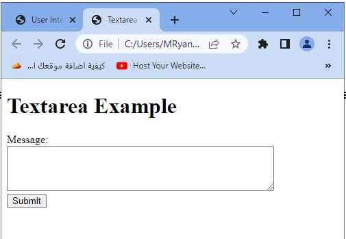
The textarea element in HTML form
<textarea>:
The <textarea> element in HTML is used to create a multiline text input field, allowing users to enter and edit larger amounts of text. It is typically used for fields where users need to provide comments, descriptions, or other lengthy textual content.
Here’s an example that demonstrates the use of the <textarea> element:
<!DOCTYPE html>
<html>
<head>
<title>Textarea Example</title>
</head>
<body>
<h1>Textarea Example</h1>
<form>
<label for="message">Message:</label>
<br>
<textarea id="message" name="message" rows="4" cols="50" placeholder="Enter your message here" required>
</textarea>
<br>
<input type="submit" value="Submit">
</form>
</body>
</html>
In this example:
1-The <textarea> element is used to create a multiline text input field.
2-The id attribute uniquely identifies the <textarea> element, and the name attribute associates it with a name that can be used to retrieve the entered value on the server-side.
3-The rows and cols attributes specify the visible number of rows and columns in the textarea.
4-The placeholder attribute provides a hint or example text that is displayed in the textarea before the user enters any content.
5-The required attribute ensures that the field must be filled out before the form can be submitted.
Users can enter and edit text within the textarea field. When the form is submitted, the entered text will be sent to the server for further processing
Remember that this is a basic example, and you can customize the attributes, such as the number of rows and columns, based on your specific requirements.
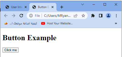
The button element in HTML:
<button>:
The <button> element in HTML is used to create a clickable button on a webpage. It can be used to trigger an action or perform a specific function when clicked by the user.
Here’s an example that demonstrates the use of the <button> element:
<!DOCTYPE html>
<html>
<head>
<title>Button Example</title>
</head>
<body>
<h1>Button Example</h1>
<button type="button" onclick="alert('Hello, World!')">Click me</button>
</body>
</html>
In this example:
1-The <button> element is used to create a clickable button.
2-The type=”button” attribute specifies that the button is a normal button and not a submit button (which would trigger a form submission).
3-The onclick attribute is used to define an inline JavaScript code that will be executed when the button is clicked. In this case, it displays an alert with the message “Hello, World!”.
When the button is clicked by the user, the specified JavaScript code (or any other action you define) will be executed.
Remember that this is a basic example, and you can customize the button’s appearance, behavior, and functionality based on your specific requirements.
The fieldset element in HTML:
<fieldset>:
The <fieldset> element in HTML is used to group related form elements together. It provides a visual grouping and semantic structure for a set of form controls. It is commonly used in forms to organize and style related input fields.
Here’s an example that demonstrates the use of the <fieldset> element:
<!DOCTYPE html>
<html>
<head>
<title>Fieldset Example</title>
</head>
<body>
<h1>Fieldset Example</h1>
<form>
<fieldset>
<legend>Personal Information</legend>
<label for="name">Name:</label>
<input type="text" id="name" name="name" required>
<label for="email">Email:</label>
<input type="email" id="email" name="email" required>
<label for="age">Age:</label>
<input type="number" id="age" name="age" min="18" max="100" required>
</fieldset>
<fieldset>
<legend>Preferences</legend>
<label for="newsletter">Subscribe to Newsletter:</label>
<input type="checkbox" id="newsletter" name="newsletter">
<label for="color">Favorite Color:</label>
<input type="text" id="color" name="color">
</fieldset>
<input type="submit" value="Submit">
</form>
</body>
</html>
In this example:
1-The <fieldset> element is used to group related form elements together.
2-The <legend> element is used as a heading for the <fieldset>, providing a description or title for the group of form elements.
3-The form controls (e.g., <input>, <checkbox>) are placed within the <fieldset> element, visually grouped together.
4-Using <fieldset> helps improve the visual organization and accessibility of a form. It provides a clear structure and helps users understand the relationship between the grouped form elements.

Remember that this is a basic example, and you can customize the <fieldset> element’s appearance and style using CSS to match your specific design requirements.
The legned element in HTML:
<legend>:
The <legend> element in HTML is used to provide a caption or title for the <fieldset> element. It helps provide a textual description or heading for the grouped form elements within the <fieldset>.
Here’s an example that demonstrates the use of the <legend> element:
<!DOCTYPE html>
<html>
<head>
<title>Legend Example</title>
</head>
<body>
<h1>Legend Example</h1>
<form>
<fieldset>
<legend>Personal Information</legend>
<label for="name">Name:</label>
<input type="text" id="name" name="name" required>
<label for="email">Email:</label>
<input type="email" id="email" name="email" required>
<label for="age">Age:</label>
<input type="number" id="age" name="age" min="18" max="100" required>
</fieldset>
<fieldset>
<legend>Preferences</legend>
<label for="newsletter">Subscribe to Newsletter:</label>
<input type="checkbox" id="newsletter" name="newsletter">
<label for="color">Favorite Color:</label>
<input type="text" id="color" name="color">
</fieldset>
<input type="submit" value="Submit">
</form>
</body>
</html>
In this example:
1-The <legend> element is used within each <fieldset> to provide a caption or title.
2-The text within the <legend> element represents the description or heading for the group of form elements within the <fieldset>.
3-The <fieldset> element groups related form elements together.
4-Using <legend> with <fieldset> helps improve the structure, organization, and accessibility of a form. It provides clear headings or captions for different sections of the form, making it easier for users to understand and interact with the form.

Remember that this is a basic example, and you can customize the <legend> element’s appearance and style using CSS to match your specific design requirements.
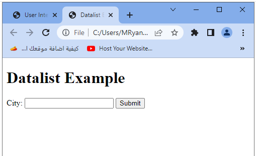
The datalist element in HTML :
<datalist>:
The <datalist> element in HTML is used to provide a predefined list of options for an <input> element with the list attribute. It allows users to select an option from the provided list or enter their own value.
Here’s an example that demonstrates the use of the <datalist> element:
<!DOCTYPE html>
<html>
<head>
<title>Datalist Example</title>
</head>
<body>
<h1>Datalist Example</h1>
<form>
<label for="city">City:</label>
<input type="text" id="city" name="city" list="city-list">
<datalist id="city-list">
<option value="New York"></option>
<option value="Los Angeles"></option>
<option value="Chicago"></option>
<option value="San Francisco"></option>
<option value="Miami"></option>
</datalist>
<input type="submit" value="Submit">
</form>
</body>
</html>
In this example:
1-The <datalist> element is used to define a list of options for the <input> element with the list attribute.
2-The <datalist> element contains one or more <option> elements, which represent the available options.
3-The <input> element is associated with the <datalist> by using the list attribute with the same value as the id attribute of the <datalist>.
Users can either select an option from the provided list or enter their own value in the <input> field.
When the form is submitted, the value entered or selected by the user in the <input> field will be sent to the server for further processing.
Remember that not all browsers fully support the <datalist> element, so it is important to provide alternative fallback options for better compatibility. Additionally, you can use JavaScript to enhance the functionality of the <datalist> element as needed.
The output element in HTML :
<output>:
The <output> element in HTML is used to display the result or output of a calculation or user interaction. It is typically used in conjunction with JavaScript to update and display dynamic content.
Here’s an example that demonstrates the use of the <output> element:
<!DOCTYPE html>
<html>
<head>
<title>Output Example</title>
</head>
<body>
<h1>Output Example</h1>
<form>
<label for="num1">Number 1:</label>
<input type="number" id="num1" name="num1" required>
<label for="num2">Number 2:</label>
<input type="number" id="num2" name="num2" required>
<button type="button" onclick="calculate()">Calculate</button>
<label for="result">Result:</label>
<output id="result" name="result"></output>
</form>
<script>
function calculate() {
var num1 = document.getElementById("num1").value;
var num2 = document.getElementById("num2").value;
var result = parseInt(num1) + parseInt(num2);
document.getElementById("result").value = result;
}
</script>
</body>
</html>
In this example:
1-The <output> element is used to display the result of the calculation.
2-The <label> element is used to associate a label with the <output> element, providing a textual description or title for the output.
3-The <input> elements with type=”number” are used to input the numbers to be calculated.
4-The <button> element is used to trigger the calculation when clicked by the user.
5-The JavaScript function calculate() is called when the button is clicked. It retrieves the values of the input fields, performs the calculation (in this case, addition), and sets the result in the <output> element.
When the user enters numbers and clicks the “Calculate” button, the sum of the numbers will be displayed in the <output> element.

Remember that this is a basic example, and you can customize the calculation and output based on your specific requirements. Additionally, you can use JavaScript to handle more complex calculations or interactions with the form elements.
The option element in HTML:
<option>:
The <option> element in HTML is used within a <select> element to define individual options within a dropdown menu or select box. Each <option> represents an item that users can choose from.
Here’s an example that demonstrates the use of the <option> element:
<!DOCTYPE html>
<html>
<head>
<title>Option Example</title>
</head>
<body>
<h1>Option Example</h1>
<form>
<label for="country">Country:</label>
<select id="country" name="country">
<option value="">Select a country</option>
<option value="us">United States</option>
<option value="uk">United Kingdom</option>
<option value="ca">Canada</option>
<option value="au">Australia</option>
</select>
<input type="submit" value="Submit">
</form>
</body>
</html>
In this example:
1-The <select> element creates a dropdown menu or select box.
2-The <option> elements are nested within the <select> element and represent the available options within the dropdown menu.
3-The value attribute in each <option> element specifies the value that will be submitted when the corresponding option is selected.
4-The text within the <option> elements represents the visible text that users will see in the dropdown menu.
Users can select an option from the dropdown menu by clicking on it. When the form is submitted, the selected option’s value will be sent to the server for further processing.
The first <option> element in the example has an empty value attribute, which represents the default option or placeholder text displayed when the dropdown menu is opened.

Remember that this is a basic example, and you can customize the options and values based on your specific requirements. Additionally, you can use JavaScript to dynamically populate the options or handle interactions with the dropdown menu.
The optgroup element in HTML:
<optgroup>:
The <optgroup> element in HTML is used within a <select> element to group related options together. It provides a way to organize and categorize options within a dropdown menu or select box. Here’s an example that demonstrates the use of the <optgroup> element:
<!DOCTYPE html>
<html>
<head>
<title>Optgroup Example</title>
</head>
<body>
<h1>Optgroup Example</h1>
<form>
<label for="country">Country:</label>
<select id="country" name="country">
<optgroup label="North America">
<option value="us">United States</option>
<option value="ca">Canada</option>
<option value="mx">Mexico</option>
</optgroup>
<optgroup label="Europe">
<option value="uk">United Kingdom</option>
<option value="de">Germany</option>
<option value="fr">France</option>
</optgroup>
</select>
<input type="submit" value="Submit">
</form>
</body>
</html>
In this example:
1-The <select> element creates a dropdown menu or select box.
2-The <optgroup> elements are nested within the <select> element and represent groups of related options.
3-The label attribute in each <optgroup> element specifies the label or name for the group of options.
4-The <option> elements are nested within the <optgroup> elements and represent the individual options within each group.
5-The options within each <optgroup> are visually grouped together within the dropdown menu, providing a clear organization and categorization of options.
Users can select an option from the dropdown menu by clicking on it. When the form is submitted, the selected option’s value will be sent to the server for further processing.

Remember that this is a basic example, and you can customize the groups and options based on your specific requirements. Additionally, you can use JavaScript to dynamically populate the options or handle interactions with the dropdown menu.
Quiz with answers about HTML form
Here’s a multi-choice quiz with answers based on the information provided in the previous lesson about HTML form elements:
1-Which HTML element is used to create a clickable button on a webpage?
a) <button>
b) <input>
c) <label>
d) <select>
Answer: a) <button>
2-Which HTML element is used to group related form elements together?
a) <form>
b) <fieldset>
c) <label>
d) <select>
Answer: b) <fieldset>
3-Which HTML element is used to provide a caption or title for a group of form elements within a <fieldset>?
a) <form>
b) <label>
c) <legend>
d) <option>
Answer: c) <legend>
4-Which HTML element is used to provide a predefined list of options for an <input> element?
a) <input>
b) <select>
c) <label>
d) <datalist>
Answer: d) <datalist>
5-Which HTML element is used to display the result or output of a calculation or user interaction?
a) <input>
b) <label>
c) <output>
d) <button>
Answer: c) <output>
6-Which HTML element is used to define individual options within a dropdown menu or select box?
a) <input>
b) <label>
c) <option>
d) <output>
Answer: c) <option>
7-Which HTML element is used to group related options together within a dropdown menu or select box?
a) <fieldset>
b) <optgroup>
c) <datalist>
d) <legend>
Answer: b) <optgroup>
8-Which HTML element is used to create a text input field?
a) <input type=”text”>
b) <textarea>
c) <input type=”checkbox”>
d) <select>
Answer: a) <input type=”text”>
9-Which HTML element is used to create a checkbox?
a) <input type=”checkbox”>
b) <input type=”text”>
c) <textarea>
d) <select>
Answer: a) <input type=”checkbox”>
10-Which HTML element is used to create a dropdown menu or select box?
a) <input type=”text”>
b) <textarea>
c) <select>
d) <option>
Answer: c) <select>
11-Which HTML element is used to create a text area for multi-line input?
a) <input type=”text”>
b) <textarea>
c) <input type=”checkbox”>
d) <select>
Answer: b) <textarea>
12-Which HTML element is used to create a radio button?
a) <input type=”checkbox”>
b) <input type=”text”>
c) <textarea>
d) <input type=”radio”>
Answer: d) <input type=”radio”>
13-Which HTML element is used to create a submit button in a form?
a) <input type=”submit”>
b) <button>
c) <input type=”button”>
d) <label>
Answer: a) <input type=”submit”>
14-Which HTML element is used to create a range slider?
a) <input type=”range”>
b) <input type=”text”>
c) <input type=”checkbox”>
d) <select>
Answer: a) <input type=”range”>
15-Which HTML element is used to create a file upload field?
a) <input type=”file”>
b) <input type=”text”>
c) <textarea>
d) <select>
Answer: a) <input type=”file”>
16-Which HTML element is used to create a hidden field?
a) <input type=”hidden”>
b) <input type=”text”>
c) <input type=”checkbox”>
d) <select>
Answer: a) <input type=”hidden”>
17-Which HTML element is used to create a reset button in a form?
a) <input type=”reset”>
b) <button>
c) <input type=”button”>
d) <label>
Answer: a) <input type=”reset”>
18-Which HTML element is used to create a date input field?
a) <input type=”date”>
b) <input type=”text”>
c) <textarea>
d) <select>
Answer: a) <input type=”date”>
19-Which HTML element is used to create a color picker?
a) <input type=”color”>
b) <input type=”text”>
c) <input type=”checkbox”>
d) <select>
Answer: a) <input type=”color”>
20-Which HTML element is used to create a search input field?
a) <input type=”search”>
b) <input type=”text”>
c) <textarea>
d) <select>
Answer: a) <input type=”search”>
21-Which HTML element is used to create a numeric input field?
a) <input type=”number”>
b) <input type=”text”>
c) <textarea>
d) <select>
Answer: a) <input type=”number”>
22-Which HTML element is used to create an email input field?
a) <input type=”email”>
b) <input type=”text”>
c) <textarea>
d) <select>
Answer: a) <input type=”email”>
23-Which HTML element is used to create a password input field?
a) <input type=”password”>
b) <input type=”text”>
c) <textarea>
d) <select>
Answer: a) <input type=”password”>
24-Which HTML element is used to create a time input field?
a) <input type=”time”>
b) <input type=”text”>
c) <textarea>
d) <select>
Answer: a) <input type=”time”>
25-Which HTML element is used to create a URL input field?
a) <input type=”url”>
b) <input type=”text”>
c) <textarea>
d) <select>
Answer: a) <input type=”url”>
26-Which HTML element is used to create a telephone number input field?
a) <input type=”tel”>
b) <input type=”text”>
c) <textarea>
d) <select>
Answer: a) <input type=”tel”>
27-Which HTML element is used to create a range of values input field?
a) <input type=”range”>
b) <input type=”text”>
c) <textarea>
d) <select>
Answer: a) <input type=”range”>
28-Which HTML element is used to create a checkbox with a label?
a) <input type=”checkbox”>
b) <input type=”text”>
c) <textarea>
d) <label>
Answer: d) <label>
29-Which HTML element is used to create a radio button with a label?
a) <input type=”radio”>
b) <input type=”text”>
c) <textarea>
d) <label>
Answer: d) <label>
30-Which HTML element is used to create a button with an image?
a) <button>
b) <input type=”button”>
c) <input type=”image”>
d) <label>
Answer: c) <input type=”image”>
31-Which HTML element is used to create a dropdown menu with multiple selections?
a) <input type=”text”>
b) <select>
c) <textarea>
d) <option>
Answer: b) <select>
32-Which HTML element is used to create a form reset button?
a) <input type=”reset”>
b) <button>
c) <input type=”button”>
d) <label>
Answer: a) <input type=”reset”>