
HTML Responsive Web Design: A Guide to Creating Flexible and User-Friendly Websites
HTML Responsive Web Design: A Guide to Creating Flexible and User-Friendly Websites
Responsive web design is an approach to web design and development that aims to create websites that provide an optimal viewing and interaction experience across different devices and screen sizes. With responsive design, the layout and content of a website automatically adjust and adapt to fit various screen resolutions, whether it’s a desktop computer, tablet, or mobile phone.
Importance of HTML Responsive Web Design:
The importance of responsive web design stems from the increasing use of mobile devices for browsing the internet. A responsive website ensures that users can access and navigate your site easily, regardless of the device they are using. It improves user experience, reduces bounce rates, and enhances search engine optimization (SEO) efforts. Additionally, responsive design eliminates the need to create separate websites for different devices, making maintenance and updates more efficient.
Usage of HTML Responsive Web Design:
To create a responsive website, you need to utilize HTML and CSS. HTML provides the structure and content of the web page, while CSS is used to style and control the layout. There are several techniques and features in CSS that enable responsive design, such as media queries, flexible grids, and fluid images.
Complete Code Example:
Here’s an example of a simple HTML structure with responsive design using CSS media queries:
<!DOCTYPE html>
<html lang="en">
<head>
<meta charset="UTF-8">
<meta name="viewport" content="width=device-width, initial-scale=1.0">
<title>Responsive Web Design Example</title>
<style>
/* Base styles */
body {
font-family: Arial, sans-serif;
margin: 0;
padding: 0;
}
.container {
max-width: 960px;
margin: 0 auto;
padding: 20px;
}
/* Media queries */
@media (max-width: 768px) {
/* Styles for smaller screens */
.container {
padding: 10px;
}
}
@media (max-width: 480px) {
/* Styles for even smaller screens */
body {
font-size: 14px;
}
.container {
padding: 5px;
}
}
</style>
</head>
<body>
<div class="container">
<h1>Responsive Web Design Example , Resize the browser window to see the responsive design page.</h1>
<p>Resize the browser window to see the responsive design page.</p>
</div>
</body>
</html>

In this example:
1-we have a basic HTML structure with a container element that holds the content of the webpage.
2-The CSS code provides base styles for the body and container elements. Inside the <style> tag, you’ll find media queries that apply different styles based on the screen width. In this case, the container’s padding decreases as the screen size decreases.
Note that this is a simplified example to demonstrate the concept of responsive design. In practice, you would need to consider a wide range of screen sizes and adjust your styles accordingly to create a fully responsive website.
steps to create HTML Responsive Web Design
To create an HTML responsive web design, follow these steps:
1)Plan and Design:
a-Determine the target audience and the devices they are likely to use.
b-Sketch out a wireframe or design layout for your website, considering how the content will adapt to different screen sizes.
2)HTML Structure:
Start by creating the basic HTML structure of your web page using the <html>, <head>, and <body> tags.
Divide your content into logical sections using semantic HTML elements such as <header>, <nav>, <main>, <section>, <article>, <aside>, and <footer>.
3)CSS Styling:
Link an external CSS file to your HTML document using the <link> tag or add inline styles using the <style> tag within the <head> section.
Apply CSS styles to your HTML elements, focusing on the overall layout, typography, colors, and spacing.
Consider using CSS frameworks like Bootstrap or Foundation, which provide pre-built responsive components and grid systems.
4)Media Queries:
Utilize CSS media queries to define different styles for various screen sizes.
Start with a mobile-first approach, where you design and code for smaller screens first and then progressively enhance for larger screens.
Use the @media rule in your CSS to specify different styles based on screen widths or other media features.
For example:
/* Styles for screens smaller than 768px */
@media (max-width: 768px) {
/* CSS rules for smaller screens */
}
/* Styles for screens between 768px and 1024px */
@media (min-width: 768px) and (max-width: 1024px) {
/* CSS rules for medium-sized screens */
}
/* Styles for screens larger than 1024px */
@media (min-width: 1024px) {
/* CSS rules for larger screens */
}
5)Responsive Images:
Make sure your images adapt to different screen sizes.
Use CSS properties like max-width: 100%; to prevent images from overflowing their containers on smaller screens.
Consider using the srcset attribute to provide different image sources based on device pixel density.
6)Testing and Optimization:
Test your responsive design on various devices, browsers, and screen sizes to ensure it works as expected.
Make adjustments and refinements as needed.
Optimize your website’s performance by minimizing file sizes, optimizing images, and employing techniques like lazy loading.
Remember, creating a fully responsive web design involves more than just these steps. It requires careful consideration of user experience, content prioritization, and thorough testing across different devices and orientations.
complete code example for HTML Responsive Web Design
Here’s a complete HTML code example for a responsive web design:
<!DOCTYPE html>
<html lang="en">
<head>
<meta charset="UTF-8">
<meta name="viewport" content="width=device-width, initial-scale=1.0">
<title>Responsive Web Design Example</title>
<style>
/* Base styles */
body {
font-family: Arial, sans-serif;
margin: 0;
padding: 0;
}
.container {
max-width: 960px;
margin: 0 auto;
padding: 20px;
}
/* Media queries */
@media (max-width: 768px) {
/* Styles for smaller screens */
.container {
padding: 10px;
}
}
@media (max-width: 480px) {
/* Styles for even smaller screens */
body {
font-size: 14px;
}
.container {
padding: 5px;
}
}
</style>
</head>
<body>
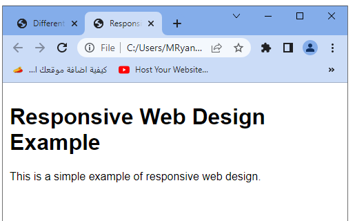
<div class="container">
<h1>Responsive Web Design Example</h1>
<p>This is a simple example of responsive web design.</p>
</div>
</body>
</html>
In this code example:
1-we have an HTML document with a responsive design. The CSS styles inside the <style> tag define the base styles for the body and container elements.
2-The max-width property of the container limits its width to a maximum of 960 pixels.
3-Two media queries are used to apply different styles based on screen width.
-The first media query targets screens with a maximum width of 768 pixels, reducing the container’s padding to 10 pixels.
-The second media query targets screens with a maximum width of 480 pixels, decreasing the body’s font size to 14 pixels and the container’s padding to 5 pixels.
Try to modify the content and styles to fit your specific needs. Remember to test the code on different devices and screen sizes to ensure the responsive design behaves as expected.
How to Set The Viewport ?
To set the viewport in HTML, you can use the meta tag with the name attribute set to “viewport”.
The viewport meta tag allows you to control how the website is displayed on different devices and adjust the initial scale and dimensions.
Here’s an example of setting the viewport:
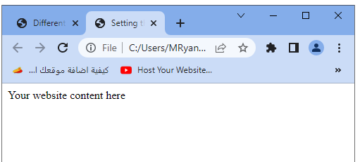
<!DOCTYPE html> <html> <head> <meta charset="UTF-8"> <meta name="viewport" content="width=device-width, initial-scale=1.0"> <title>Setting the Viewport</title> </head> <body> <!-- Your website content here --> Your website content here </body> </html>
In the above example:
- The <meta> tag with the name attribute “viewport” is placed within the <head> section of the HTML document.
- The content attribute of the <meta> tag specifies the viewport settings.
The most common settings used in the viewport meta tag are:
1-width=device-width:
Sets the width of the viewport to the width of the device screen.
This ensures that the website adapts to different screen sizes.
2-initial-scale=1.0:
Sets the initial zoom level of the website to 100% when the page is first loaded.
Other optional settings you can include are minimum-scale, maximum-scale, and user-scalable to control the minimum and maximum zoom levels and whether the user can manually zoom in or out.
By setting the viewport, you ensure that your website is displayed correctly and responsively across different devices, providing a better user experience.
How to create Responsive Images ?
To create responsive images, you can use CSS and HTML attributes to ensure that the images adapt to different screen sizes. Here are some approaches you can take:
CSS max-width Property:
Set the CSS max-width property of the image to 100%.
This ensures that the image scales down proportionally to fit within its container, preventing it from overflowing on smaller screens.
Example CSS:
img {
max-width: 100%;
height: auto;
}
HTML srcset Attribute:
The srcset attribute allows you to provide multiple image sources with different resolutions or sizes.
The browser selects the most appropriate image based on the device’s pixel density and screen size.
Example usage:
<img src="image-small.jpg"
srcset="image-small.jpg 480w,
image-medium.jpg 768w,
image-large.jpg 1024w"
alt="Responsive Image">
sizes Attribute:
The sizes attribute specifies the sizes that the image will be displayed at under different conditions.
It helps the browser determine the appropriate image to load based on the available space.
Example usage:
<img src="image-small.jpg"
srcset="image-small.jpg 480w,
image-medium.jpg 768w,
image-large.jpg 1024w"
sizes="(max-width: 480px) 100vw,
(max-width: 768px) 50vw,
33vw"
alt="Responsive Image">
Picture Element:
The <picture> element allows you to provide multiple image sources with different formats, sizes, and resolutions.
You can use media queries to specify different image sources based on screen size or other conditions.
Example usage:
<picture> <source media="(max-width: 480px)" srcset="image-small.jpg"> <source media="(max-width: 768px)" srcset="image-medium.jpg"> <source srcset="image-large.jpg"> <img src="image-large.jpg" alt="Responsive Image"> </picture>
By implementing these techniques, you can ensure that your images adapt and provide the best quality and size for different screen sizes and devices, enhancing the overall responsiveness of your website.
complete code example
Certainly! Here’s a complete HTML code example that demonstrates responsive images using the CSS max-width property and the srcset attribute:
<!DOCTYPE html>
<html>
<head>
<meta charset="UTF-8">
<meta name="viewport" content="width=device-width, initial-scale=1.0">
<title>Responsive Images Example</title>
<style>
img {
max-width: 100%;
height: auto;
}
</style>
</head>
<body>
<h1>Responsive Images Example</h1>
<img src="image-small.jpg"
srcset="image-small.jpg 480w,
image-medium.jpg 768w,
image-large.jpg 1024w"
alt="Responsive Image">
</body>
</html>

In this example:
1- we have a simple HTML structure with a heading and an <img> element.
2-The CSS code sets the max-width property of the image to 100% and the height to auto, allowing the image to scale down proportionally within its container.
3-The <img> element includes the src attribute, which specifies the default image source.
4-The srcset attribute is used to provide a list of image sources with different resolutions or sizes.
5-The browser will select the most appropriate image based on the device’s capabilities.
In the srcset attribute, we have provided three image sources (image-small.jpg, image-medium.jpg, and image-large.jpg) along with their respective widths (480w, 768w, and 1024w).
This helps the browser choose the most suitable image based on the available width.
Make sure to replace the image source URLs with the actual URLs of your images. Additionally, you can adjust the image sizes and resolutions in the srcset attribute to match your specific requirements.
By using these techniques, your images will adapt and scale appropriately on different devices, providing an optimal viewing experience for users with various screen sizes and resolutions.
How to use the max-width Property ?
To use the max-width property in CSS, follow these steps:
Select the HTML element or class you want to apply the max-width property to. This could be an image, a container div, or any other element.
Define the CSS rule for the selected element or class and set the max-width property to the desired value. The value can be specified in pixels, percentage, or any other valid CSS unit.
Example CSS rule:
img {
max-width: 100%;
}
In this example, the max-width property is applied to all <img> elements and set to 100%. This ensures that the image scales down proportionally to fit its parent container.
You can further customize the CSS rule by adding other properties or combining it with media queries for responsive designs.
Example CSS rule with additional properties:
.container {
max-width: 960px;
margin: 0 auto;
}
In this example, the .container class has a max-width of 960px, which limits the width of the container to a maximum of 960px. The margin: 0 auto; rule centers the container horizontally within its parent element.
The max-width property allows you to set a maximum width for an element, preventing it from exceeding that width on larger screens. This property is commonly used for responsive design to ensure that elements or images scale appropriately on different devices.
Remember to adjust the selected elements and the specific value of the max-width property to fit your design requirements.
How to use the max-width Property with image
To use the max-width property with an image, follow these steps:
Select the <img> element that you want to apply the max-width property to.
Define a CSS rule for the selected <img> element and set the max-width property to the desired value. This value can be specified in pixels, percentage, or any other valid CSS unit.
Example CSS rule:
img {
max-width: 100%;
}
In this example, the max-width property is applied to all <img> elements and set to 100%. This ensures that the image scales down proportionally to fit its parent container.
You can further customize the CSS rule by adding other properties or combining it with media queries for responsive designs.
Example CSS rule with additional properties:
img {
max-width: 100%;
height: auto;
}
In this example, the max-width property is combined with the height: auto; rule. This ensures that the image maintains its aspect ratio when scaling down by automatically adjusting the height.
By setting the max-width property to 100% on an image, you allow it to resize according to the width of its parent container. This ensures that the image remains within its container and prevents it from overflowing or becoming distorted on smaller screens.
Remember to adjust the CSS selector and other properties as needed to fit your specific HTML structure and design requirements.
complete code example
Here’s a complete HTML code example that demonstrates the usage of the max-width property with an image:
<!DOCTYPE html>
<html>
<head>
<meta charset="UTF-8">
<title>Image with max-width Example</title>
<style>
img {
max-width: 100%;
height: auto;
}
</style>
</head>
<body>
<h1>Image with max-width Example</h1>
<img src="example-image.jpg" alt="Example Image">
</body>
</html>

In this example, we have an HTML structure with a heading and an <img> element. The CSS code sets the max-width property of the image to 100% and the height property to auto. This allows the image to scale down proportionally within its parent container while maintaining its aspect ratio.
Make sure to replace the src attribute of the <img> element with the actual image source URL and provide an appropriate alt attribute for accessibility.
By using the max-width property, the image will resize dynamically based on the width of its parent container, ensuring that it remains within its boundaries and adapts to different screen sizes.
Try to modify the code and styles to fit your specific needs, such as applying the max-width property to a specific class or targeting different images on your webpage.
How to Show Different Images Depending on Browser Width ?
To show different images depending on the browser width, you can use the HTML picture element along with the source element and media queries. Here’s how you can achieve this:
<!DOCTYPE html>
<html>
<head>
<meta charset="UTF-8">
<title>Different Images Depending on Browser Width</title>
</head>
<body>
<h1>Different Images Depending on Browser Width</h1>
<picture>
<source media="(max-width: 480px)" srcset="image-small.jpg">
<source media="(max-width: 768px)" srcset="image-medium.jpg">
<source srcset="image-large.jpg">
<img src="image-large.jpg" alt="Responsive Image">
</picture>
</body>
</html>
In this example, we use the <picture> element to provide multiple image sources with different conditions. Inside the <picture> element, we use the <source> element to define each image source along with the corresponding media query.
The first <source> element has media=”(max-width: 480px)” which means it will be used for screens with a maximum width of 480 pixels.
The second <source> element has media=”(max-width: 768px)” which will be used for screens with a maximum width of 768 pixels.
The third <source> element doesn’t have a media query specified and will be used as a fallback for larger screens.
The srcset attribute of each <source> element specifies the image source URL for the corresponding condition.
Finally, we include the <img> element as a fallback option with the src attribute pointing to the default image source. This ensures that the image is displayed on browsers that don’t support the <picture> element.
By using this approach, the browser will choose the appropriate image source based on the screen size and load the corresponding image, providing a tailored image experience for different browser widths.
How to create Responsive Text Size ?
To create responsive text size, you can use CSS media queries and relative units such as percentages, em, or rem. Here’s an example of how to achieve responsive text size:
<!DOCTYPE html>
<html>
<head>
<meta charset="UTF-8">
<title>Responsive Text Size Example</title>
<style>
body {
font-size: 16px; /* Default font size */
}
@media (max-width: 768px) {
body {
font-size: 14px; /* Adjusted font size for smaller screens */
}
}
@media (max-width: 480px) {
body {
font-size: 12px; /* Further adjusted font size for even smaller screens */
}
}
</style>
</head>
<body>
<h1>Responsive Text Size Example</h1>
<p>This is an example of responsive text size.</p>
</body>
</html>

In this example, we use CSS media queries to define different font sizes based on the screen width. The @media rule specifies the conditions for when the CSS rules inside it should apply.
The first media query @media (max-width: 768px) targets screens with a maximum width of 768 pixels. Inside this media query, we adjust the font-size property of the body element to 14 pixels, providing a smaller text size for smaller screens.
The second media query @media (max-width: 480px) targets screens with a maximum width of 480 pixels. Inside this media query, we further adjust the font-size property of the body element to 12 pixels, providing an even smaller text size for even smaller screens.
By adjusting the font-size property within the media queries, you can create responsive text that adapts to different screen sizes. You can modify the font sizes and media query conditions according to your design requirements.
It’s important to note that using relative units like percentages, em, or rem for font size instead of fixed pixels allows the text size to scale relative to the base font size, providing a more flexible and responsive layout.
Media Queries:exaplaination-creation-uses-importanc
Media queries in CSS are used to apply different styles based on certain conditions such as screen size, device type, or orientation. They are a powerful tool for creating responsive designs that adapt to different devices and screen resolutions.
Explanation of Media Queries:
Media queries consist of a media type and one or more expressions that define the conditions under which the styles should apply. The media type can be all (default), screen, print, speech, or others. The expressions use features such as width, height, device-width, orientation, and more to define the conditions.
Creation of Media Queries:
To create a media query, you use the @media rule followed by the media type and the conditions enclosed in curly braces. Inside the curly braces, you define the CSS styles that should apply when the conditions are met.
Example Media Query Syntax:
@media media-type and (condition) {
/* Styles to apply when the condition is met */
}
Example Uses and Importance of Media Queries:
Responsive Web Design:
Media queries are crucial for creating responsive designs that adapt to different screen sizes. You can define specific styles for mobile, tablet, and desktop screens, ensuring optimal layout and readability on various devices.
Adjusting Layout:
Media queries allow you to modify the layout of your webpage based on screen size or orientation. You can change the positioning, widths, heights, and other properties of elements to provide an optimized user experience.
Hiding or Showing Elements:
Media queries enable you to hide or show certain elements based on screen size. This is useful for hiding navigation menus on small screens or displaying different content for mobile and desktop users.
Typography and Font Sizes:
Media queries can be used to adjust font sizes, line heights, and other typographic elements based on the available screen space. This ensures that text remains readable and well-proportioned across different devices.
Complete Code Example:
Here’s a complete HTML code example that demonstrates the usage of media queries to create a responsive layout:
<!DOCTYPE html>
<html>
<head>
<meta charset="UTF-8">
<title>Media Queries Example</title>
<style>
/* Default styles */
.container {
width: 100%;
padding: 20px;
background-color: lightgray;
text-align: center;
}
/* Media query for smaller screens */
@media (max-width: 768px) {
.container {
font-size: 14px;
padding: 10px;
}
}
/* Media query for even smaller screens */
@media (max-width: 480px) {
.container {
font-size: 12px;
}
}
</style>
</head>
<body>
<div class="container">
<h1>Media Queries Example</h1>
<p>This is a responsive layout.</p>
</div>
</body>
</html>

In this example, we have a container with some default styles applied. Inside the <style> block, we define two media queries.
The first media query (max-width: 768px) adjusts the font size and padding of the container for screens with a maximum width of 768 pixels.
The second media query (max-width: 480px) further reduces the font size for screens with a maximum width of 480 pixels.
By utilizing media queries, the layout and typography adapt to different screen sizes, providing an optimal user experience across various devices.
Try to modify the styles and media query conditions to suit your specific needs.
Responsive Web Design – Frameworks:complete code example
Here’s a complete HTML code example that demonstrates the usage of a popular responsive web design framework called Bootstrap:
<!DOCTYPE html>
<html>
<head>
<meta charset="UTF-8">
<title>Responsive Web Design with Bootstrap Example</title>
<link rel="stylesheet" href="https://stackpath.bootstrapcdn.com/bootstrap/4.5.0/css/bootstrap.min.css">
<script src="https://code.jquery.com/jquery-3.5.1.slim.min.js"></script>
<script src="https://cdn.jsdelivr.net/npm/@popperjs/core@2.9.1/dist/umd/popper.min.js"></script>
<script src="https://stackpath.bootstrapcdn.com/bootstrap/4.5.0/js/bootstrap.min.js"></script>
</head>
<body>
<div class="container">
<h1>Responsive Web Design with Bootstrap Example</h1>
<p>This is a responsive layout created using the Bootstrap framework.</p>
<div class="row">
<div class="col-sm-6">
<h2>Column 1</h2>
<p>Lorem ipsum dolor sit amet, consectetur adipiscing elit.</p>
</div>
<div class="col-sm-6">
<h2>Column 2</h2>
<p>Sed do eiusmod tempor incididunt ut labore et dolore magna aliqua.</p>
</div>
</div>
</div>
</body>
</html>

In this example, we include the necessary CSS and JavaScript files from the Bootstrap CDN (Content Delivery Network) to utilize the Bootstrap framework. The CSS file provides the pre-defined responsive styles, while the JavaScript files enable certain interactive features.
Inside the <body> tag, we have a container <div> with the class “container” to create a responsive container for the content. Within the container, we have a heading, paragraph, and a responsive grid layout created using the Bootstrap classes “row” and “col-sm-6”. The “row” class creates a row to contain the columns, while the “col-sm-6” class creates two equal-width columns for screens that are small (or larger).
Bootstrap’s responsive grid system allows you to easily create responsive layouts by dividing the page into 12 equal-width columns, which can be adjusted based on the screen size.
By utilizing the Bootstrap framework, you can leverage its pre-built components, responsive grid system, and CSS classes to create responsive web designs more efficiently.
Here are a few more examples of complete HTML code using popular responsive web design frameworks:
Foundation:
<!DOCTYPE html>
<html>
<head>
<meta charset="UTF-8">
<title>Responsive Web Design with Foundation Example</title>
<link rel="stylesheet" href="https://cdn.jsdelivr.net/foundation/6.2.4/foundation.min.css">
<script src="https://cdn.jsdelivr.net/foundation/6.2.4/foundation.min.js"></script>
</head>
<body>
<div class="grid-container">
<h1>Responsive Web Design with Foundation Example</h1>
<p>This is a responsive layout created using the Foundation framework.</p>
<div class="grid-x">
<div class="cell small-6">
<h2>Column 1</h2>
<p>Lorem ipsum dolor sit amet, consectetur adipiscing elit.</p>
</div>
<div class="cell small-6">
<h2>Column 2</h2>
<p>Sed do eiusmod tempor incididunt ut labore et dolore magna aliqua.</p>
</div>
</div>
</div>
</body>
</html>

In this example, we include the Foundation CSS and JavaScript files from the CDN. The “grid-container” class creates a responsive container for the content, and the “grid-x” class creates a row to contain the columns. The “cell” class with “small-6” creates two equal-width columns for small screens and larger.
Bulma:
<!DOCTYPE html>
<html>
<head>
<meta charset="UTF-8">
<title>Responsive Web Design with Bulma Example</title>
<link rel="stylesheet" href="https://cdn.jsdelivr.net/npm/bulma@0.9.3/css/bulma.min.css">
</head>
<body>
<div class="container">
<h1 class="title">Responsive Web Design with Bulma Example</h1>
<p class="subtitle">This is a responsive layout created using the Bulma framework.</p>
<div class="columns">
<div class="column">
<h2>Column 1</h2>
<p>Lorem ipsum dolor sit amet, consectetur adipiscing elit.</p>
</div>
<div class="column">
<h2>Column 2</h2>
<p>Sed do eiusmod tempor incididunt ut labore et dolore magna aliqua.</p>
</div>
</div>
</div>
</body>
</html>

In this example, we include the Bulma CSS file from the CDN. The “container” class creates a responsive container, and the “columns” class creates a row to contain the columns. The “column” class creates two equal-width columns by default.
Semantic UI:
<!DOCTYPE html>
<html>
<head>
<meta charset="UTF-8">
<title>Responsive Web Design with Semantic UI Example</title>
<link rel="stylesheet" href="https://cdn.jsdelivr.net/npm/semantic-ui/dist/semantic.min.css">
<script src="https://cdn.jsdelivr.net/npm/semantic-ui/dist/semantic.min.js"></script>
</head>
<body>
<div class="ui container">
<h1 class="ui header">Responsive Web Design with Semantic UI Example</h1>
<p>This is a responsive layout created using the Semantic UI framework.</p>
<div class="ui stackable grid">
<div class="four wide column">
<h2>Column 1</h2>
<p>Lorem ipsum dolor sit amet, consectetur adipiscing elit.</p>
</div>
<div class="four wide column">
<h2>Column 2</h2>
<p>Sed do eiusmod tempor incididunt ut labore et dolore magna aliqua.</p>
</div>
</div>
</div>
</body>
</html>

In this example, we include the Semantic UI CSS and JavaScript files from the CDN. The “ui container” class creates a responsive container, and the “ui stackable grid” class creates a row to contain the columns. The “four wide column” class creates two equal-width columns by default.
These examples demonstrate how different responsive web design frameworks can be used to create responsive layouts with ease. Feel free to explore the documentation and customize the styles according to your needs.
Quiz about Responsive web with answers
Here’s a multiple-choice quiz based on the lesson about responsive web design frameworks. The answers are marked in bold.
1-Which of the following is a popular responsive web design framework?
a) CSS
b) HTML
c) Bootstrap
d) JavaScript
2-What is the purpose of using a responsive web design framework?
a) To make websites load faster
b) To create animations and interactive effects
c) To ensure a consistent user experience across different devices and screen sizes
d) To improve search engine optimization (SEO)
3-Which framework provides a responsive grid system for creating layouts?
a) Foundation
b) Bulma
c) Semantic UI
d) All of the above
4-True or False: Media queries are an essential part of responsive web design.
a) True
b) False
5-Which CSS unit is commonly used in responsive web design to create flexible and scalable layouts?
a) Pixels (px)
b) Inches (in)
c) Em
d) Points (pt)
6-Which attribute is used in media queries to define the maximum width of a device or browser window?
a) max-height
b) min-height
c) max-width
d) min-width
7-Which CDN can be used to include the Bootstrap framework in your web page?
a) Google Fonts
b) Bootstrap CDN
c) jQuery CDN
d) Font Awesome CDN
8-True or False: Responsive web design frameworks provide pre-built components and styles to speed up development.
a) True
b) False
9-Which framework uses the “container” class to create a responsive container for content?
a) Foundation
b) Bulma
c) Semantic UI
d) Bootstrap
10-Which framework uses the “column” class to create responsive columns within a row?
a) Foundation
b) Bulma
c) Semantic UI
d) All of the above
Answers:
- c) Bootstrap
- c) To ensure a consistent user experience across different devices and screen sizes
- d) All of the above
- a) True
- c) Em
- c) max-width
- b) Bootstrap CDN
- a) True
- d) Bootstrap
- d) All of the above
11-Which CSS property is commonly used to create responsive layouts?
a) color
b) font-size
c) background-image
d) width
12-Media queries allow us to apply different styles based on:
a) Browser type
b) Screen resolution
c) Device orientation
d) All of the above
13-Which meta tag is used to set the viewport for responsive web design?
a) <meta name=”viewport”>
b) <meta name=”responsive”>
c) <meta name=”scale”>
d) <meta name=”width”>
14-What is the purpose of a responsive image?
a) To adjust the image size based on the screen resolution
b) To display different images depending on the browser width
c) To optimize image loading speed
d) All of the above
15-Which CSS unit is commonly used for responsive font sizes?
a) rem
b) pt
c) em
d) px
16-True or False: Media queries can be used to hide or show elements based on screen size.
a) True
b) False
17-Which of the following is a popular responsive web design framework?
a) jQuery
b) React
c) Angular
d) Foundation
18-What is the purpose of a responsive grid system?
a) To create visually appealing designs
b) To align elements on a webpage
c) To organize content into a grid layout that adapts to different screen sizes
d) To improve website loading speed
19-Which CSS property is commonly used to limit the maximum width of an image?
a) width
b) max-width
c) min-width
d) height
20-What is the importance of responsive web design?
a) Better user experience on different devices
b) Improved search engine rankings
c) Higher conversion rates
d) All of the above
Answers:
- d) width
- d) All of the above
- a) <meta name=”viewport”>
- d) All of the above
- a) rem
- a) True
- d) Foundation
- c) To organize content into a grid layout that adapts to different screen sizes
- b) max-width
- d) All of the above
21-What is the purpose of using a mobile-first approach in responsive web design?
a) To prioritize mobile devices over desktop devices
b) To optimize the performance of mobile websites
c) To ensure that the design and layout work well on smaller screens
d) All of the above
22-Which CSS property is commonly used to create responsive navigation menus?
a) display
b) position
c) float
d) flexbox
23-What is the purpose of using breakpoints in media queries?
a) To define specific screen resolutions at which styles should change
b) To specify different styles based on device types
c) To determine the number of columns in a responsive grid layout
d) All of the above
24-True or False: Responsive web design is only important for mobile devices.
a) True
b) False
25-Which CSS property is commonly used to adjust the spacing between elements in a responsive layout?
a) margin
b) padding
c) border
d) width
26-What is the purpose of the @media rule in CSS?
a) To apply styles only on mobile devices
b) To define media queries for different screen sizes
c) To import external stylesheets
d) To apply animations and transitions
27-Which framework provides a responsive typography system for managing font sizes and line heights?
a) Bulma
b) Foundation
c) Semantic UI
d) Materialize CSS
28-True or False: Responsive web design can help improve website accessibility.
a) True
b) False
29-Which CSS property is commonly used to control the layout and alignment of elements in a responsive design?
a) position
b) display
c) float
d) flexbox
30-What is the importance of testing and optimizing a responsive website across different devices and browsers?
a) To ensure consistent user experience
b) To identify and fix any layout or design issues
c) To improve website performance and loading speed
d) All of the above
Answers:
- d) All of the above
- d) flexbox
- a) To define specific screen resolutions at which styles should change
- b) False
- b) padding
- b) To define media queries for different screen sizes
- b) Foundation
- a) True
- d) flexbox
- d) All of the above
References of Responsive web design
Here are some references related to the concepts covered in this lesson on responsive web design:
CSS-Tricks – A Complete Guide to Flexbox:
W3Schools – Responsive Web Design Tutorial:
Responsive Images Community Group: