
Python Tkinter Label Widget
Python Tkinter Label Widget
The Label widget in Tkinter is used to display text or images on a window or frame. It is a simple widget that does not allow user input or interaction. The label can display a single line of text or an image.
To create a Label widget in Tkinter, you first need to import the tkinter module and create a Tkinter window or frame. Then, you can create a Label object and add it to the window or frame using the pack(), grid(), or place() methods.
The syntax to create Label Widget
label = tk.Label(parent, options)
where tk is the Tkinter module, parent is the parent widget (e.g., a window or a frame) to which the label belongs, and options are the configuration options for the label.
Example:
Here’s an example of how to create a Label widget with the text “Hello, World!” in Tkinter:
import tkinter as tk # Create a Tkinter window root = tk.Tk() # Create a Label widget with text "Hello, World!" label = tk.Label(root, text="Hello, GOGO!") # Add the Label widget to the window label.pack() # Start the main loop root.mainloop()
This will create a window with a label that displays the text “Hello, World!”.
The output:

Uses of the Label widget in Tkinter:
-
Displaying dynamic text: You can use the
textvariableoption to specify a Tkinter variable to use as the label’s text. This allows you to update the label’s text dynamically by changing the value of the variable. -
Providing context or instructions: You can use labels to provide context or instructions for other widgets in your application. For example, you might use a label to explain how to use a particular form field, or to provide a brief description of a button’s function.
-
Displaying status information: You can use labels to display status information about your application or system. For example, you might use a label to display the current time, the status of a background process, or the number of items in a list.
-
Creating custom widgets: You can combine labels with other widgets to create custom widgets that meet your specific needs. For example, you might create a custom button by combining a label with a button widget and adding event handlers to the label’s click events.
-
Providing visual cues: You can use labels to provide visual cues to the user about the state of your application or system. For example, you might use a label to display an icon or symbol that indicates the status of a network connection, or to display a warning message when an error occurs.
-
Creating a splash screen: You can use a label to create a splash screen for your application. A splash screen is a simple window that appears briefly when your application starts up, providing branding or other introductory information to the user before the main window appears.
The option or parametrs of Label Widget in tkinter
The anchor option/parameter in the Tkinter Label widget
It specifies the position of the text relative to the center point of the label. The default value of anchor is “center”. Here are the available anchor values:
- “center”: the text is centered in the label.
- “nw”: the text is aligned to the top-left corner of the label.
- “n”: the text is aligned to the top-center of the label.
- “ne”: the text is aligned to the top-right corner of the label.
- “e”: the text is aligned to the center-right of the label.
- “se”: the text is aligned to the bottom-right corner of the label.
- “s”: the text is aligned to the bottom-center of the label.
- “sw”: the text is aligned to the bottom-left corner of the label.
- “w”: the text is aligned to the center-left of the label.
You can set the anchor option when creating a Label widget using the anchor parameter:
import tkinter as tk root = tk.Tk() label1 = tk.Label(root, text="Hello World!", anchor="nw") label1.pack() label2 = tk.Label(root, text="Hello World!", anchor="center") label2.pack() label3 = tk.Label(root, text="Hello World!", anchor="se") label3.pack() root.mainloop()
This code will create three Label widgets, each with different anchor values. The first label will have its text aligned to the top-left corner of the label, the second label will have its text centered, and the third label will have its text aligned to the bottom-right corner of the label.

The bg (short for “background”) option/parameter in the Tkinter Label widget
It specifies the background color of the label. You can use a color name (e.g., “red”, “green”, “blue”), a hexadecimal color code (e.g., “#FF0000” for red), or an RGB tuple (e.g., (255, 0, 0) for red) to set the background color.
Here’s an example that creates a label with a red background color:
import tkinter as tk root = tk.Tk() label = tk.Label(root, text="Hello World!", bg="red") label.pack() root.mainloop()
The output:

This will create a Label widget with a red background color and the text “Hello World!”. If you want to use an RGB tuple to set the background color, you can do it like this:
label = tk.Label(root, text="Hello World!", bg=(255, 0, 0))
Alternatively, you can use a hexadecimal color code:
label = tk.Label(root, text="Hello World!", bg="#FF0000")
In both cases, the label will have a red background color.
Another example
import tkinter as tk root = tk.Tk() # Create a label with a blue background color label1 = tk.Label(root, text="Hello World!", bg="blue") label1.pack() # Create a label with a yellow background color label2 = tk.Label(root, text="Hello World!", bg="yellow") label2.pack() root.mainloop()
In this example, we create two Label widgets with different background colors. The first label has a blue background color (bg="blue"), and the second label has a yellow background color (bg="yellow"). You can use any valid color name, hexadecimal color code, or RGB tuple to set the background color of a Label widget.
The output:

The bitmap option/parameter in the Tkinter Label widget
It specifies a bitmap image to display instead of text. A bitmap is a small image that uses only two colors (usually black and white) to represent a simple graphic. Tkinter provides several built-in bitmaps that you can use, such as “error”, “info”, “question”, and “warning”, among others.
Here’s an example that creates a Label widget with the “error” bitmap:
import tkinter as tk root = tk.Tk() label = tk.Label(root, bitmap="error") label.pack() root.mainloop()
This code will create a Label widget that displays the “error” bitmap instead of text. The bitmap parameter is set to “error” to select the built-in bitmap to display. You can also use the bitmap parameter to specify a custom bitmap file (in XBM format) to use instead of the built-in bitmaps.
Note that when you use a bitmap image in a Label widget, you cannot use the text parameter to display text. The bitmap and text parameters are mutually exclusive.
The output:

The borderwidth or bd option/parameter in the Tkinter Label widget
It specifies the width of the border around the label. The default value is 2 pixels. You can set the borderwidth or bd option when creating a Label widget using the corresponding parameter.
Here’s an example that creates a Label widget with a border width of 5 pixels:
import tkinter as tk root = tk.Tk() label = tk.Label(root, text="Hello World!", bd=5) label.pack() root.mainloop()
This code will create a Label widget with a 5-pixel-wide border around it. You can adjust the border width by changing the value of the borderwidth or bd parameter. Note that the border color is the same as the background color of the label by default. If you want to change the border color, you can use the highlightbackground or highlightcolor parameters.
The output:

The compound option/parameter in the Tkinter Label widget
It specifies how to display both text and image in the label. By default, if you specify both text and image parameters, the label will display the image to the left of the text. The compound parameter allows you to change this behavior and specify how to display the image and text.
Here are the possible values for the compound parameter:
tk.CENTER: Display the image and text centered on top of each other.tk.BOTTOM: Display the image below the text.tk.LEFT: Display the image to the left of the text (default).tk.RIGHT: Display the image to the right of the text.tk.TOP: Display the image above the text.
Here’s an example that creates a Label widget with an image to the left of the text:
import tkinter as tk from tkinter import PhotoImage root = tk.Tk() img = PhotoImage(file="path/to/image.png") label = tk.Label(root, text="Hello World!", image=img, compound="left") label.pack() root.mainloop()
This code will create a Label widget with an image to the left of the text. The compound parameter is set to "left" to specify this layout. You can change the value of the compound parameter to display the image and text in different ways. Note that you need to use the PhotoImage class to load an image file and create an image object that can be used in a Label widget.
The cursor option/parameter in the Tkinter Label widget
It specifies the type of cursor to display when the mouse pointer is over the label. The default cursor is usually an arrow, but you can change it to any valid cursor type.
Here’s an example that creates a Label widget with a hand cursor:
import tkinter as tk root = tk.Tk() label = tk.Label(root, text="Click me!", cursor="hand2") label.pack() root.mainloop()
This code will create a Label widget with the text “Click me!” and a hand cursor. The cursor parameter is set to "hand2" to select the hand cursor. You can use any valid cursor type for the cursor parameter, such as "arrow", "crosshair", "fleur", "ibeam", "no", "watch", and many others. Note that the available cursor types may vary depending on your operating system and platform.
The disabledforeground option/parameter in the Tkinter Label widget
It specifies the foreground color to use when the label is disabled. By default, when you disable a label using the state parameter, the text color is changed to a gray color. The disabledforeground parameter allows you to change this color to any other color.
Here’s an example that creates a Label widget with a custom disabled foreground color:
import tkinter as tk root = tk.Tk() label = tk.Label(root, text="Hello World!", state="disabled", disabledforeground="red") label.pack() root.mainloop()
This code will create a Label widget with the text “Hello World!” in red. When you disable the label, the text color will change to a lighter shade of red, indicating that the label is disabled. You can use any valid color name or color code for the disabledforeground parameter. Note that the disabledforeground parameter only affects the text color when the label is disabled.
The output:

The font option/parameter in the Tkinter Label widget
It specifies the font to use for the label text. You can set the font family, size, weight, and other properties using this parameter.
Here’s an example that creates a Label widget with a custom font:
import tkinter as tk
root = tk.Tk()
label = tk.Label(root, text="Hello World!", font=("Helvetica", 20, "bold"))
label.pack()
root.mainloop()
This code will create a Label widget with the text “Hello World!” in a bold Helvetica font with a size of 20 points. The font parameter is set to a tuple with three values: the font family, size, and weight. You can use any valid font family name, font size, and font weight for the font parameter. You can also specify other font properties, such as the font style, underline, or overstrike, using a dictionary-based syntax, such as {"family": "Arial", "size": 12, "weight": "bold", "slant": "italic", "underline": 1}.
The output:

The foreground option/parameter in the Tkinter Label widget
It specifies the foreground color to use for the label text. By default, the text color is black, but you can change it to any valid color name or color code using this parameter.
Here’s an example that creates a Label widget with a custom text color:
import tkinter as tk root = tk.Tk() label = tk.Label(root, text="Hello World!", foreground="blue") label.pack() root.mainloop()
This code will create a Label widget with the text “Hello World!” in blue. You can use any valid color name or color code for the foreground parameter. Note that the foreground parameter only affects the text color and not the background color or any other part of the widget.
The output:

The height option/parameter in the Tkinter Label widget
It specifies the height of the widget in text lines. By default, the height is set to 1, which means that the label can display a single line of text. If you set the height parameter to a value greater than 1, the label will be able to display multiple lines of text, and the height of the widget will be adjusted accordingly.
Here’s an example that creates a Label widget with a height of 2:
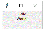
import tkinter as tk root = tk.Tk() label = tk.Label(root, text="Hello\nWorld!", height=2) label.pack() root.mainloop()
This code will create a Label widget with two lines of text: “Hello” on the first line and “World!” on the second line. The height parameter is set to 2 to allow the label to display both lines of text. Note that you need to use the newline character (\n) to separate the lines of text in the text parameter. You can use any integer value for the height parameter, but keep in mind that the actual height of the widget will depend on the font size and other parameters
The output:
The highlightbackground option/parameter in the Tkinter Label widget
It specifies the color of the focus highlight when the label widget does not have focus. By default, the highlight color is the same as the widget background color. You can change this color to any valid color name or color code using the highlightbackground parameter.
Here’s an example that creates a Label widget with a custom highlight background color:
import tkinter as tk root = tk.Tk() label = tk.Label(root, text="Hello World!", highlightbackground="red") label.pack() root.mainloop()
This code will create a Label widget with the text “Hello World!” and a red highlight border. The highlightbackground parameter is set to “red” to change the focus highlight color. Note that the focus highlight is only visible when the label widget has focus, which can be achieved by clicking on the widget or using the keyboard to navigate to it.

The highlightcolor option/parameter in the Tkinter Label widget
It specifies the color of the focus highlight when the label widget has focus. By default, the highlight color is system-dependent, but you can change it to any valid color name or color code using the highlightcolor parameter.
Here’s an example that creates a Label widget with a custom highlight color:
import tkinter as tk root = tk.Tk() label = tk.Label(root, text="Hello World!", highlightcolor="green") label.pack() root.mainloop()
This code will create a Label widget with the text “Hello World!” and a green focus highlight. The highlightcolor parameter is set to “green” to change the focus highlight color. Note that the focus highlight is only visible when the label widget has focus, which can be achieved by clicking on the widget or using the keyboard to navigate to it.
The highlightthickness option/parameter in the Tkinter Label widget
It specifies the width of the focus highlight border around the widget when it has focus. By default, the highlight thickness is 0, which means that no focus highlight border is shown. You can change this value to any positive integer to set the width of the focus highlight border.
Here’s an example that creates a Label widget with a focus highlight border:
import tkinter as tk root = tk.Tk() label = tk.Label(root, text="Hello World!", highlightthickness=2) label.pack() root.mainloop()
This code will create a Label widget with the text “Hello World!” and a focus highlight border with a thickness of 2 pixels. The highlightthickness parameter is set to 2 to create the border. Note that the focus highlight is only visible when the label widget has focus, which can be achieved by clicking on the widget or using the keyboard to navigate to it.
The image option/parameter in the Tkinter Label widget
It allows you to display an image in the label. You can set the image parameter to an instance of the PhotoImage class or any other image class that Tkinter supports.
Here’s an example that creates a Label widget with an image:
import tkinter as tk root = tk.Tk() photo = tk.PhotoImage(file="image.gif") label = tk.Label(root, image=photo) label.pack() root.mainloop()
This code will create a Label widget with the image from the file “image.gif”. The image parameter is set to the PhotoImage object created from the file. Note that the file path should be updated to the location of the actual image file on your computer. You can use other image file formats such as .png, .jpg, .bmp, etc., as long as Tkinter supports them.
The justify option/parameter in the Tkinter Label widget
It allows you to control the horizontal alignment of the text in the label. You can set the justify parameter to one of the following values:
"left": Align the text to the left edge of the label."center": Center the text horizontally within the label."right": Align the text to the right edge of the label.
Here’s an example that creates a Label widget with centered text:
import tkinter as tk root = tk.Tk() label = tk.Label(root, text="Hello World!", justify="center") label.pack() root.mainloop()
This code will create a Label widget with the text “Hello World!” centered within the label. The justify parameter is set to “center” to align the text in the center. You can change this value to “left” or “right” to align the text accordingly
The padx option/parameter in the Tkinter Label widget
It allows you to specify the amount of horizontal padding to add around the text or image in the label. You can set the padx parameter to any integer value to add padding on both sides of the label. Alternatively, you can specify two values separated by a comma to add different amounts of padding on the left and right sides of the label.
Here’s an example that creates a Label widget with horizontal padding:
import tkinter as tk root = tk.Tk() label = tk.Label(root, text="Hello World!", padx=20) label.pack() root.mainloop()
This code will create a Label widget with the text “Hello World!” and 20 pixels of horizontal padding on both sides of the label. The padx parameter is set to 20 to add the padding. You can change this value to any other integer value to adjust the padding. If you want to specify different amounts of padding on the left and right sides, you can set padx to a tuple or list of two integers. For example, padx=(10, 20) would add 10 pixels of padding on the left side and 20 pixels of padding on the right side.
The pady option/parameter in the Tkinter Label widget
It allows you to specify the amount of vertical padding to add around the text or image in the label. You can set the pady parameter to any integer value to add padding above and below the label. Alternatively, you can specify two values separated by a comma to add different amounts of padding above and below the label.
Here’s an example that creates a Label widget with vertical padding:
import tkinter as tk root = tk.Tk() label = tk.Label(root, text="Hello World!", pady=20) label.pack() root.mainloop()
This code will create a Label widget with the text “Hello World!” and 20 pixels of vertical padding above and below the label. The pady parameter is set to 20 to add the padding. You can change this value to any other integer value to adjust the padding. If you want to specify different amounts of padding above and below the label, you can set pady to a tuple or list of two integers. For example, pady=(10, 20) would add 10 pixels of padding above the label and 20 pixels of padding below the label.

The relief option/parameter in the Tkinter Label widget
It allows you to specify the appearance of the border around the label. You can set the relief parameter to one of the following values:
"flat": No border (default)."raised": A raised border."sunken": A sunken border."solid": A solid border."ridge": A ridged border."groove": A grooved border.
Here’s an example that creates a Label widget with a sunken border:
import tkinter as tk root = tk.Tk() label = tk.Label(root, text="Hello World!", relief="sunken") labe2 = tk.Label(root, text="Hello World!", relief="solid") labe3 = tk.Label(root, text="Hello World!", relief="raised") label.pack() labe2.pack() labe3.pack() root.mainloop()
This code will create a Label widget with the text “Hello World!” and a sunken border. The relief parameter is set to "sunken" to add the border. You can change this value to any of the other options to change the appearance of the border.

The state option/parameter in the Tkinter Label widget
It allows you to control whether the label is interactive or not. You can set the state parameter to one of the following values:
"normal": The label is interactive (default)."disabled": The label is not interactive and its text and background colors are grayed out.
Here’s an example that creates a Label widget with a disabled state:
import tkinter as tk root = tk.Tk() label = tk.Label(root, text="Hello World!", state="disabled") label.pack() root.mainloop()
This code will create a Label widget with the text “Hello World!” and a disabled state. The state parameter is set to "disabled" to make the label non-interactive. You can change this value to "normal" to make the label interactive again. When the label is in the "disabled" state, the foreground and background colors are also adjusted automatically to make the text and label look grayed out.

The takefocus option/parameter in the Tkinter Label widget
It determines whether the label can receive keyboard focus or not. By default, labels cannot receive keyboard focus, but you can enable this feature by setting the takefocus parameter to a non-zero value.
Here’s an example that creates a Label widget that can receive keyboard focus:
import tkinter as tk root = tk.Tk() label = tk.Label(root, text="Hello World!", takefocus=1) label.pack() root.mainloop()
This code will create a Label widget with the text “Hello World!” that can receive keyboard focus.
The takefocus parameter is set to 1 to enable this feature. If you want to disable the ability for the label to receive focus, you can set the takefocus parameter to 0 or omit it entirely (since 0 is the default value).
The text option/parameter in the Tkinter Label widget
It is used to specify the text that should be displayed in the label. You can set the text parameter to a string value to display that text in the label.
Here’s an example that creates a Label widget with the text “Hello World!”:
import tkinter as tk root = tk.Tk() label = tk.Label(root, text="Hello World!") label.pack() root.mainloop()
This code will create a Label widget with the text “Hello World!”. The text parameter is set to “Hello World!” to display that text in the label. You can change the text by updating the value of the text parameter to a different string.
The textvariable option/parameter in the Tkinter Label widget
It is used to associate a Tkinter variable with the label. When the value of the variable changes, the text in the label is automatically updated to reflect the new value.
Here’s an example that creates a StringVar variable and associates it with a Label widget:
import tkinter as tk
root = tk.Tk()
var = tk.StringVar()
var.set("Hello World!")
label = tk.Label(root, textvariable=var)
label.pack()
root.mainloop()
This code will create a StringVar variable and set its value to “Hello World!”. The textvariable parameter is set to the var variable, which means that the label will display the value of the variable. If you update the value of the variable using its set method, the text in the label will automatically update to reflect the new value. For example:
var.set("Goodbye World!")
This code will change the value of the var variable to “Goodbye World!”, and the text in the label will update to reflect this change.
The underline option/parameter in the Tkinter Label widget
It is used to specify which character in the label’s text should be underlined. You can set the underline parameter to an integer value to specify the index of the character to underline. The first character has an index of 0, the second has an index of 1, and so on.
Here’s an example that creates a Label widget with the text “Hello World!” and underlines the “o” in “World”:
import tkinter as tk root = tk.Tk() label = tk.Label(root, text="Hello World!", underline=6) label.pack() root.mainloop()
This code will create a Label widget with the text “Hello World!”, and the underline parameter is set to 6 to underline the “o” in “World”. When you run this code, you should see that the “o” in “World” is underlined in the label. Note that if you set the underline parameter to a value that is greater than or equal to the length of the label’s text, no character will be underlined.

The width option/parameter in the Tkinter Label widget
It is used to specify the width of the label, measured in characters. You can set the width parameter to an integer value to specify the width of the label.
Here’s an example that creates a Label widget with the text “Hello World!” and a width of 20 characters:
import tkinter as tk root = tk.Tk() label = tk.Label(root, text="Hello World!", width=20) label.pack() root.mainloop()
This code will create a Label widget with the text “Hello World!”, and the width parameter is set to 20 to specify that the label should be 20 characters wide. When you run this code, you should see that the label is 20 characters wide, and any extra space is filled with blank space characters. You can adjust the width of the label by updating the value of the width parameter to a different integer value.